










Why banking onboardings fail, and what changes when design, technology, and compliance work together.
Digital product design for banks and fintechs across LATAM
Bank customers in Latin America no longer compare their banking app to the branch down the street. They compare it to Mercado Pago or Nubank, which reported 139 million customers across the region in its latest quarterly report. That comparison leaves little room for excuses, and a legacy banking core is no exception.
The industry is caught between two realities. Banks have scale, licenses, and trust. Fintechs have speed and focus. Caught in the middle is the product itself: legacy screens, 11-step onboarding flows, and verification checks that push users away just before they finish. And since September, there's been a new requirement that directly affects that experience.
What changes with the BCRA’s new fraud risk score?
In September, Argentina's Central Bank (BCRA) issued Communication "A" 8473. Under the new regulation, banks and digital wallets will have to use a fraud risk score linked to each person's CUIL or CUIT, Argentina's personal and tax identification numbers. The score will be calculated by authorized administrators such as Red Link and COELSA. Implementation will be phased in, with full rollout expected by mid-2027.
Digital wallets will feel the impact most directly. According to the BCRA's Retail Payments Report, 76.5% of instant peso transfers in July originated from or were sent to a virtual account. And, as experts interviewed by iProUP explain, fintechs will need to integrate the score into their onboarding and transaction monitoring systems.
From a product perspective, the key question is what happens when a legitimate user gets flagged as risky. If they're blocked without an explanation, they leave. If they're given a clear way to verify their identity and move forward, they stay. That's a journey worth designing now, with compliance at the table, before deadlines start putting pressure on the team.
So, why do banking onboarding flows fail?
Usually, it's death by a thousand cuts. Every department asks for another field, and no one removes anything. Eventually, the form ends up reflecting the bank's organizational chart instead of the user's journey.
The numbers back this up. According to Signicat's Battle to Onboard survey of 7,600 European consumers, 68% abandoned a financial services application in the previous year. The most common reasons were that the process took too long and asked for too much information. On the institutional side, Fenergo's 2025 survey found that seven out of ten organizations had lost customers due to inefficient onboarding.
We saw this firsthand while working with Santander Prendarios. Its auto loan application had a complex interface that caused people to drop off halfway through. We redesigned the experience and brought together several insurers, each with a different identity, into one cohesive product.
This is where product design does something no marketing campaign can: it brings clarity to the decision-making process before a single line of code is written.
At Paisanos, we bring that clarity to three areas at once: user experience, system architecture, and compliance. All three sit at the same table from day one. The BCRA's new score is a good example. When it's part of the design process from the start, it becomes just another step in the journey. Introduce it in week eight, and the team has to rework what they've already built, at a much higher cost.
What changes when teams work together?
The questions change order. First, we define what the business needs to verify before opening an account. Then we decide what information to request, when to ask for it, and how. Often, the data already exists in an external source and can be retrieved without asking the user to provide it again.
The system changes, too. A design system with reusable form components, error states, and verification flows speeds up every release. The product team stops debating button colors and starts focusing on business decisions.
Measurement changes as well. An app that people like is just the starting point. We track activation, time to first transaction, and drop-off at each step because those are the metrics that make a compelling case in the boardroom.
What kind of impact can you expect?
Every step you remove gives more people a chance to finish. If users drop off because the process is too long and asks for too much, the biggest opportunity is clear: fewer fields, fewer screens, and less waiting. Making a long flow look better doesn't make it any shorter.
MODO shows how far a simple product can go. Backed by more than 30 Argentine banks, the digital wallet came to Paisanos with its backend ready to go and just two months to launch. We designed the product around three core actions: send money, request payments, and pay with QR. In its first four years, MODO surpassed 100 million transactions and 3 million active users, earning a 4.8 rating across app stores.
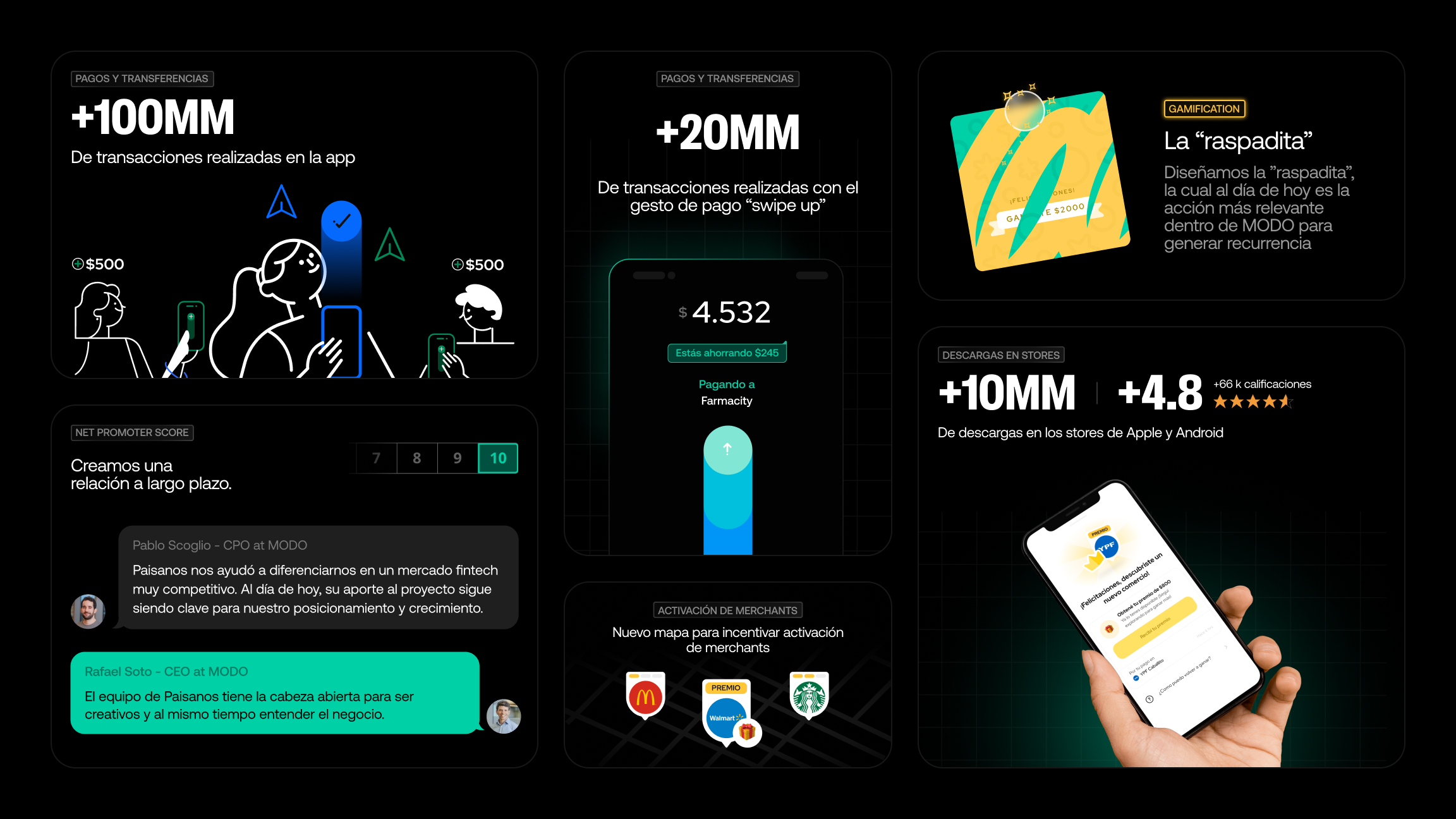
For us, the takeaway is simple: a bank needs an app people can use without having to call customer support. That's worth more than having the best-looking app on the market.
If you want to see how we bring strategy, craftsmanship, and thoughtful decision-making together, take a look at how we've partnered with teams at Banco Galicia, Claro Pay, and Ualá across strategy, product, and design systems.
If you're looking at your financial product and something doesn't quite add up, let's talk!