


By Juan Venezia — Product Designer at Paisanos
In a context where everything seems to lean toward extreme simplification, design can also be a way of telling stories. This article walks through the creative process behind Twin: what began as a straightforward logo request and ended up becoming the construction of a brand with identity, purpose, and long-term vision.
More than showcasing a final outcome, this piece opens up the process itself, how we think, how we explore, and how this approach can be applied to other creative challenges. Because sometimes, designing isn’t about reducing, it’s about making meaning.
The beginning: the logo of a story
The Twin project started with a simple sentence: “We need a logo.”
But behind that request was something deeper: the need to build a brand capable of telling a story, conveying trust, and at the same time moving naturally within a complex technological ecosystem.
The web3, crypto, and blockchain universe is often perceived as technical and intimidating, even for those of us who work in design. That’s where the first conceptual challenge appeared: how do you translate a highly technical world into something human, approachable, and understandable?
From the outset, we understood that Twin needed to speak two languages at once.
On one side, the institutional one: trust, security, structure.
On the other, the digital one: innovation, flexibility, constant evolution.
Twin had to be a bridge. Two sides, one identity.
The carving: understanding before designing
Every identity process starts the same way for me: by searching. By understanding before designing.
Exploration cuts across multiple layers: visual references, architecture, typography, art movements, materials, colors. Tools like Mobbin, Awwwards, Pinterest, Instagram, or X act as sparks, each from a different angle.
It’s not a linear process. One image leads to another. One concept opens a new door. Until, at some point, the algorithm starts repeating itself. That’s the signal: it’s time to stop, organize, and begin creating.
Along that path, one concept started to emerge with force: classical architecture. Columns, domes, and structures that for centuries have communicated stability, permanence, and trust.
That discovery opened up a central metaphor.
The board, not the piece
Chess appeared as a mental image: a game of strategy, not chance. Each piece has a role, but it’s the board that makes the game possible. Twin shouldn’t be the piece, it had to be the board.
That idea took us even further back, to the Renaissance and to Florence. A time when the human being moved to the center, when proportion, symmetry, and detail became ways of understanding the world.
That’s where Twin’s spirit was defined: a brand with a Renaissance soul, capable of reclaiming the classical to speak about the future. As El Eternauta said (and as Santi Echazú, Paisanos’ CCO, repeated at the project launch): “The old still works.”
In a world obsessed with simplifying everything, returning to tradition can be a profoundly contemporary gesture.
The work: giving form to the idea
From the very first meetings, one definition was clear: Twin needed the solidity of a financial institution without losing the flexibility of a digital product.
The logo couldn’t be simply minimalist. It needed to be complex in meaning, capable of conveying duality, stability, and at the same time allowing the system to expand.
The synthesis came through a symbol built from recognizable elements:
- Two identical side structures, reflecting duality.
- A central semicircular arch, directly rooted in Renaissance architecture.
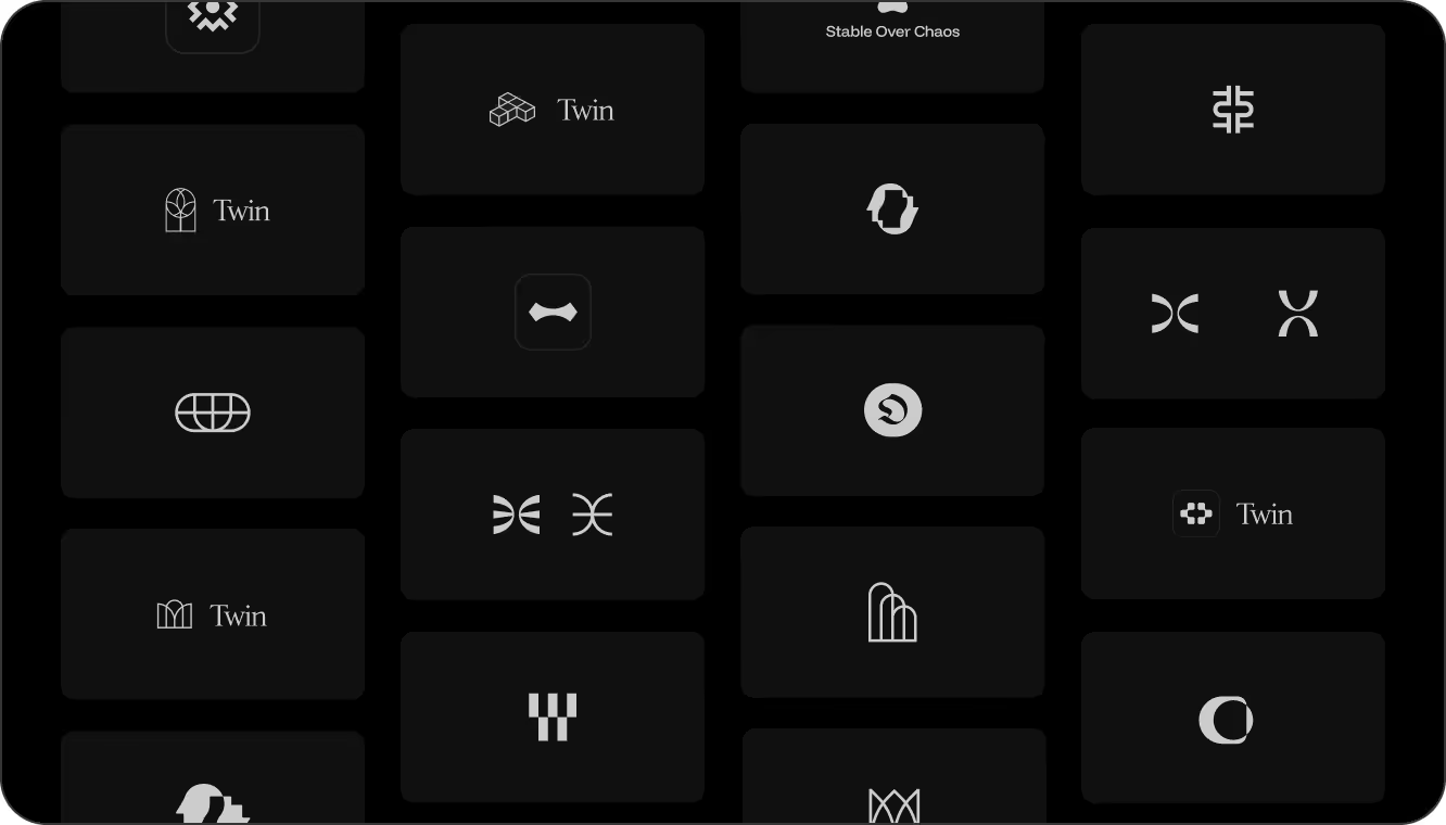
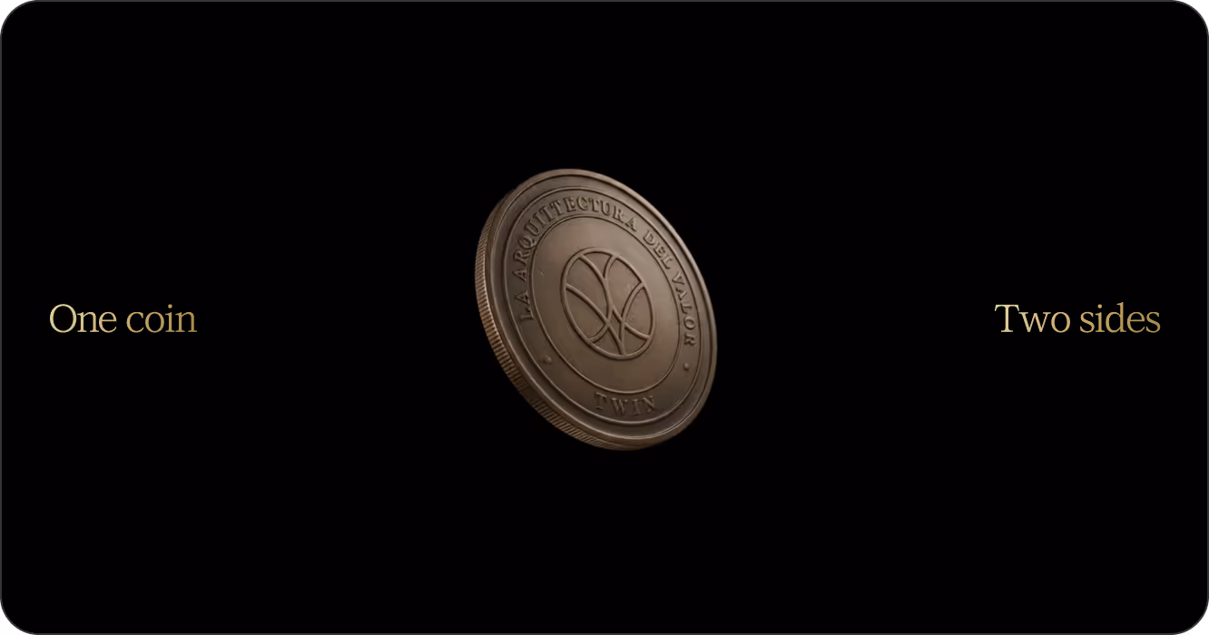
- A circular coin, conceived as a system: a resource that would allow the creation of sub-brands and unique symbols for each Twin vertical.
Nothing was arbitrary. Even the coin in the main logo was developed from an abstraction of the Vitruvian Man, seeking balance, proportion, and visual harmony.
Typography, color, and material
The typographic search was extensive. The brand needed to convey trust and elegance while also adapting to multiple digital environments. The solution was a combination: an institutional typeface for headlines and a cleaner, more contemporary one for body text and functional use.
Color arrived with a clear condition from the client: “No navy blue.” And yet, blue appeared.
Not just any blue, but ultramarine, the blue of lapis lazuli, of the Virgin Mary’s mantle, a pigment that during the Renaissance was worth more than gold. A color with history, depth, and symbolic weight.
Alongside it, a vibrant orange brought energy and contrast. Tradition and innovation coexisting in tension. The palette was completed with whites, blacks, grays, and gold, reinforcing the institutional tone.
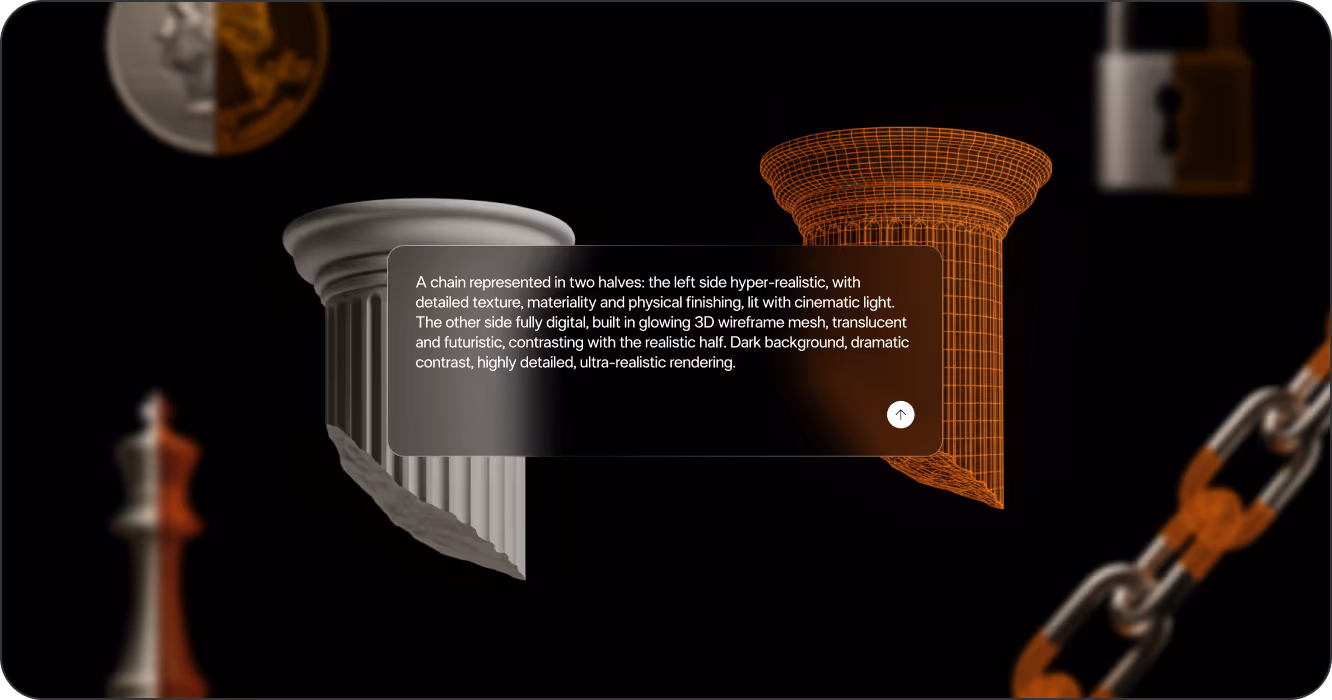
Illustrating two worlds as one
Illustrations sealed the visual narrative. Each piece was conceived as a synthesis: half material, half digital.
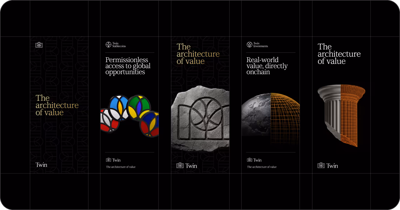
To achieve this, visual generation tools like Midjourney and Nano Banana were combined, creating realistic and digital versions of the same object, later unified into a single composition. The result was a coherent visual system capable of adapting to coins, planets, chess pieces, or keys, without losing intention or detail.
A universe where two worlds don’t compete, they coexist.
The museum: when design starts to live
Twin was a project driven by love for detail and a desire to tell something more. From day one, there was a story asking to come out, and the work was about accompanying it.
The relationship with the Twin team was key. It wasn’t a client–vendor dynamic, but a shared process. Conversations, debates, adjustments, excitement. Until that sentence every designer hopes to hear arrives: “We don’t have any more comments. This is it.”
That’s when you realize the work has completed its cycle.
Because when a brand starts to live, it stops belonging to you entirely. It begins to grow, transform, and appear in unexpected places. And that may be the most beautiful part of design.
Made to Transcend
What started as a logo request turned into a story. One about design, time, trust, and projection.
Twin reminded us of something essential: design isn’t just about simplifying or solving visual problems. It’s about telling better stories, creating narratives that connect people, ideas, and the future.
Design is still that: giving form to an idea so that someone can feel it.
4 key questions (and answers)
What is brand identity design?
Brand identity design is the process of building a visual and conceptual system that represents an organization’s values, personality, and purpose. It goes beyond the logo—it includes typography, color, symbols, and narrative.
Why is the creative process important in branding?
Because a strong brand doesn’t emerge from isolated decisions, but from understanding context, business, and culture. The creative process gives identity coherence, depth, and long-term projection.
How do you design a brand for complex digital environments like web3?
By translating the technical into human language. The focus is on building trust, clarity, and closeness, without losing rigor or institutional solidity.
What differentiates a purpose-driven brand from a purely aesthetic one?
A purpose-driven brand has a story, an intention, and a logic that guides every decision. Aesthetics are a consequence, not the starting point.
Want to see how we brought it to life? Explore the full Twin case study here.