


By Juan Venezia — Product Designer at Paisanos
Strategy, design, and technology studio applied to digital products.
Over the past few years, 3D design has stopped being the exclusive domain of ultra-technical profiles. What once felt complex, expensive, or hard to implement is now part of the everyday language of digital design. Thanks to more accessible tools and more agile workflows, 3D has become approachable, flexible, and (above all) strategic.
This shift didn’t just expand visual possibilities; it also transformed creative processes. Today, ideas can be explored, iterated on, and validated in less time, connecting visuals with narrative and user experience in a much more direct way.
In the redesign of the Switch Software website, we approached this opportunity from a clear standpoint: incorporating 3D not as a decorative resource, but as a core element of its visual identity.
The value of three-dimensional design in digital products
Integrating 3D elements into digital products goes far beyond an aesthetic choice. When used well, three-dimensional design becomes a strategic tool that brings presence, character, and visual coherence.
If you look around, you’ll probably notice physical objects that evoke different sensations: solidity, warmth, lightness, dynamism. That sensory reading comes from form, light, texture, and movement. 3D makes it possible to translate part of that experience into the digital environment, creating greater closeness and depth.
Working with tridimensionality today also optimizes creative timelines. It allows for rapid iteration, testing variations, and validating decisions in context. In this way, 3D stops being a technical challenge and becomes a concrete opportunity: building visual identities that are memorable, recognizable, and hard to replicate.
Applying 3D with intent: the Switch case
The Switch Software project involved a complete redesign of their website. The goal was to build a solid, direct, and professional visual identity that could communicate their methodology and value proposition in just a few seconds. The challenge was positioning them as technology experts without losing a sense of closeness, disruption, and friendliness.
The incorporation of 3D elements was one of the project’s pillars, but we never started from the “how”, we started from the “why.” What do we want to communicate? To whom? What feeling do we want to create for people visiting the site? These questions guided every decision.
We understood that 3D could bring impact and presence, adding personality without breaking the coherence of a clear, timeless identity.

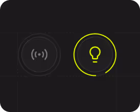
The isologo as a three-dimensional protagonist
Our first focus was the Switch isologo. While its shape and color palette were already defined, we opened up the exploration: what would happen if we took it into a three-dimensional space?
We developed it as the central element of the main hero and repeated it across key sections of the site. We tested variations in color, lighting, orientation, materiality, and style. From shiny, vibrant versions to more opaque, matte, or translucent options, each iteration sought a balance between visual impact, elegance, and functionality.
The final result (defined together with the client) was a minimalist, refined version that supports the experience without becoming intrusive.

Motion, interaction, and just the right “wow”
At Paisanos, we often talk about the chiche: those small “WOW moments” that add an extra layer to the experience. In Switch, that extra spark came through motion.
We explored rotations, translations, and interactions controlled by scroll or cursor, aiming for a more active relationship between the site and its users. These experiments were done in Spline, which allowed us to iterate quickly, validate ideas, and test them in context before integrating them into Webflow.
The focus was always on making interaction add value rather than distract: motion with intention.
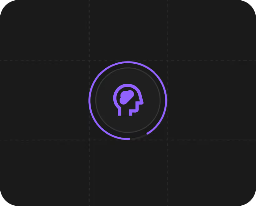
Representing teams and structure through 3D
The second major challenge was visually representing Switch’s studios, specialized internal teams that structure the way they work. The objective was twofold: to present them as a cohesive whole, while also allowing each one to project itself as an independent business unit.
The process began in 2D, with the creation of abstract symbols that communicated each studio’s specialty. Then, to amplify their presence, we brought them into the three-dimensional plane.
For this, we used Endless, a tool that allowed us to maintain a consistent aesthetic (shared materiality, orientation, lighting, and texture) while working with specific morphologies and colors for each studio. This way, each team gained its own visual identity without losing coherence within the broader Switch universe.

Artificial intelligence as a creative ally
Artificial intelligence is part of our working stack, not as a replacement for judgment, but as an amplifier of the creative process.
Its greatest value shows up during exploration stages: it allows us to generate variations, test materiality and textures, and validate possible directions at high speed. This frees up valuable time for what truly makes the difference: judgment, sensitivity, and critical thinking applied to the final details.
Far from automating decisions, AI helps us focus more deeply on the nuances that make a product unique.

Conclusion
The combination of 3D and artificial intelligence isn’t just a technical matter. It’s a new way of building visual identities, where the real challenge lies in knowing when, how, and why to use each resource.
Tools that once felt distant now integrate naturally into digital design, enabling more agile, flexible, and precise processes. The value isn’t in using 3D or AI for their own sake, but in applying judgment so that every visual decision has meaning and purpose.
Want to see how we put this into practice? Check out the full Switch Software case here.
FAQ
What is 3D design used for in a digital visual identity?
3D design adds depth, personality, and presence to a digital visual identity. When applied thoughtfully, it helps differentiate a brand, create stronger emotional impact, and connect digital experiences with references from the physical world.
Does 3D affect website performance?
Not necessarily. When designed with intention and implemented in an optimized way, 3D can coexist with strong performance, especially when using tools that allow testing and adjustment before final integration.
What role does artificial intelligence play in 3D design?
AI acts as an ally during exploration and ideation stages. It enables rapid generation of variations, testing of materials, and faster decision-making, freeing time for fine-tuned work and creative judgment.
Is 3D only for tech brands?
No. While it’s common in tech products, 3D can be adapted to many industries—as long as it serves a clear purpose within the visual identity and brand experience.