Description
The company
The challenge
The impact


Sometimes, projects come in as small asks. "We need a logo" they said. But as soon as we started digging, we uncovered a much bigger story, one that needed to be told. The kind that makes you want to grab a coffee, open a notebook, and start writing.
It all started with an acquisition. Belo, a crypto company from Argentina, had acquired Num Finance. Their goal was to build an infrastructure for issuing and operating stablecoins across Latin America. Their dream? That anyone in the region could use their local currency frictionlessly (as if they were using cash) powered by technology.
Go to case details to know more

.avif)
The challenge? It wasn't technical, it was existential. How do you give a face to a system that aims to be the playing field where the future of money is decided?
That's when we said: we can't just design a logo, we need to build a vision.
And building a vision starts way before design. It means stepping back: understanding the business model, mapping the competitive landscape, identifying tensions, and finding the unique space where Twin could stand out.
Go to case details to know more

The first clue to building "the whole thing" came in the very first meeting:
It started with a simple, offhand question: "If you were at the zoo, which animal would you go see firstand why?" We got a bunch of different answers, but one stood out:
"The monkey" someone said. "Because I’m curious to see something that looks like me behind bars".
That was the moment it clicked. Who's really behind the bars? Who's watching whom? From that question, the metaphor that would shape the entire project was born:
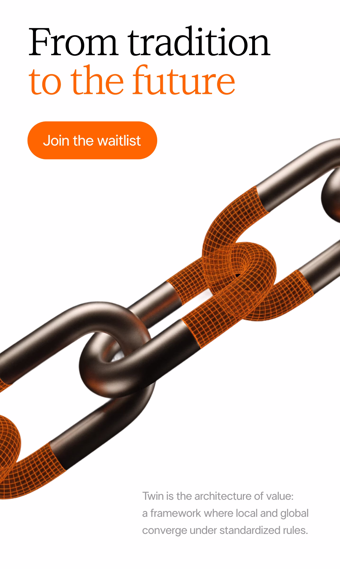
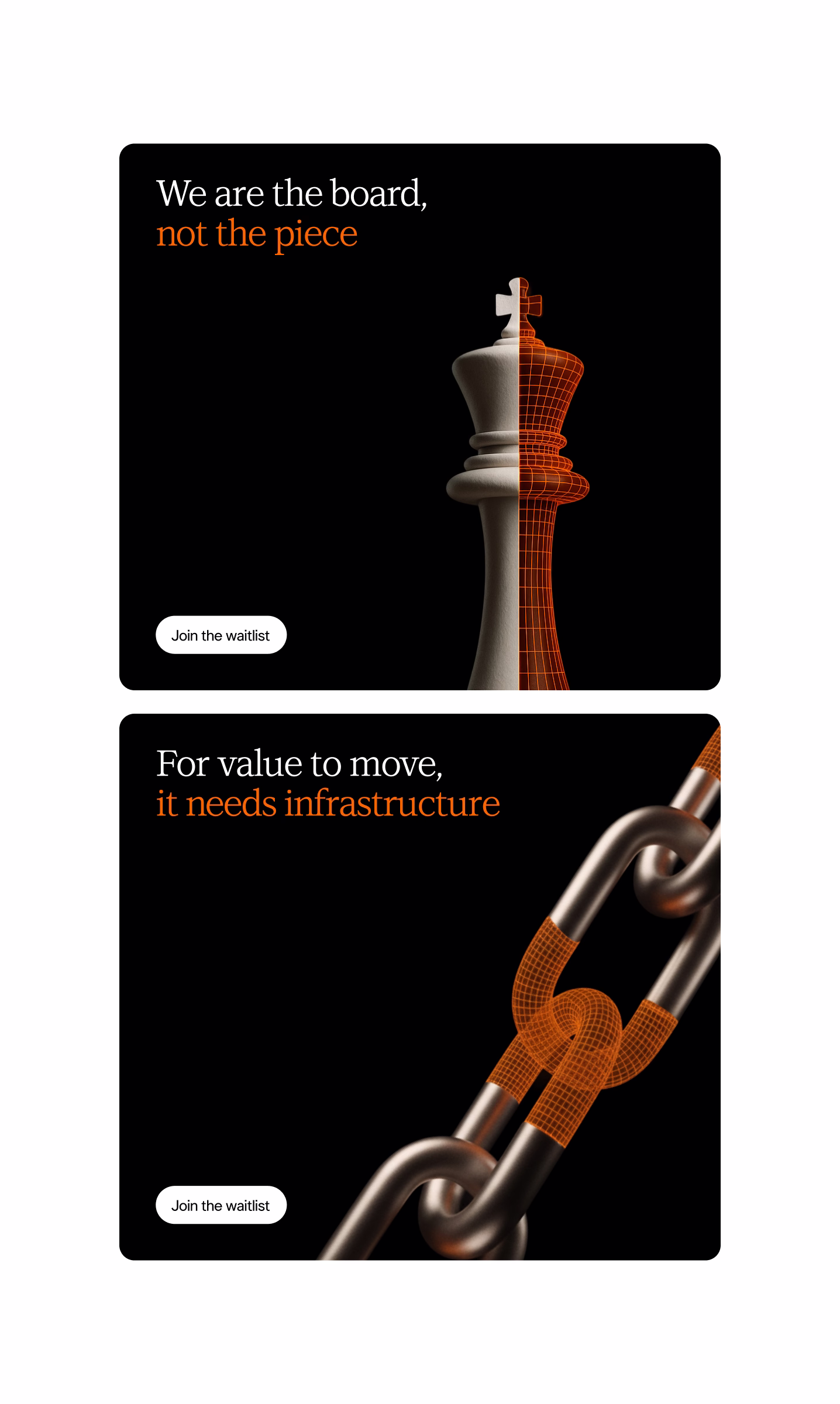
Two sides of the same coin.
Go to case details to know more
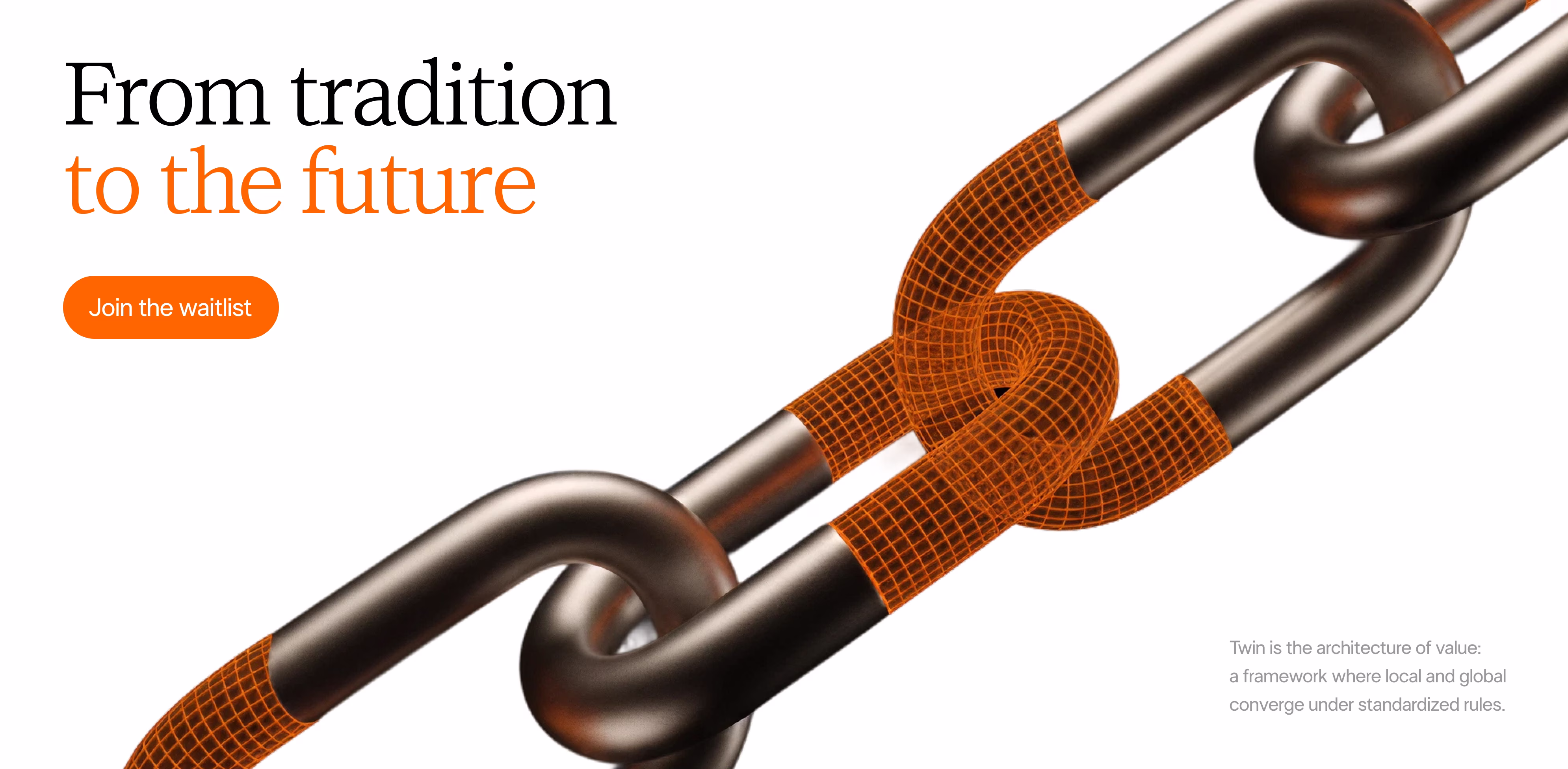
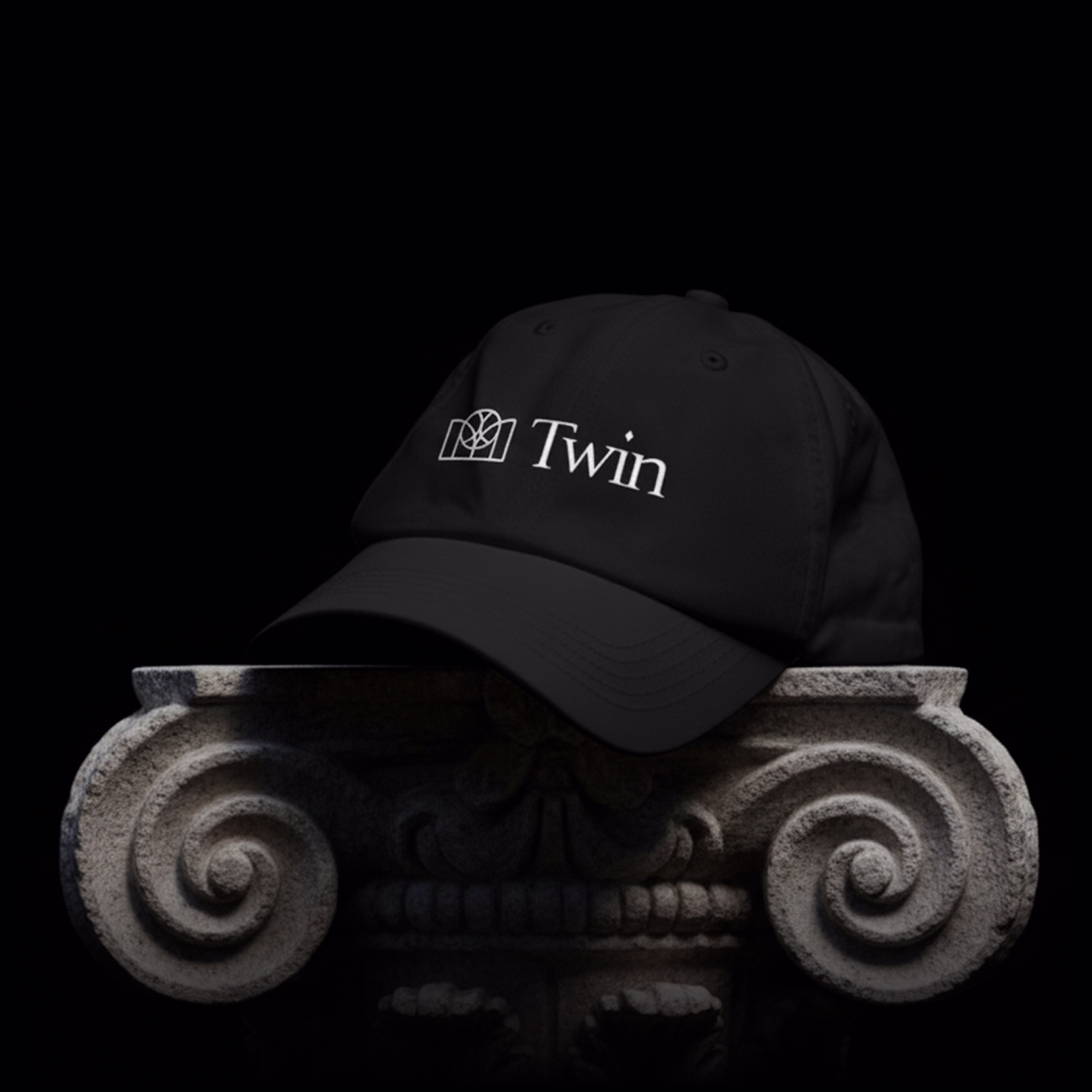
Twin.
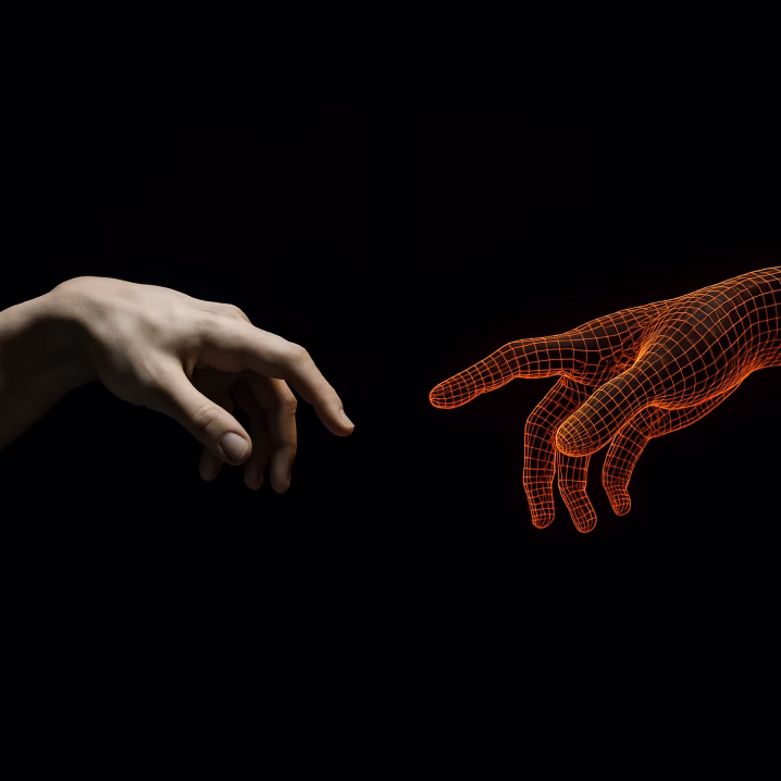
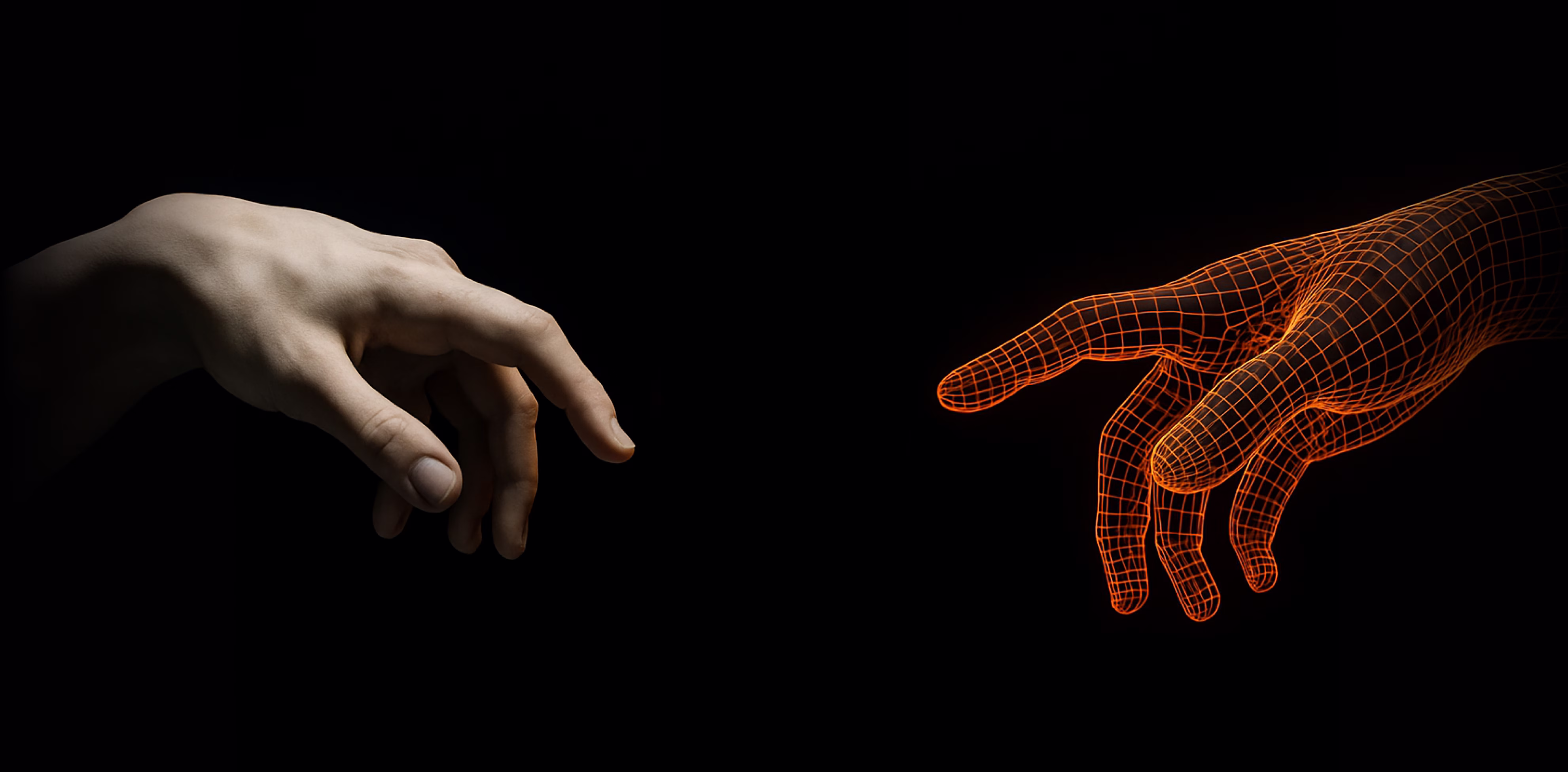
An infrastructure built between two worlds:
One more crypto, more punk, shaped by urgency and constant change. The other more institutional, corporate, rooted in legacy systems. Different, but complementary. One needs to disrupt. The other needs not to be disrupted.
That duality wasn't just a creative spark, it became the core of the positioning. We saw that Twin had to live in the "institutional-local" quadrant: a rarely explored space that blends the legitimacy of traditional finance with the closeness and cultural depth of LATAM. A position that sets it apart from both global players and oversaturated crypto-native brands.
We had to go deep: What's the real business model behind these two sides? Where does it sit in the ecosystem? What cultural tensions and opportunities are at play? Without those answers, any logo would've been just a hollow shell. And that's not how we do things.
Go to case details to know more

.avif)
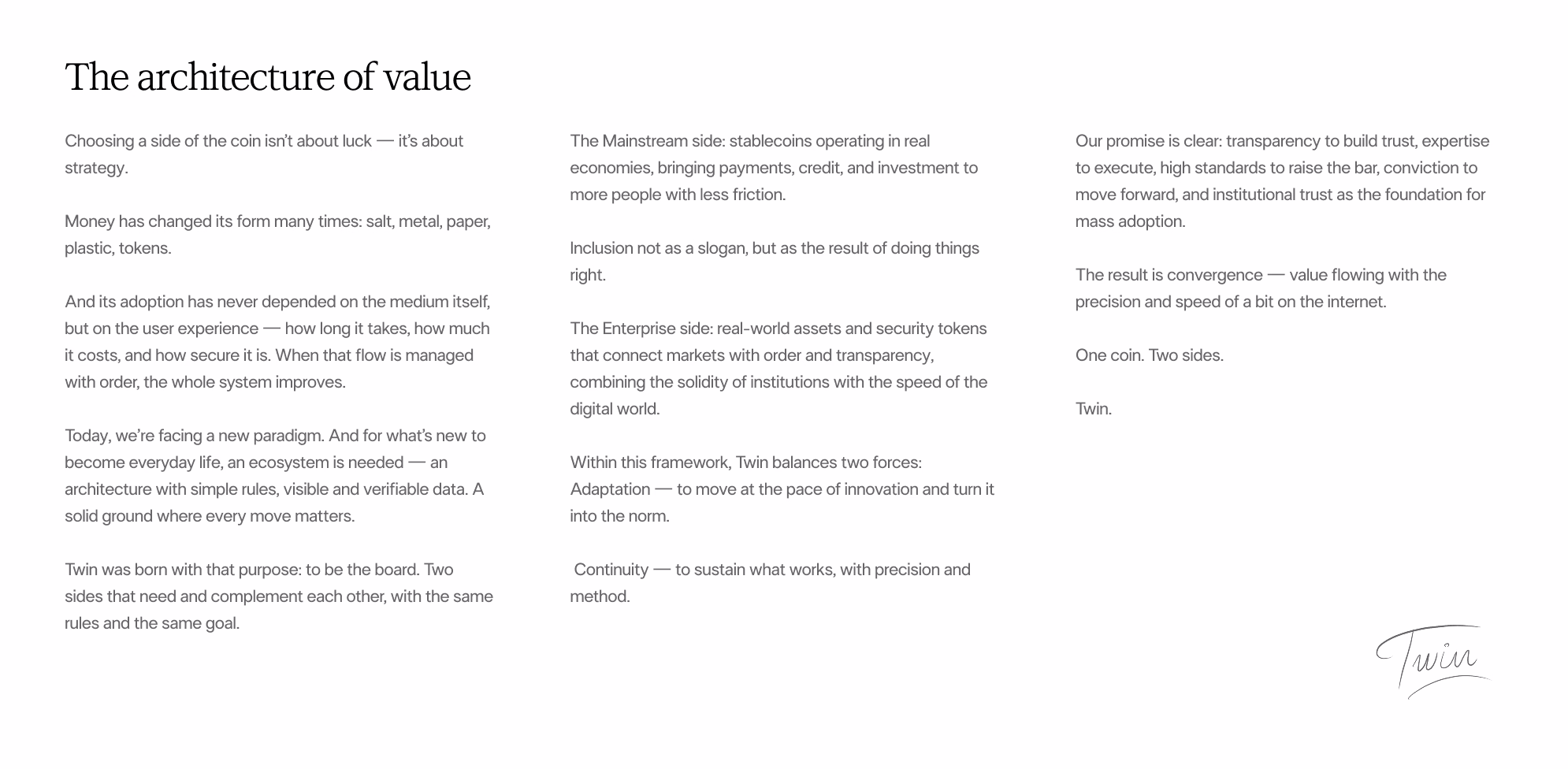
The next step was to craft the manifesto, the foundation that would guide everything moving forward. It pushed us to ask deeper questions: How is value created? What does a currency mean today? What truly matters when we talk about money? Spoiler: it's not the format, it's the experience. How fast it moves, how much it costs, how secure it is, and most importantly, how much trust it generates.
That kind of trust isn't drawn... it's built. And the story had to live up to that standard.
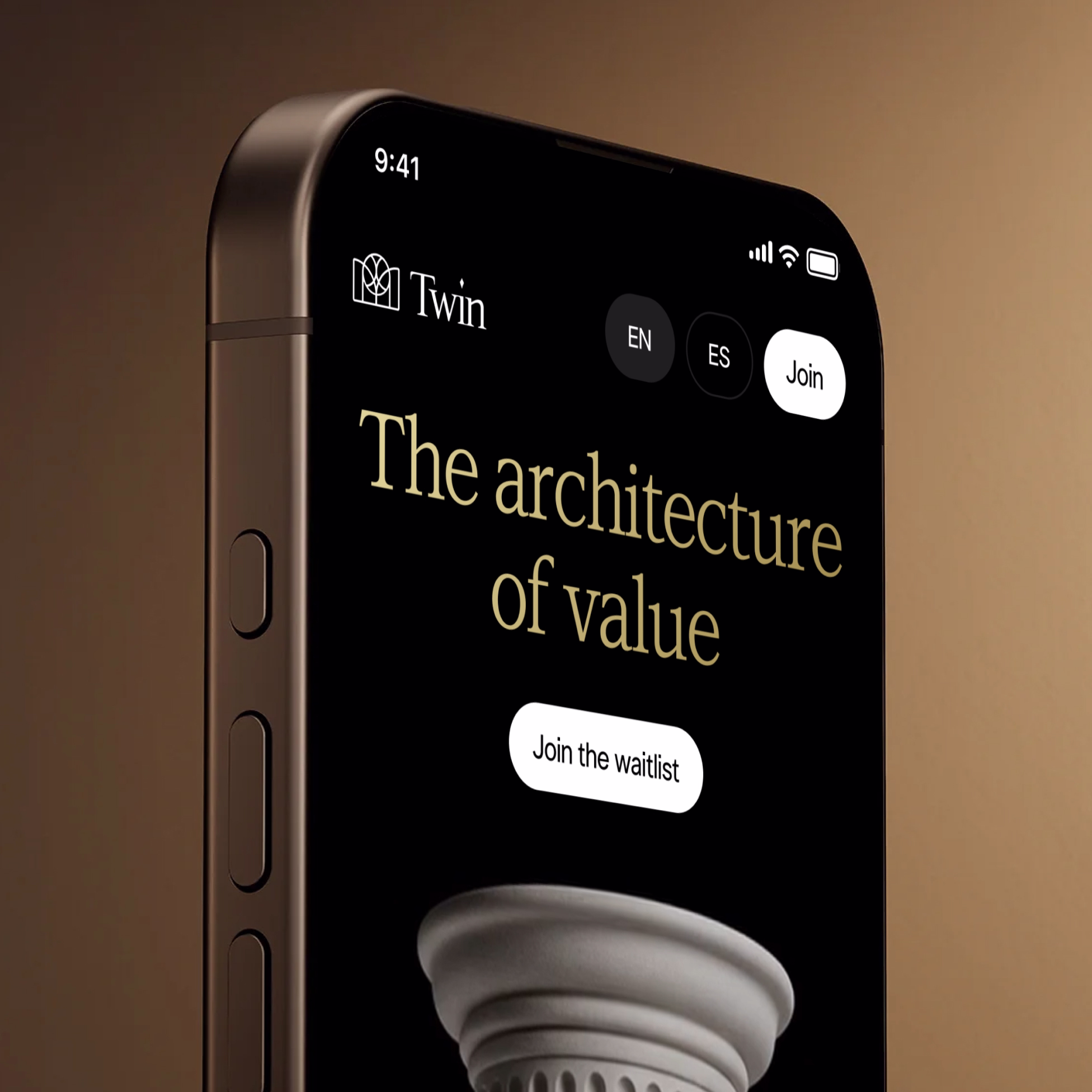
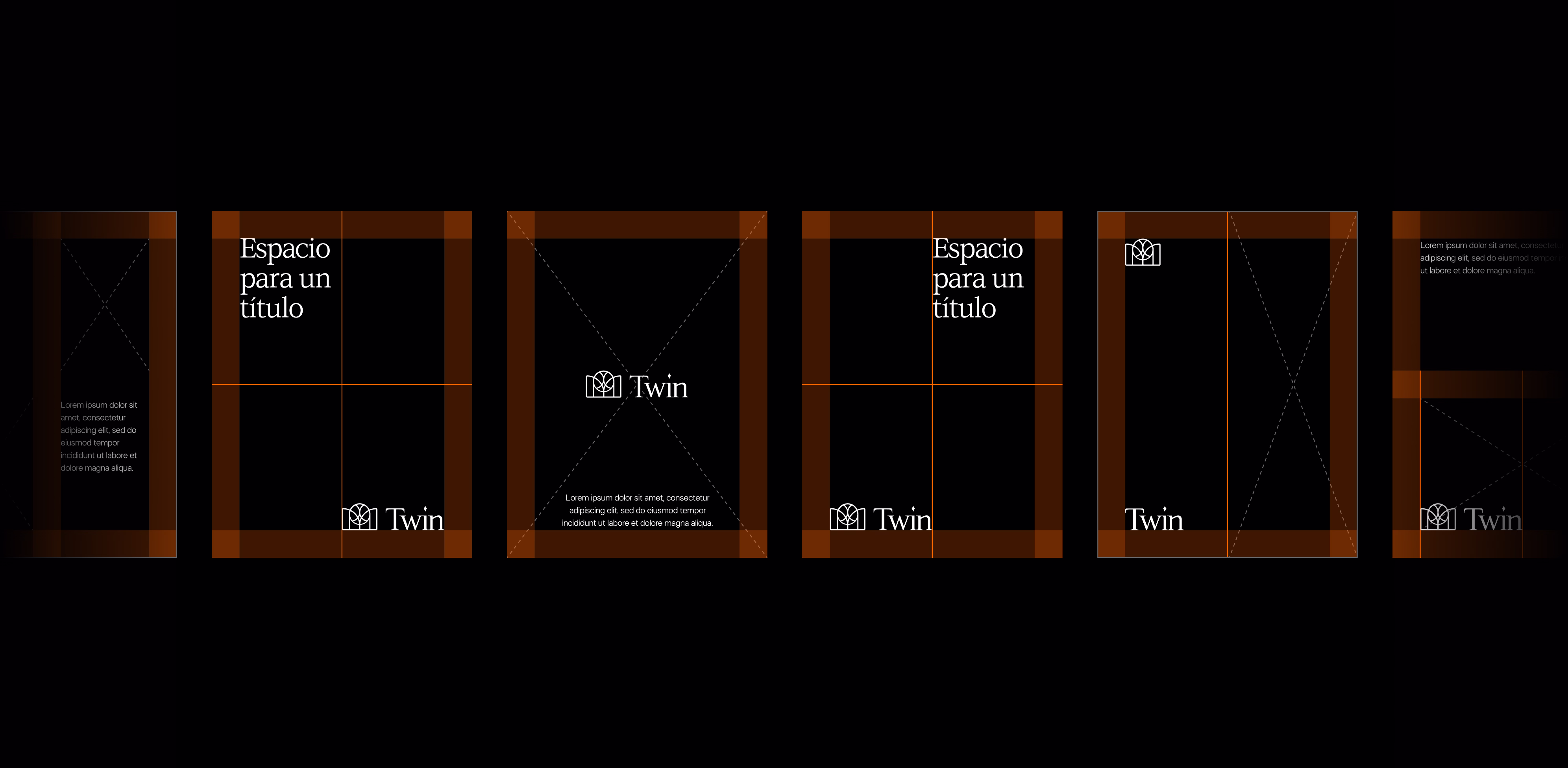
That's why we created a modular brand architecture, with Twin as the masterbrand and two verticals ready to grow: Twin Stablecoins and Twin Securities. A structure designed to avoid fragmentation and support new extensions under a single, cohesive narrative.
Go to case details to know more
.avif)

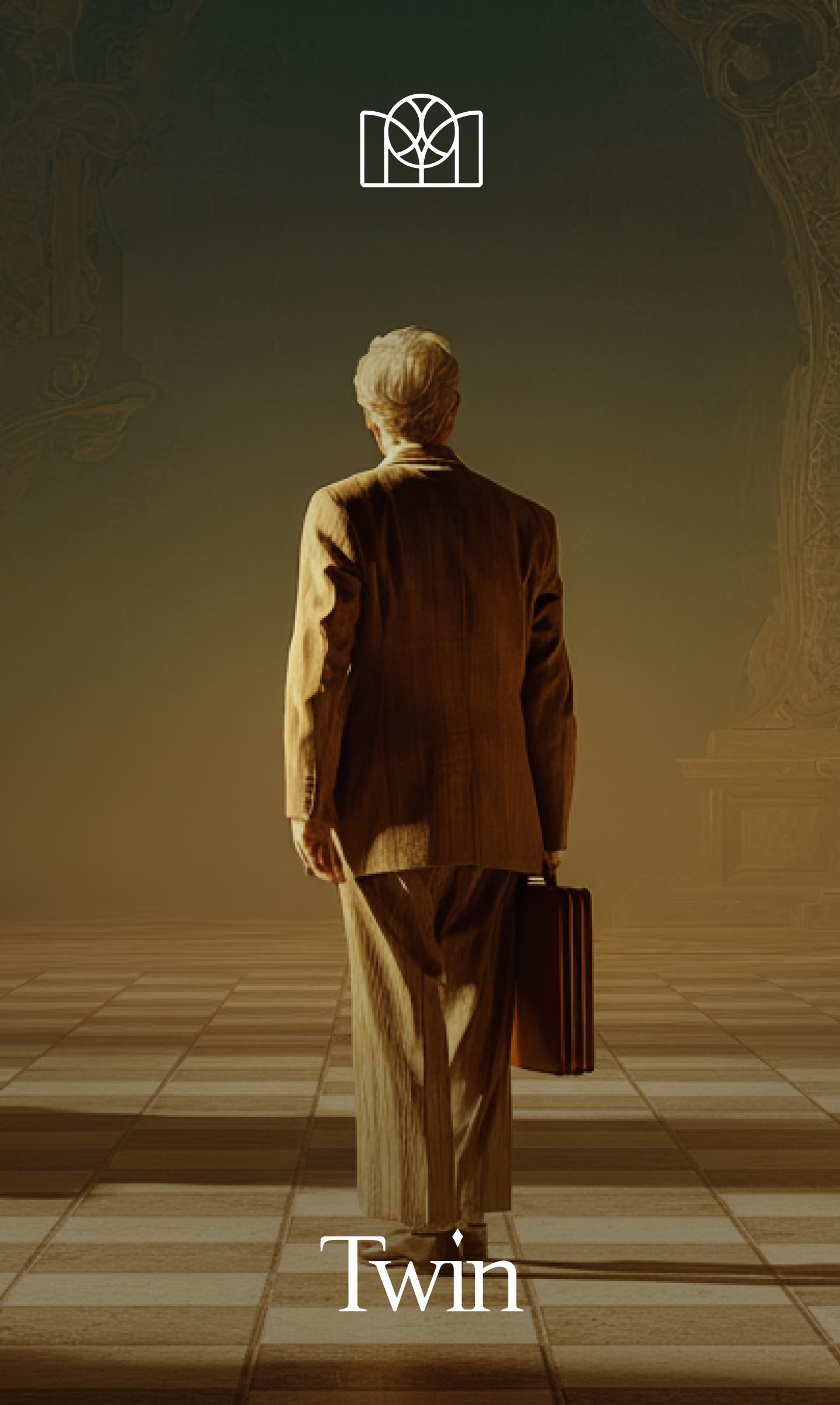
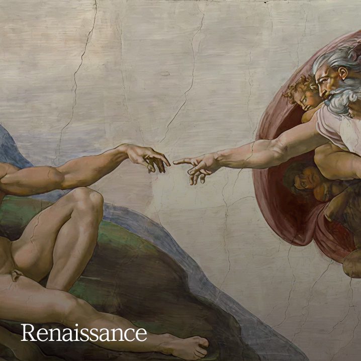
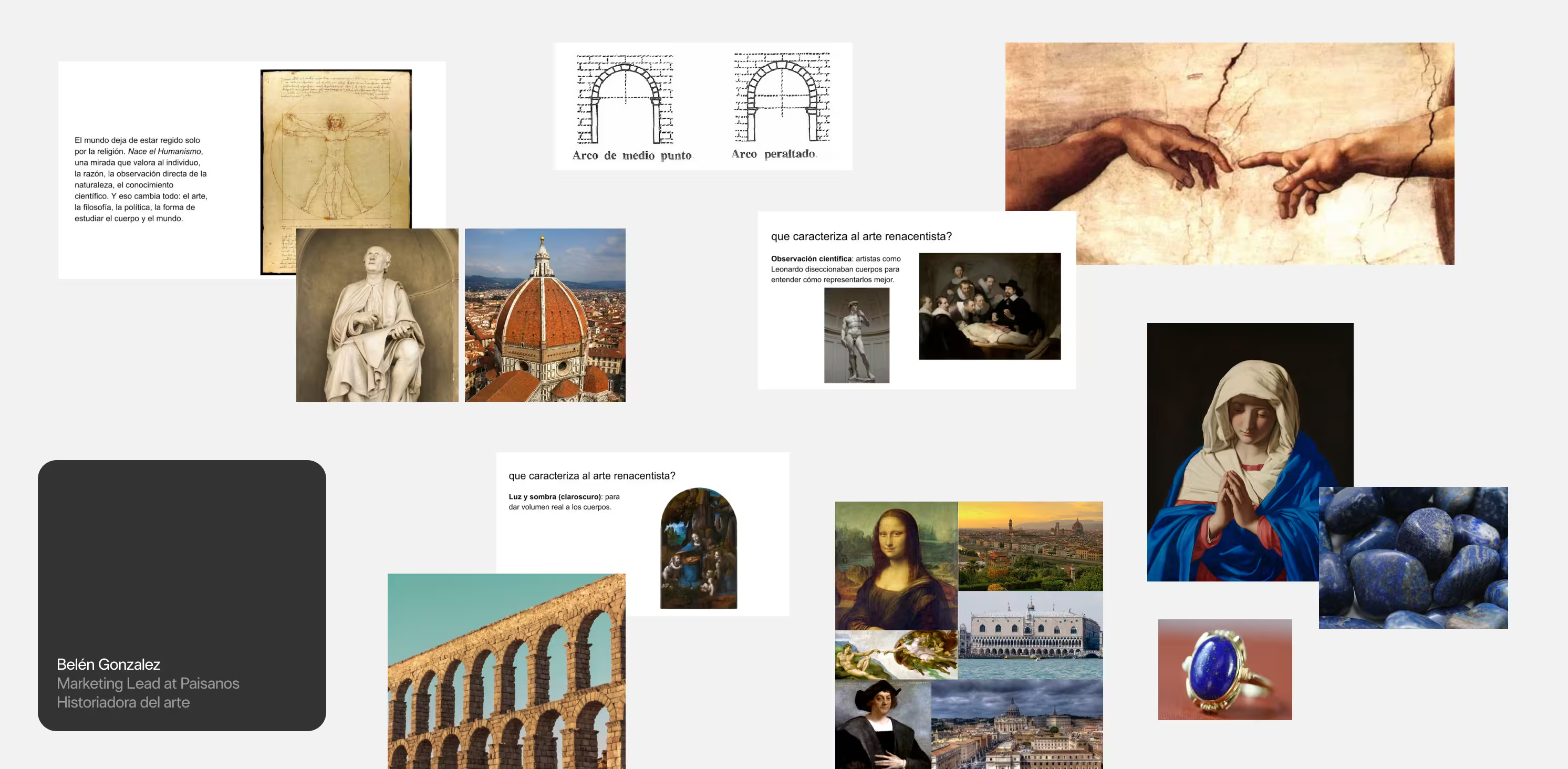
We dove deep into the history of the Renaissance, not just for its aesthetics, but for its way of thinking.
The Renaissance didn't invent everything from scratch. It took what was old, reinterpreted it, and made it new.
That's exactly what we did: we took the classical symbols of power, architecture, and order… and brought them into a world that demands speed, transparency, and scalability.
Go to case details to know more
.avif)
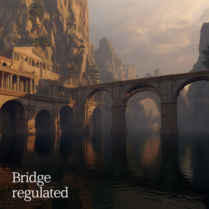
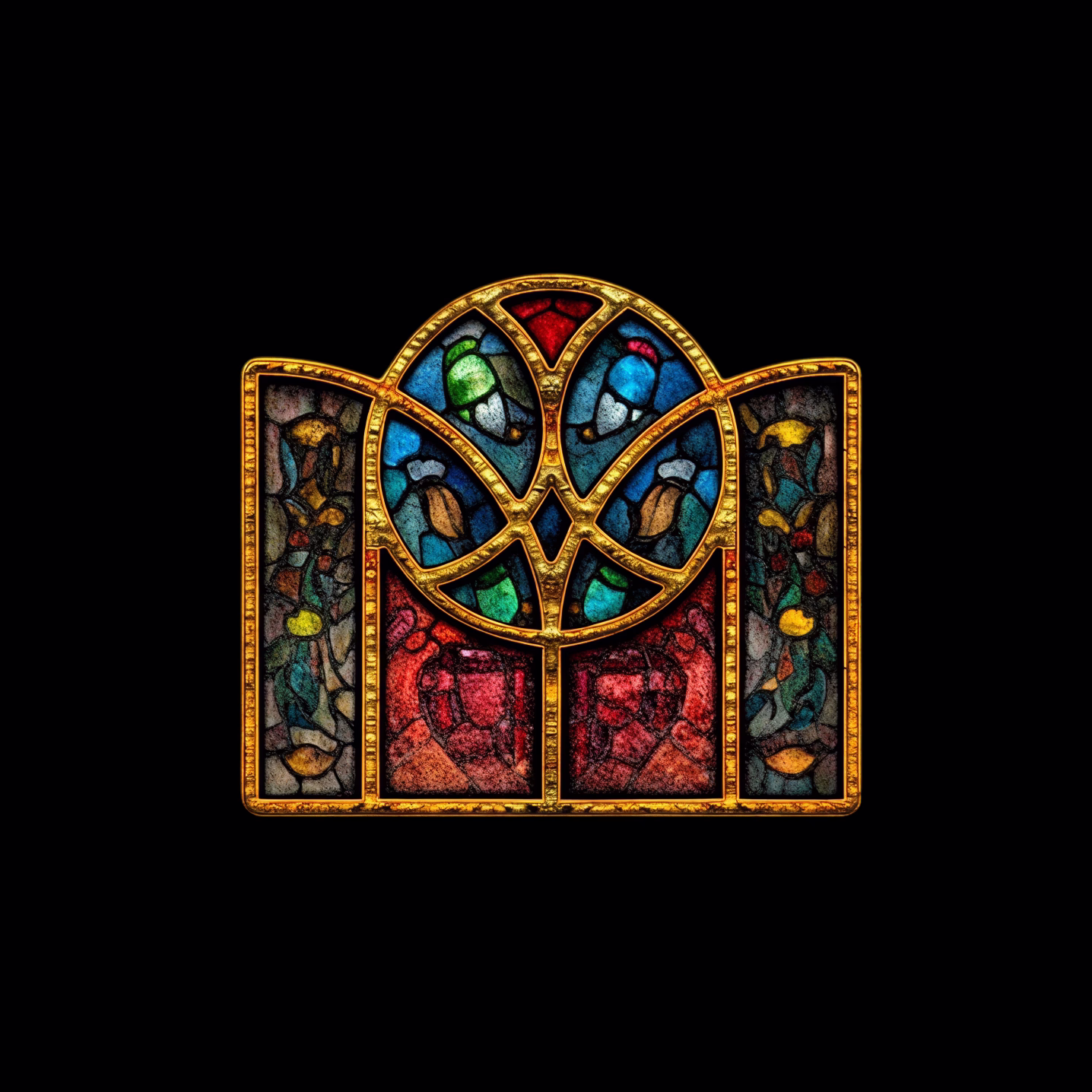
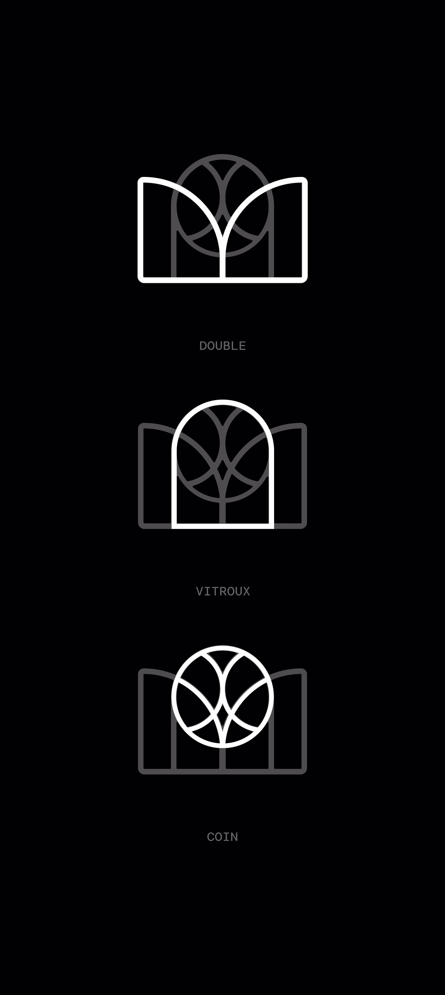
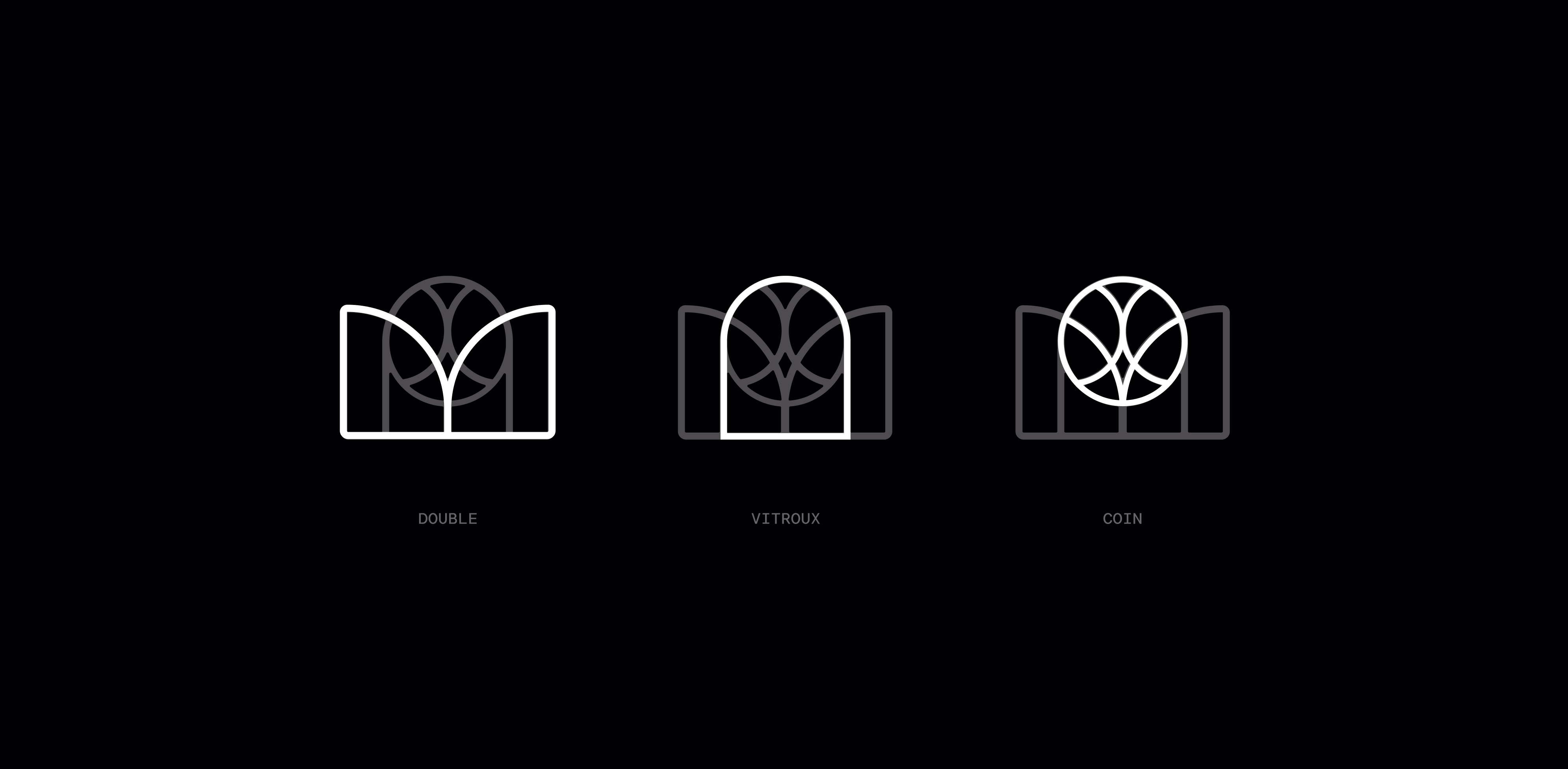
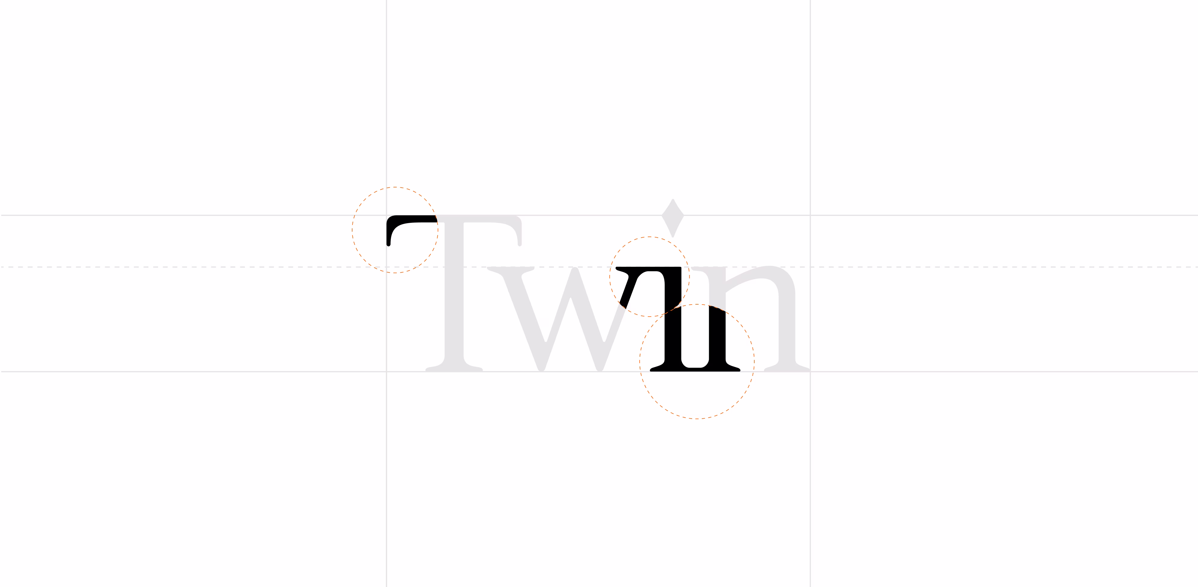
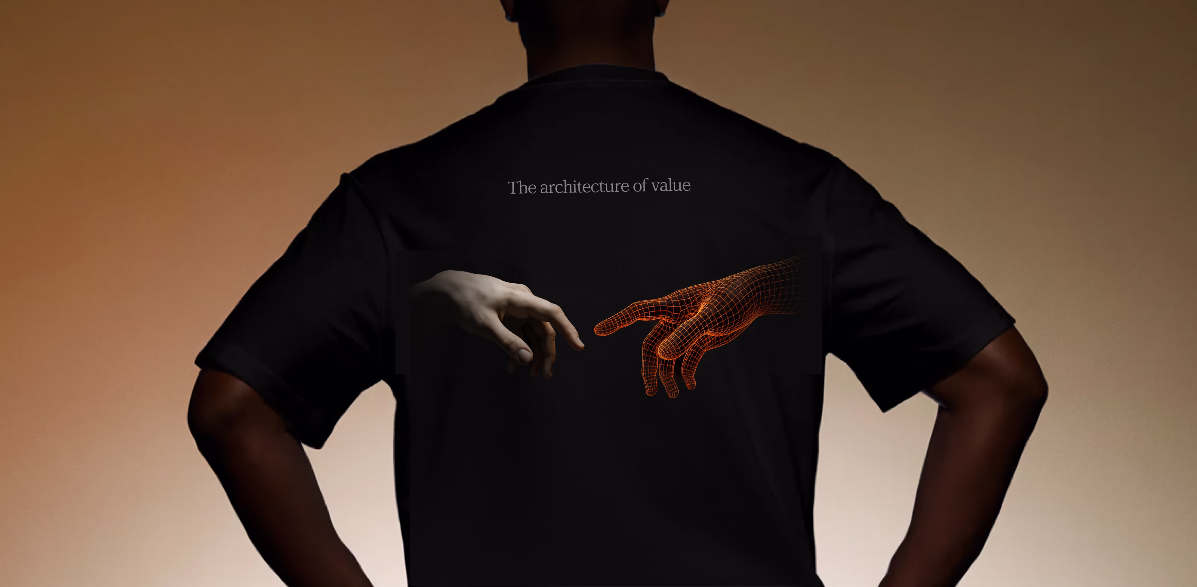
The logo was born from a semicircular arch, a Renaissance figure that holds, connects, and projects.
Two columns, a coin at the center, a structure that can be taken apart and rebuilt to adapt to new realities.
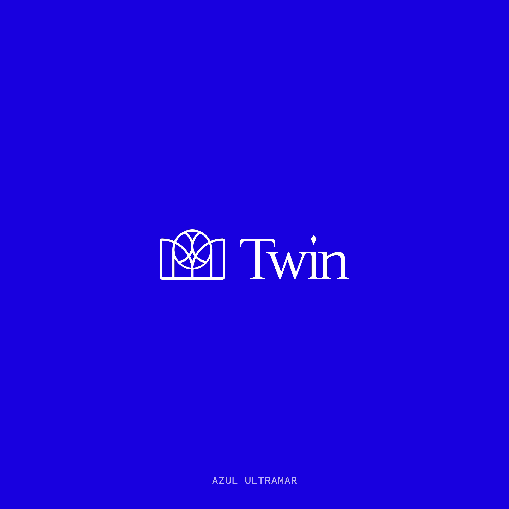
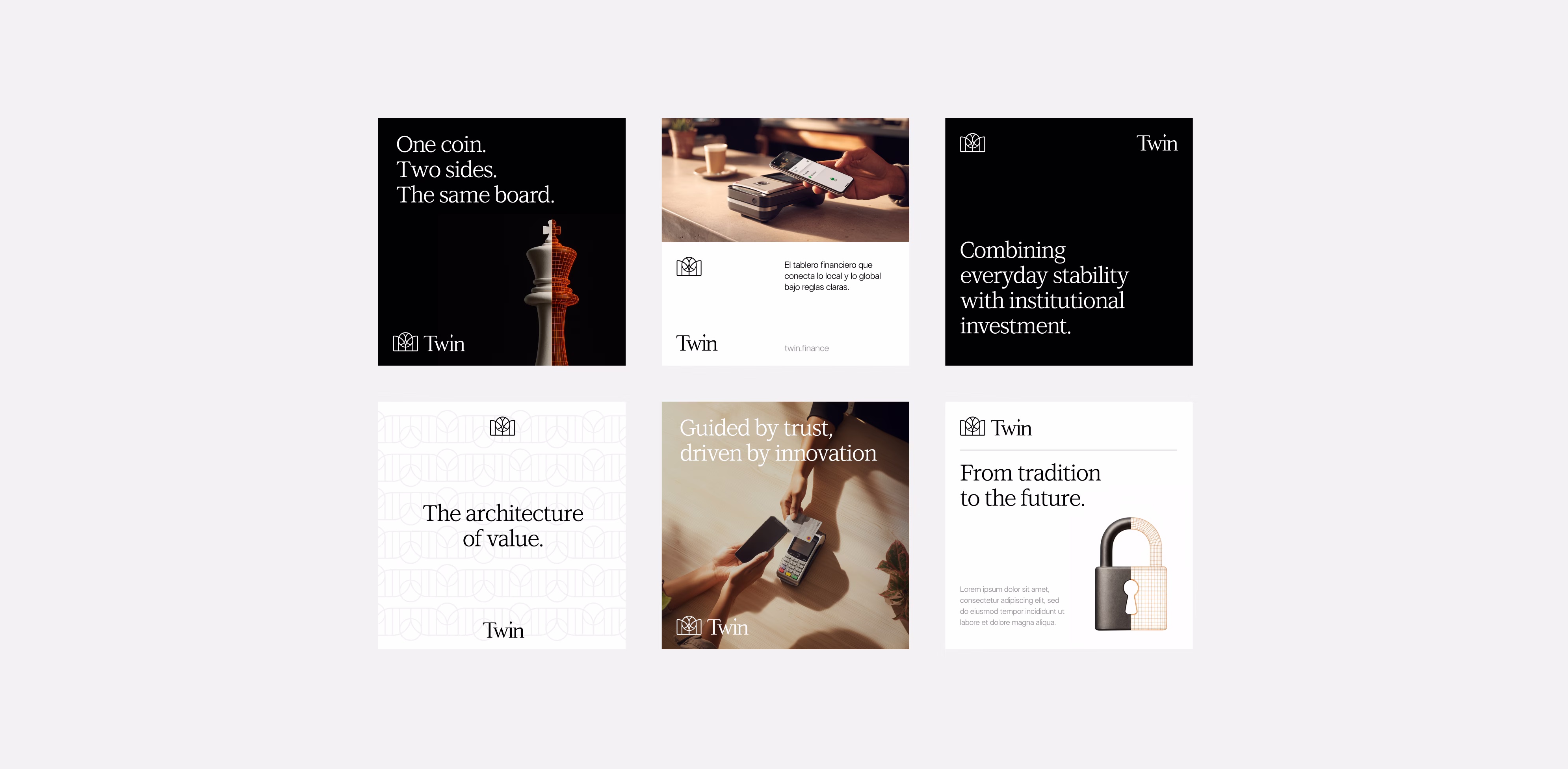
We searched through colors, symbols, and found "Ultramarine Blue", the same blue used to paint the Virgin Mary's mantle, the most expensive pigment of its time, reserved only for the divine.
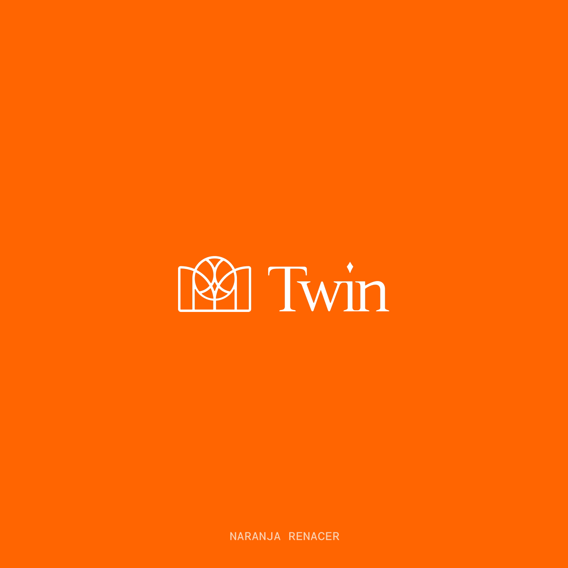
We chose that color because we wanted the brand to carry strong symbolic weight, almost spiritual. Something unique, distinctive, and full of meaning.And we paired it with a vibrant orange: the contrast that brings tension, the opposite of blue on the color wheel, the spark that gives it life the other side.
Every aesthetic decision had a reason. But more than that, it had a feeling.Because this project wasn't just an execution, it was an exploration. A work of its own.
Go to case details to know more
We spent more time thinking than designing.
We analyzed each of the six key audiences: regulators, asset managers, sophisticated crypto users, financial institutions, B2B integrators, and end users, to define what they needed, what they feared, and what they aspired to.
From there, we shaped how Twin should speak to them: with a tone that's sophisticated yet clear, trustworthy but never arrogant, approachable while still institutional, ambitious but grounded.
We spent hours reading about art, history, and economics. Looking for references that weren't trendy, but meaningful.We became obsessed with making sure nothing was random and once we found the thread, we pulled hard for two months to create something truly unique.
Go to case details to know more
.avif)
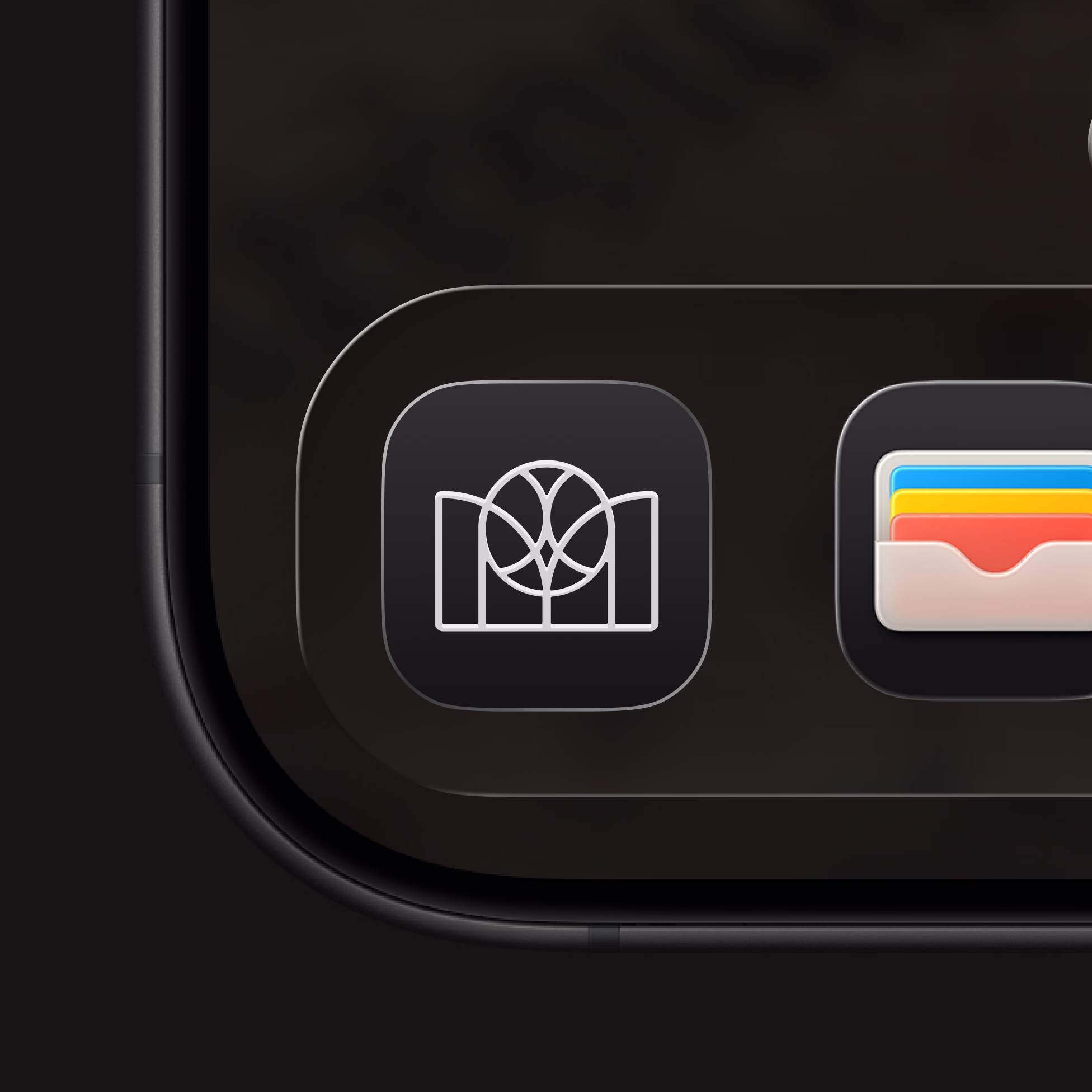
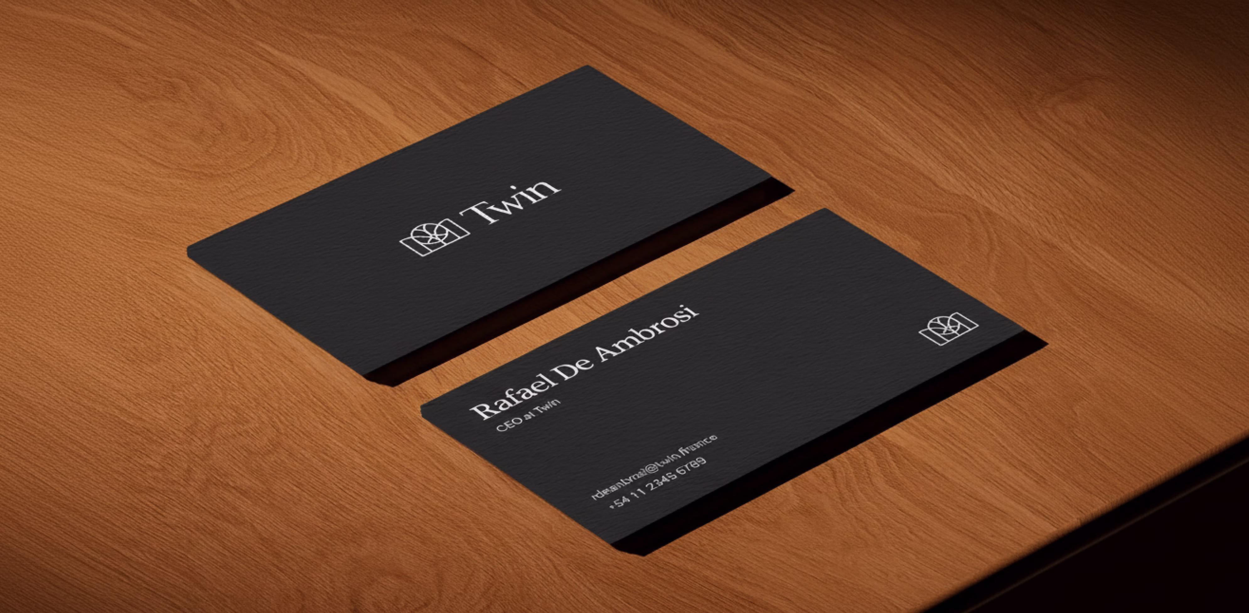
The result isn't just a logo, it's an identity that expands.
It's built to scale, to grow new verticals, to evolve with consistency. It can live on a business card or power a global campaign. It speaks both to the CEO of a bank and the developer building a wallet from their bedroom.If this project taught us anything, it's this: when a client says "we need a logo" what they often really mean is "we need a story that represents us".
And with Twin, that story found all of us.
Go to case details to know more
A brand that doesn't try to look like crypto, or like a bank. One that isn't trying to fit in but to set the pace. An infrastructure built with precision, conviction, and a simple but powerful idea: that value should flow like a bit on the internet.
And that vision didn't stop at design, it became a full strategic exercise. A platform-brand built to grow, with a narrative that runs across everything, and a modular system that holds it all together.
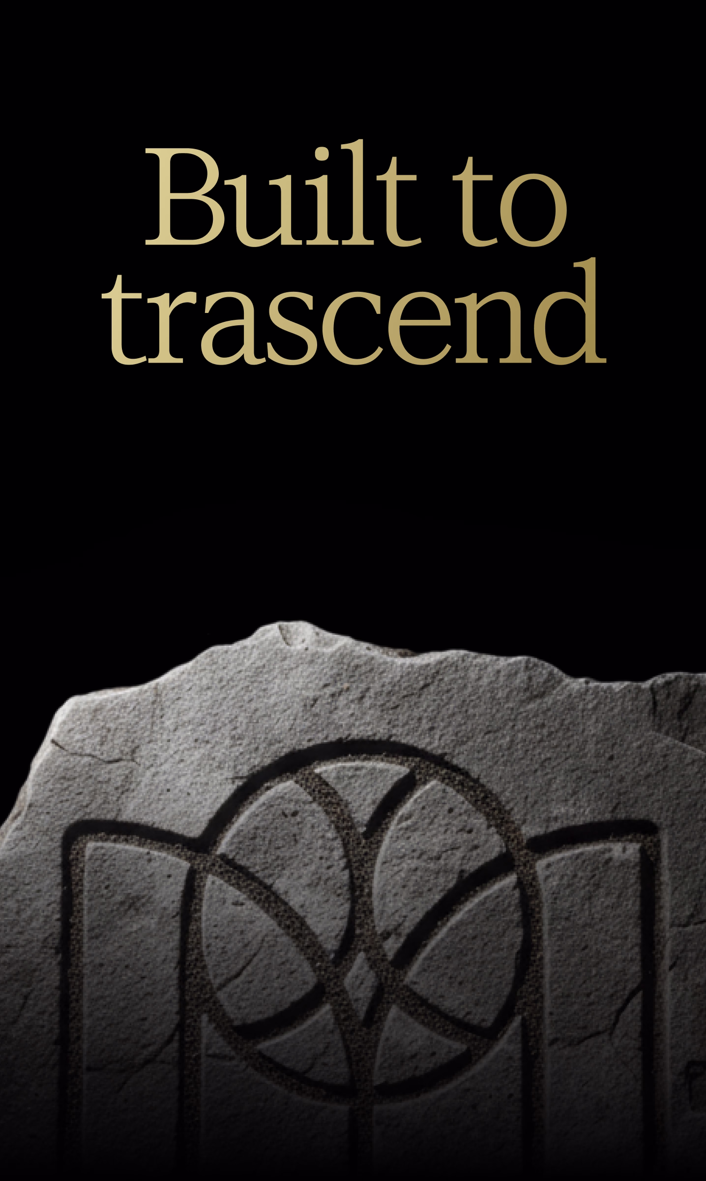
And just like that, almost without noticing, we realized we hadn't just done branding, we had made art.With method, with thought, with soul.A case built to transcend, just like any great piece of work.
Go to case details to know more