Description
The challenge
Results & Impact









When a brand moves beyond its early years in the market and establishes itself as a trusted presence in people’s lives, a new need emerges: reflecting that maturity to the world.
Ualá came to Paisanos with this next stage already underway, and with a structural problem standing in its way. Its website was not communicating what the brand had become in any of the three countries where it operated.
The brief, then, was to redesign the websites for Argentina, Mexico, and Colombia so that the quality of the product could be felt from the very first interaction, even before people started using it.
The product had matured. Investments, merchant solutions, physical card readers: Ualá was no longer just the app for young adults looking to make the most of their money. It had become something more robust, more established, and more expansive.
That was the starting point for the redesign.
Go to case details to know more
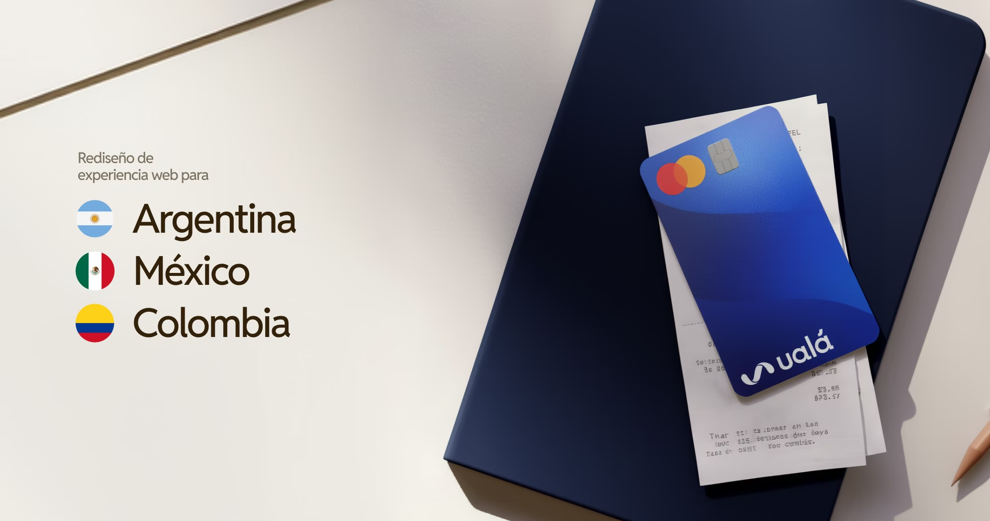

Three countries, one shared challenge.
Argentina, Mexico, and Colombia operated like separate islands, each with its own visual decisions, navigation logic, and way of organizing information.
The challenge was not simply to deliver a visual redesign. It was to build a system and information architecture that could work across all three countries at once, feeling local without losing consistency, while remaining scalable and manageable for Ualá’s team.
We went from designing individual pages to creating a universal language for the brand.
When websites grow without a shared structure, products are presented inconsistently and information becomes harder to navigate. That creates friction and confusion for visitors, weakening their perception of the brand and, ultimately, of the product itself.
Go to case details to know more
The first step was to understand how the business was structured and how that structure translated into the websites.
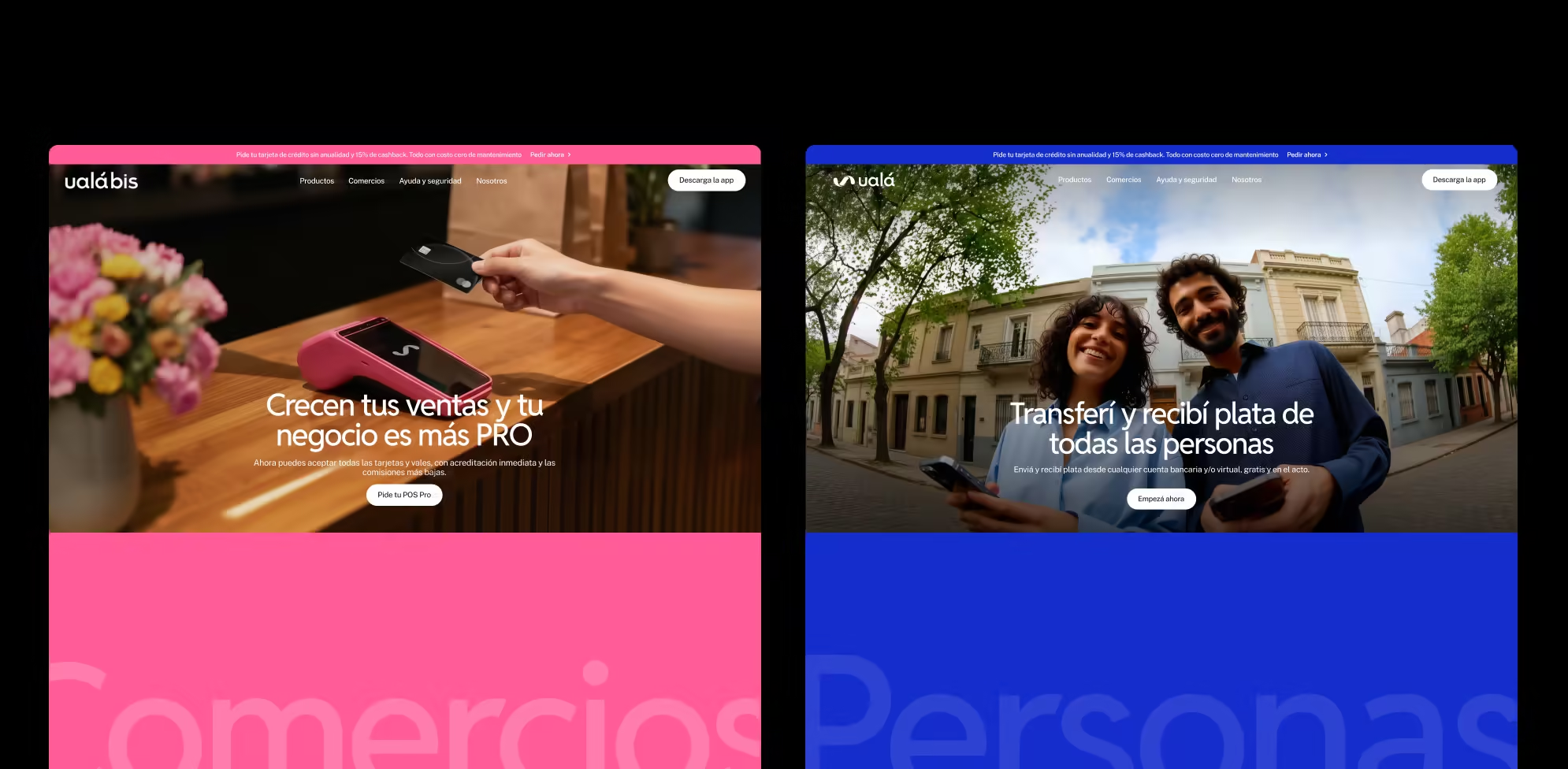
Ualá brings together two very different worlds under the same roof: Ualá for individuals and Ualá Bis for businesses. Each speaks to a different audience, with a different value proposition and different needs.
Before changing a color, a typeface, or a single message, we needed to understand how those two worlds related to one another, where they overlapped (if at all) and where they needed to remain separate.
Once that was clear, we could begin reorganizing the structure.
Go to case details to know more
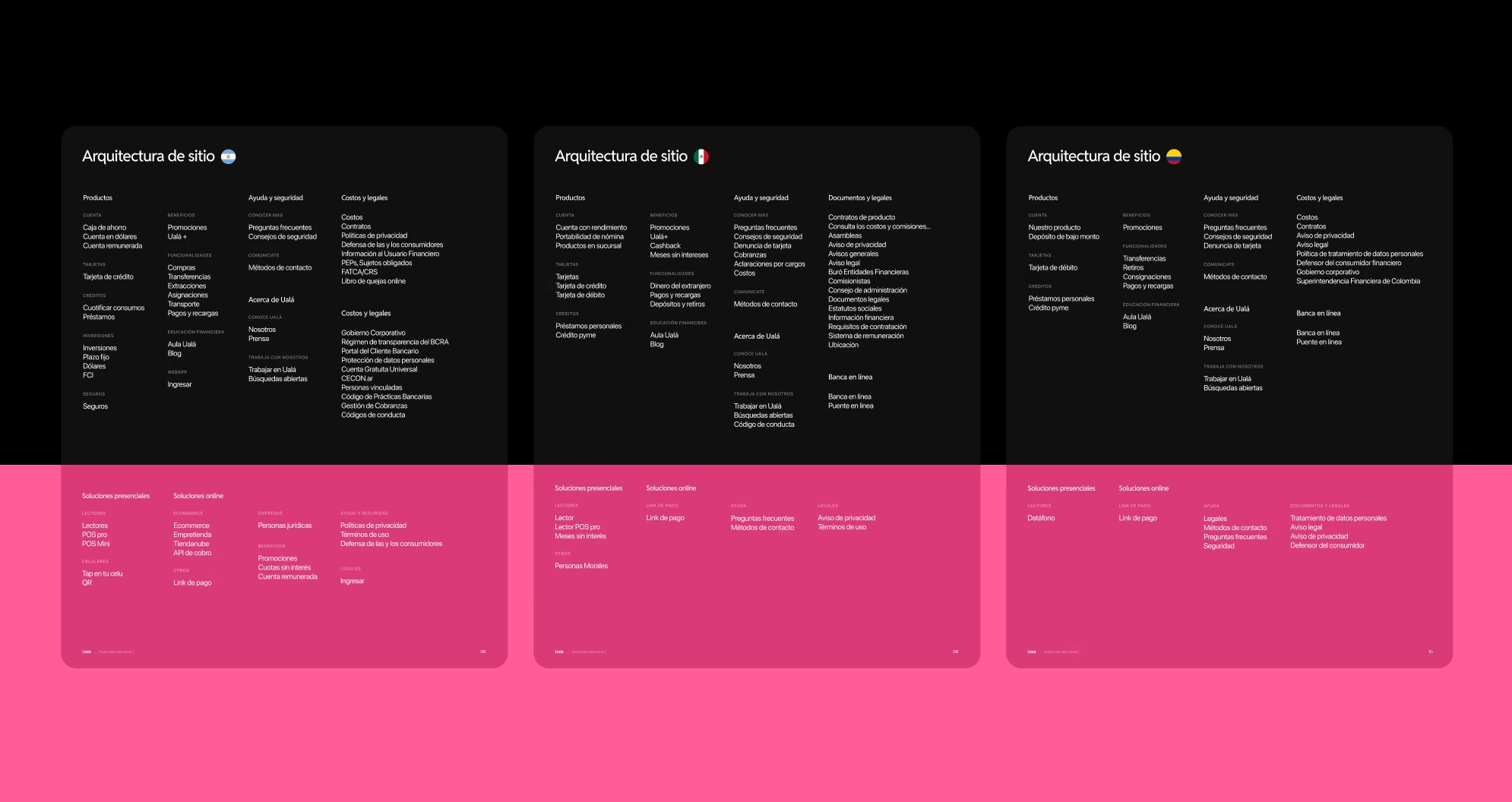
The system behind it all
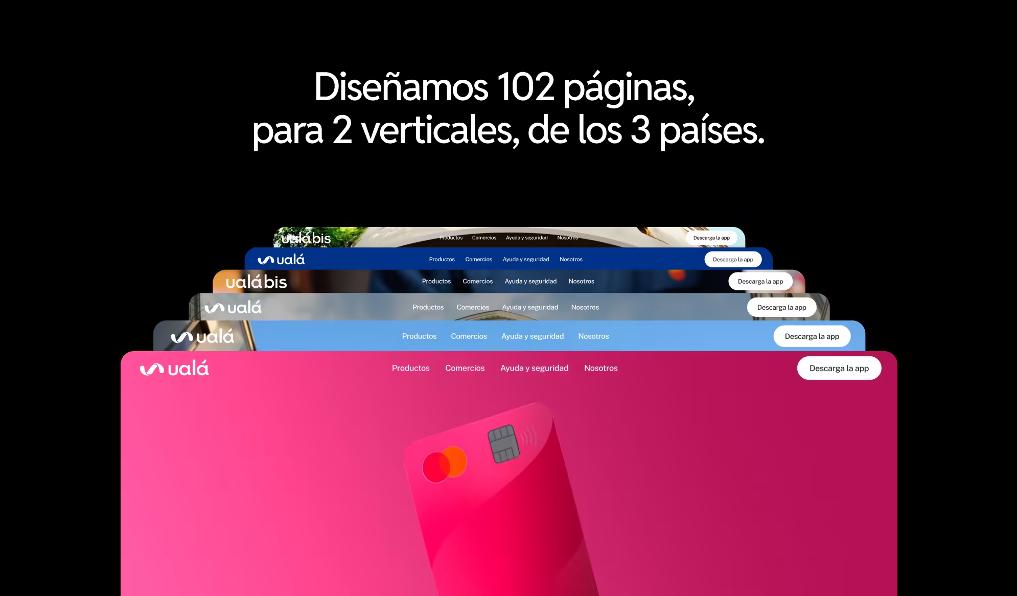
The website we delivered includes 102 pages, along with the tools Ualá’s team needs to keep scaling and creating new ones without compromising the system over time.
How did we make that possible? We built a modular system with more than 40 section types, allowing teams to create new pages without redesigning everything from scratch while maintaining consistency across the experience. The goal was not to deliver a rigid template, but a flexible foundation that any team could use.
At the same time, we began working on something less visible, but just as important: the visual language. Ualá’s identity did not need to be reinvented. It needed to be amplified.
Go to case details to know more
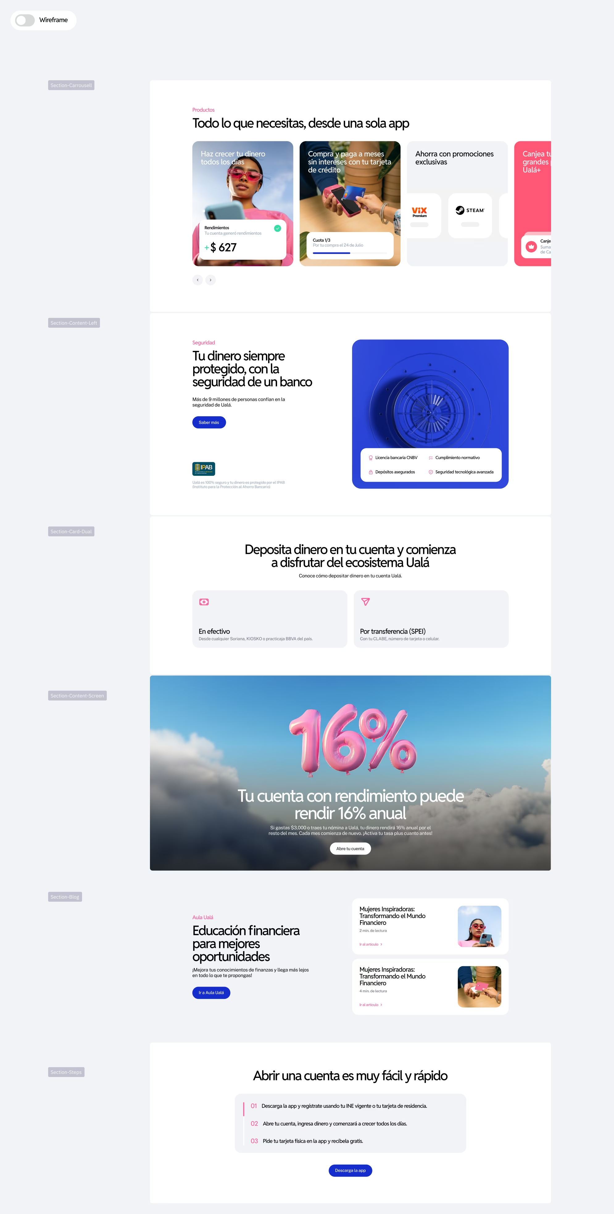
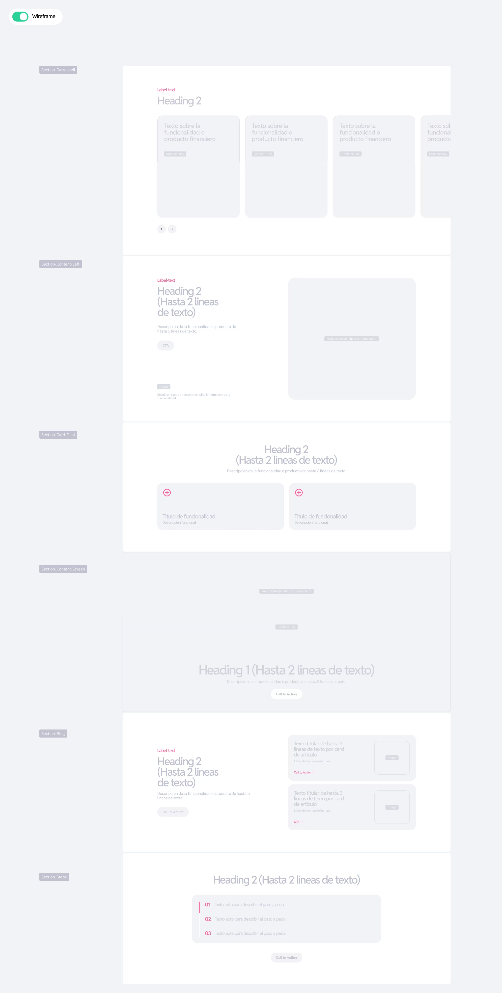
We built on Ualá’s existing design system, while pushing its visual universe into territory the website had not yet explored.
One of the first shifts involved headline typography. We moved away from the small, functional type designed for in-app reading and introduced a display format that takes advantage of the scale of the web to create greater impact.
Beyond color and typography, the work was also about defining what Ualá looks like when it speaks: the kind of imagery it uses, how it positions itself in relation to people, and how literal or interpretive it should be when presenting its products.
Go to case details to know more


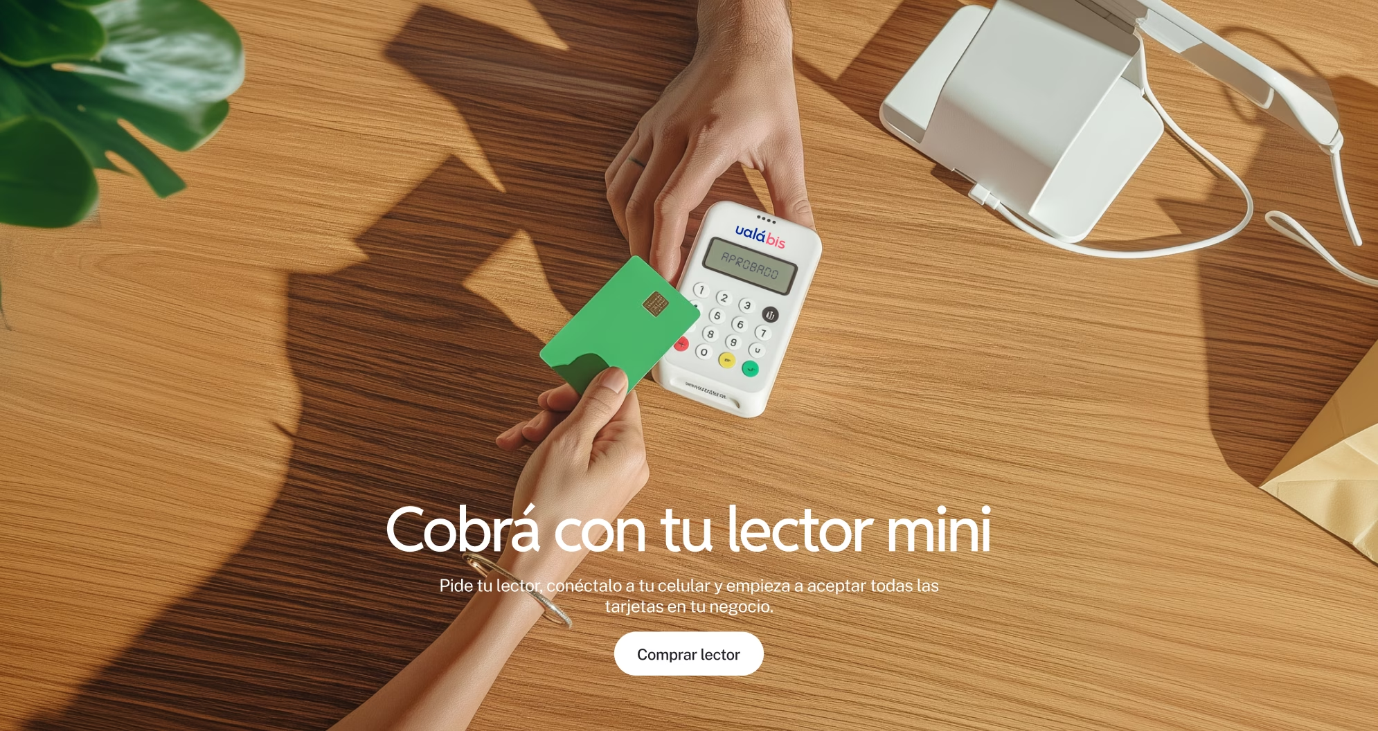
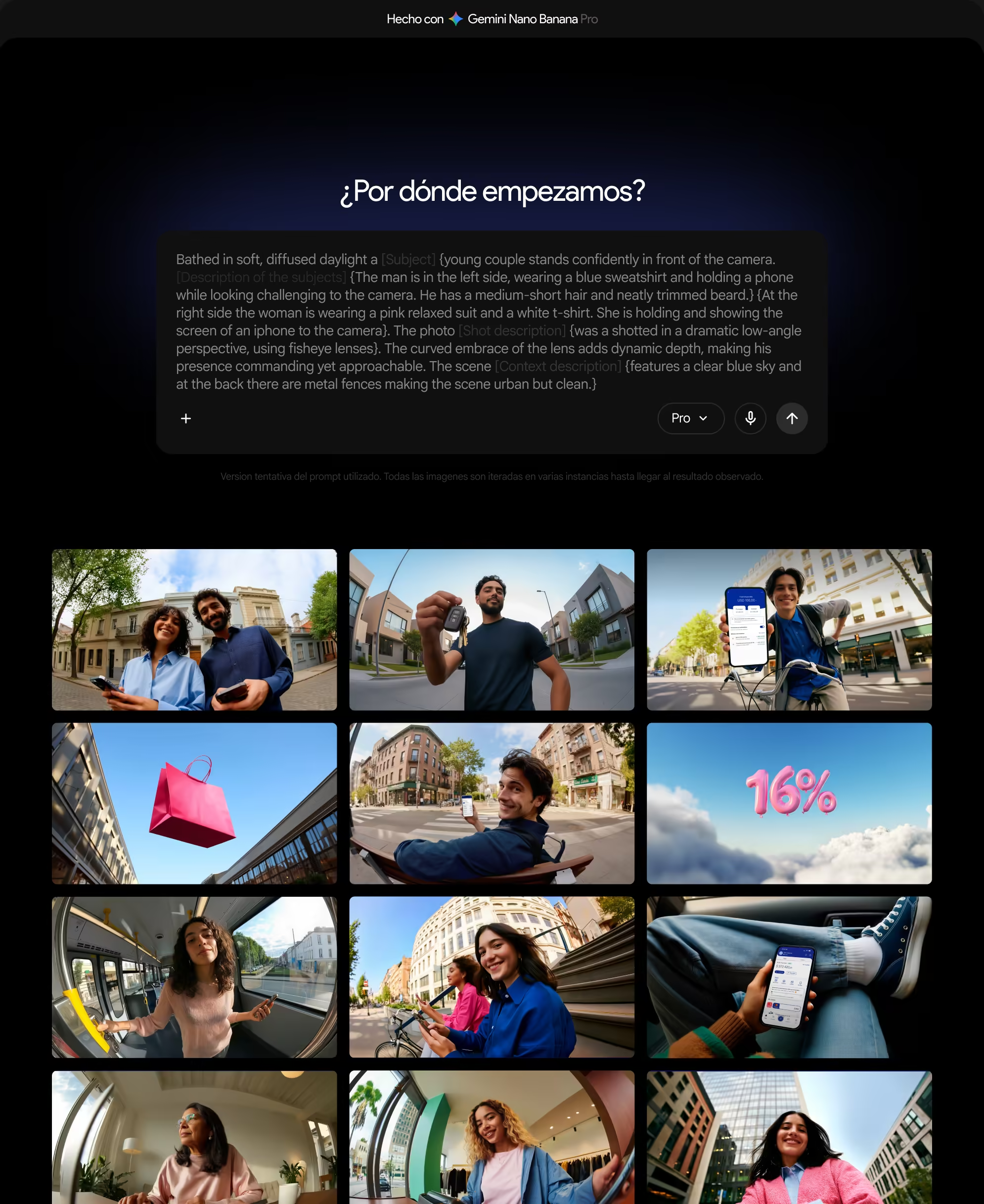
For imagery, we developed a system based on AI-generated photography, guided by a very precise aesthetic criteria: low-angle camera shots, wide-angle framing, urban environments, and a human figure in the foreground. The same visual approach was applied across all three countries, while being adapted to each geographic context to preserve a natural feel.
Another resource we used to expand the visual system was 3D rendering. This ranged from realistic compositions that highlighted the attributes of Ualá’s physical products (such as the card and the POS Mini) to branded atmospheric renders for other communication touchpoints.
Go to case details to know more

None of this had been explicitly defined at the outset. It emerged as we developed a deeper understanding of the problem, and the project grew along with it.
What began as a redesign ultimately became a complete rebuild of the website: more than 100 pages, including areas that had not been part of the original scope but proved essential for the system to work as a whole.
Go to case details to know more


The result
We created a website capable of better supporting who Ualá is today,
and who it will continue to become.
The new experience features clearer navigation that makes the ecosystem easier to understand, a stronger distinction between individuals and businesses, a system that allows new features to launch without rethinking everything from scratch, and a level of consistency across countries that did not exist before.
Go to case details to know more