See case details
Case Study
Menu

Switch

Event Details
Section
Menu
Menu
Section
Get in touch
Get in touch
Case Study
Switch
Strategic design, innovation, and an alpaca: Switch Software's DNA on its new website.
Client
Switch Software
Year
2024
Country
Argentina
Industry
Tech Services
Service
Brand Website

About Switch

Show
Hide

The challenge

Show
Hide

Outcomes

Show
Hide
Stack and tools used in the project
Figma
Slack
Notion
Webflow
Pattern of 19 evenly spaced white circles arranged in a hexagonal grid on a black background.
Endlesstools
Circular gradient with vibrant colors blending from yellow and pink to green and blue.
Spline
The team
Paisanos
Show
Hide
Switch Software
Show
Hide
Did you like our website?
Share it for free
Link copied!
White stylized arrow logo inside a rounded square with the text switchsoftware.io below it.Digital billboard on a sidewalk with text 'Crafting tomorrow’s solutions, today.' and a subtle 3D logo in the background.
Person holding a smartphone displaying a webpage titled 'Performance delivered Our success stories' with a purple button labeled 'Explore our work'.

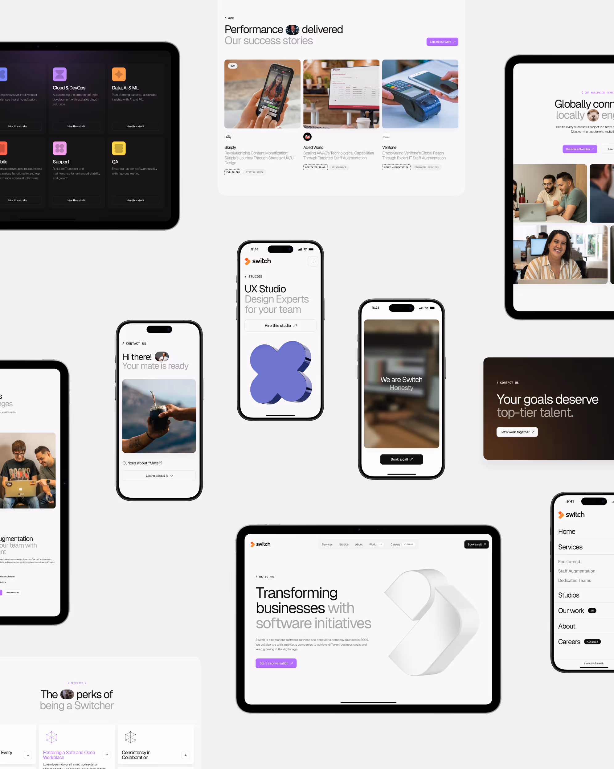
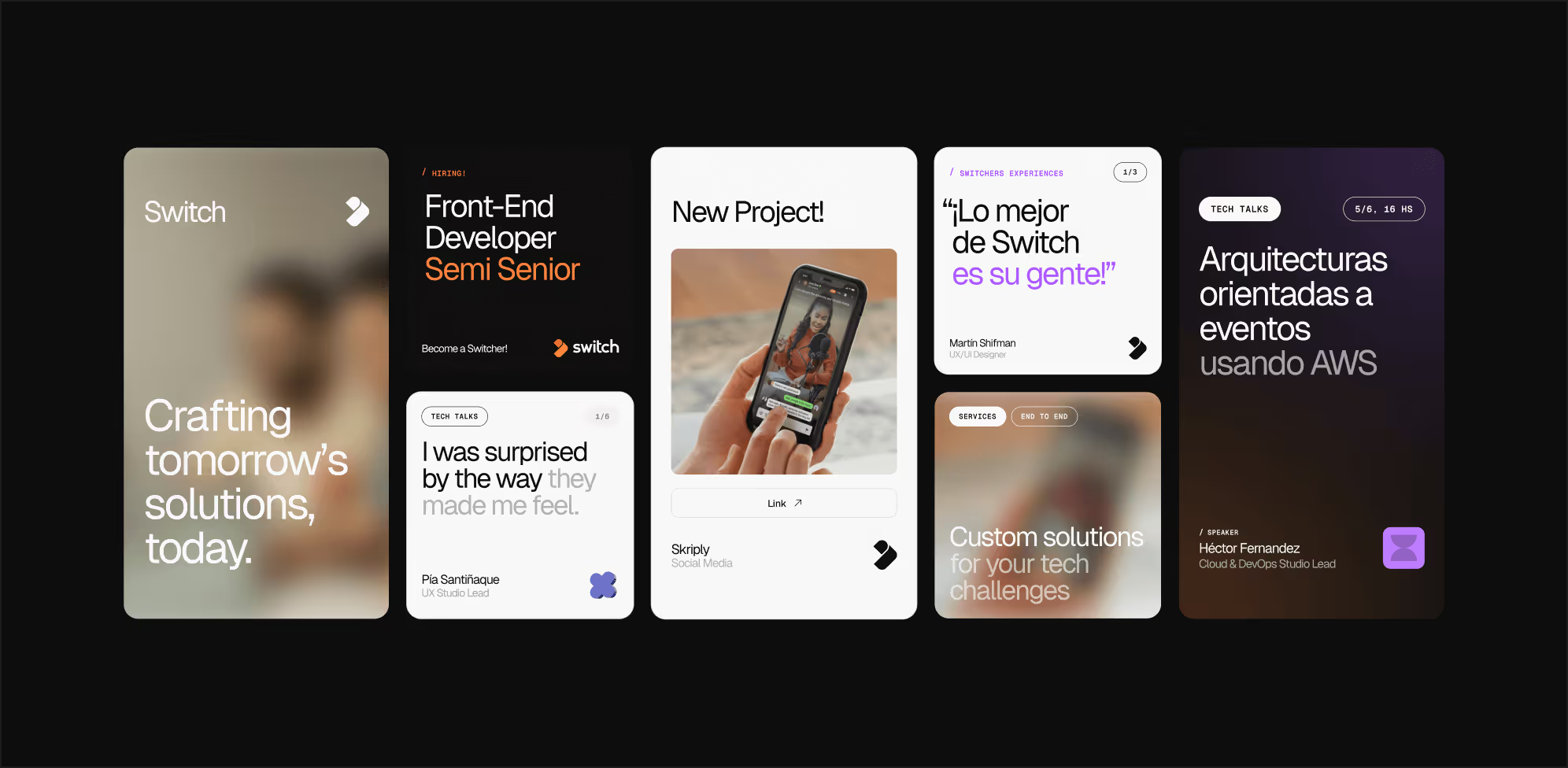
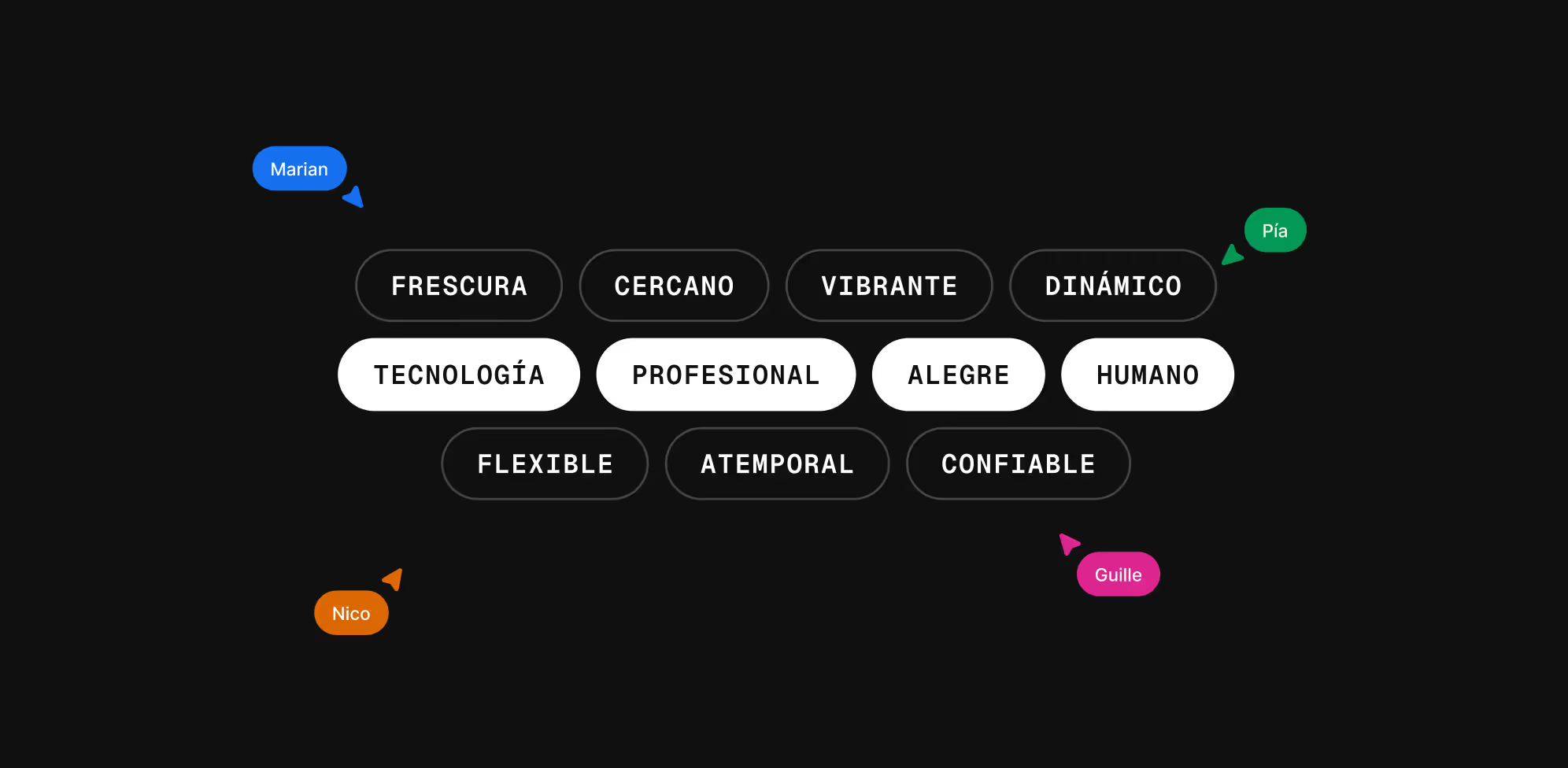
When innovation and design come together, the result doesn’t just transform a brand — it redefines its impact on the global market. That’s exactly what happened with Switch Software, a Uruguayan company that took a bold step into the future by launching a website that captures their essence: approachability and professionalism.

Switch’s previous website no longer reflected the sophistication of their services or the energy of their team. After a strategic redefinition, they were looking for a partner who could help them communicate their value proposition more clearly and persuasively — and that’s when they found Paisanos, a like-minded ally with the same spirit of innovation.

Go to case details to know more

Two people looking at a computer screen displaying a website with the text 'Specialized talent to solve any tech-challenge. Together.'
Text reading 'WE ARE SWITCH' in purple monospaced font enclosed in angle brackets on a light gray background.
Profile icon with a close-up of a llama's face next to the text switchsoftware.io on a dark background.
Map highlighting locations in Montevideo, Denver, Chicago, and Austin with text about company presence from Uruguay to the world and a purple button labeled 'Let’s start a conversation'.

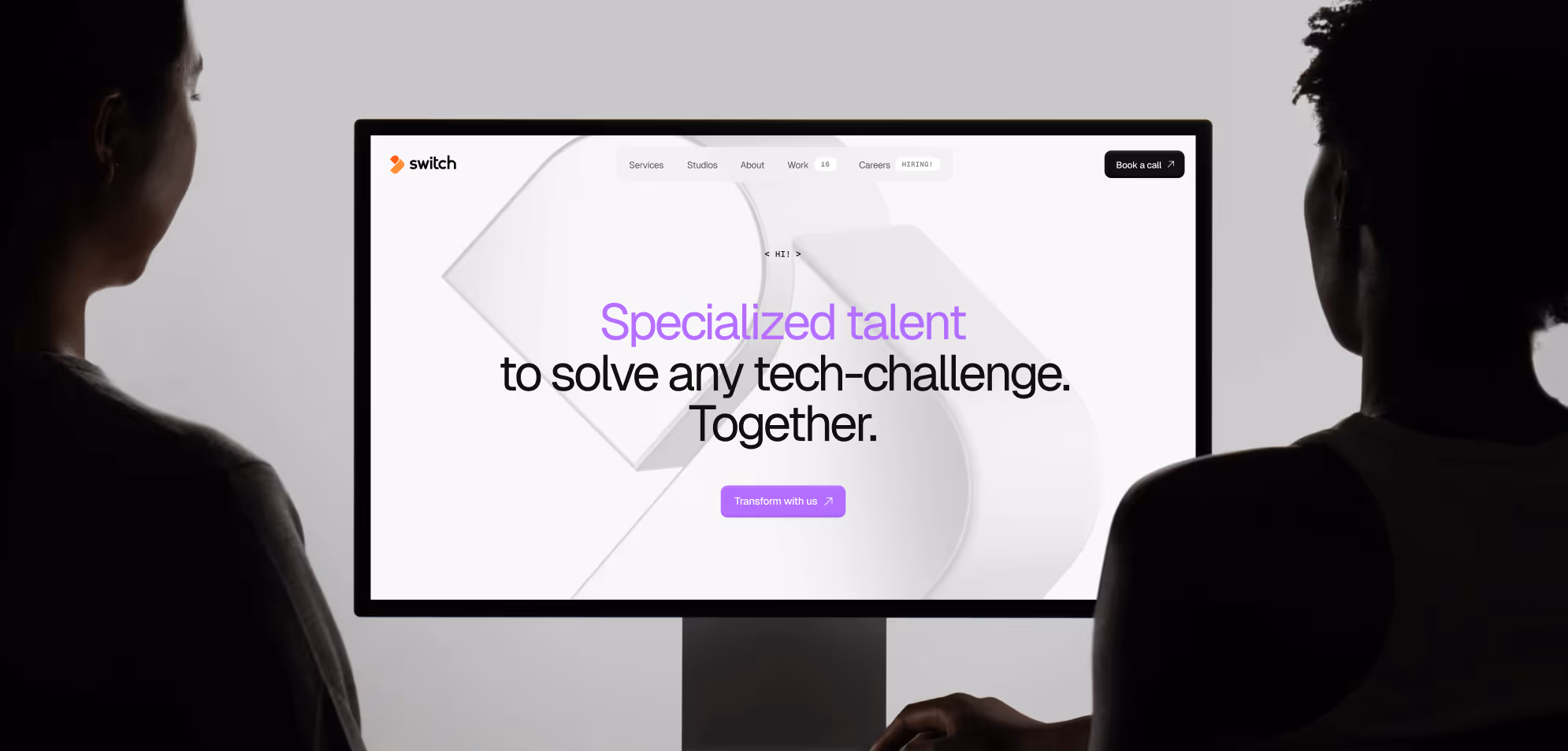
The goal was to rethink their visual identity, professionalize their brand, and modernize their communication — all without losing the approachability and energy that define them. The aim was to stand out in the global tech ecosystem with cutting-edge design that attracts qualified new clients.

Go to case details to know more

Black background with Spanish words describing qualities arranged in white and black rounded rectangles, including tecnología, profesional, alegre, humano, frescura, cercano, vibrante, dinámico, flexible, atemporal, confiable, with colored name tags Marian, Pía, Nico, and Guille pointing at various words.

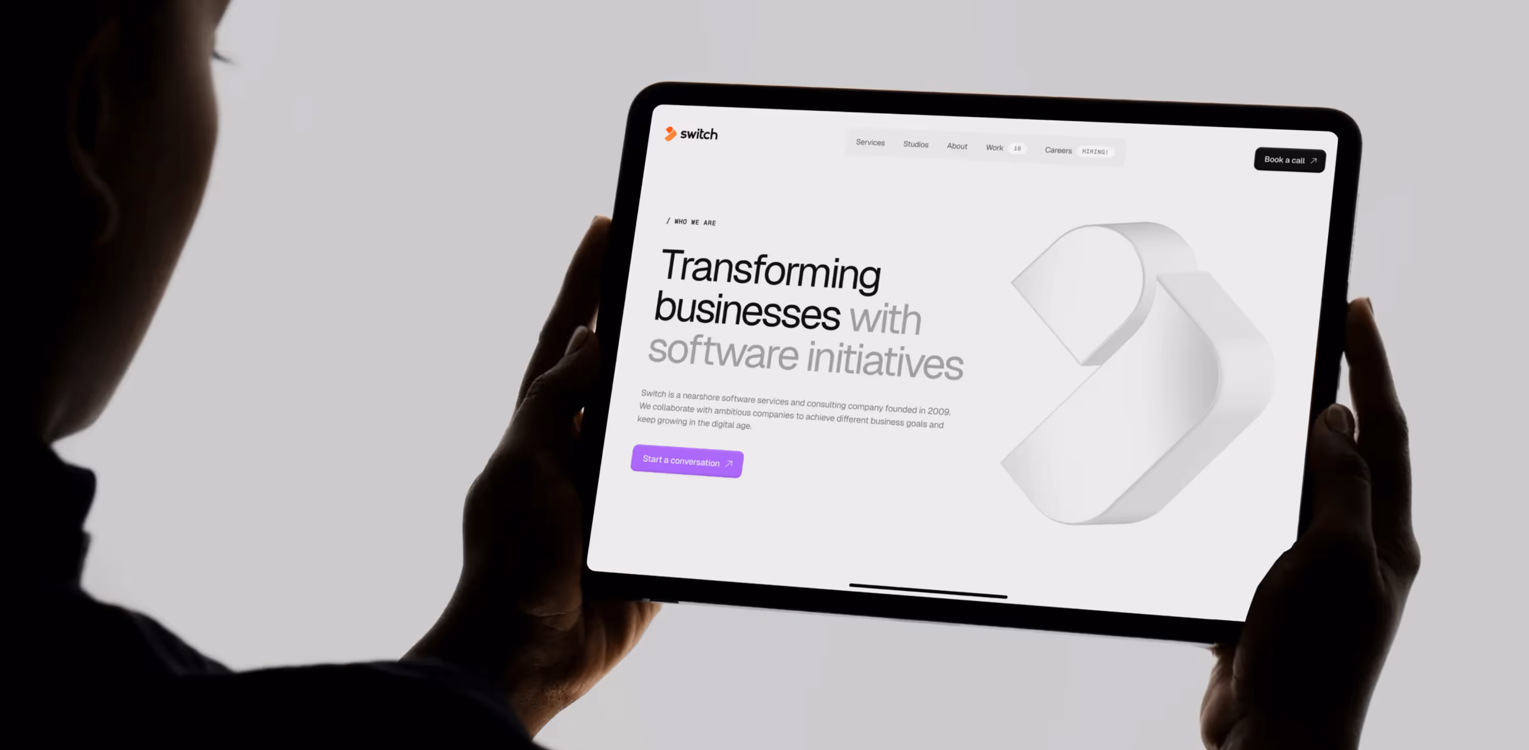
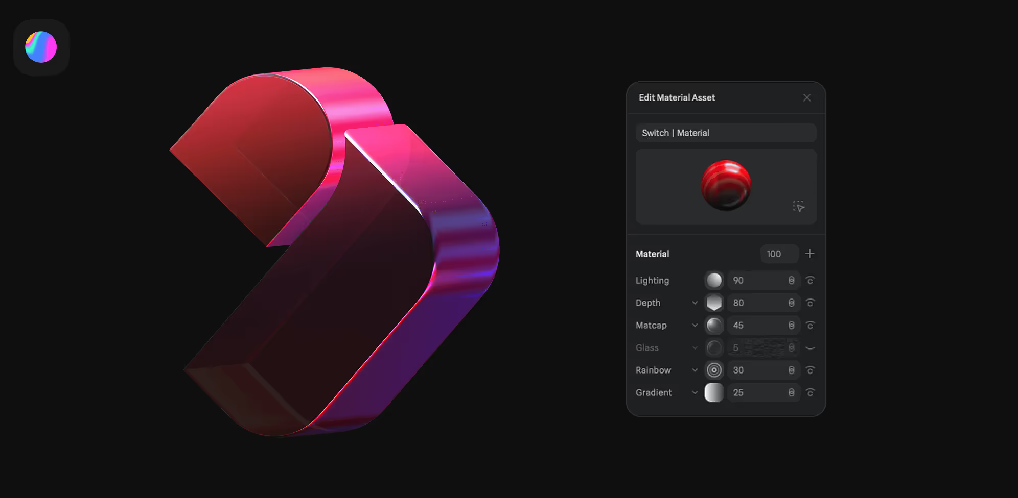
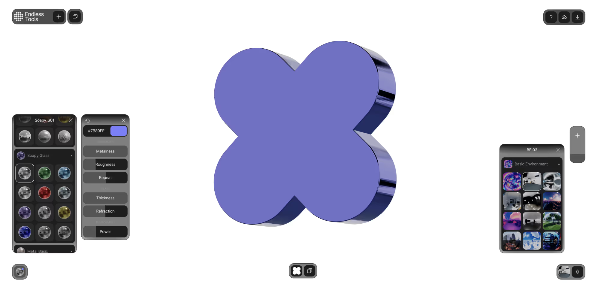
The end result was a website that strikes a balance between warmth and professionalism without leaning too corporate. It reinforces their strategic positioning in the industry while improving both navigation and conversion metrics.We also expanded their brand toolkit by adding 3D and 2D graphics created with Spline and Endless Tool.

Go to case details to know more

Row of four app icons on a light gray background: a colorful circular gradient, black dots on white, a multicolored F, and a white W on a blue background.
3D shiny purple and pink abstract shape next to a dark interface panel labeled Edit Material Asset with settings for lighting, depth, matcap, glass, rainbow, and gradient.
3D blue metallic flower-shaped object with rounded petals set against a white background and surrounded by color and environment adjustment panels.

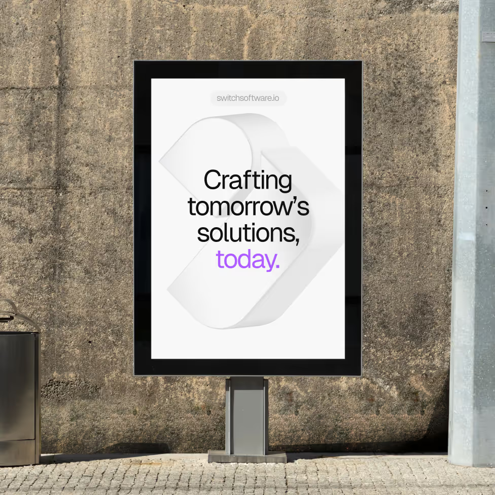
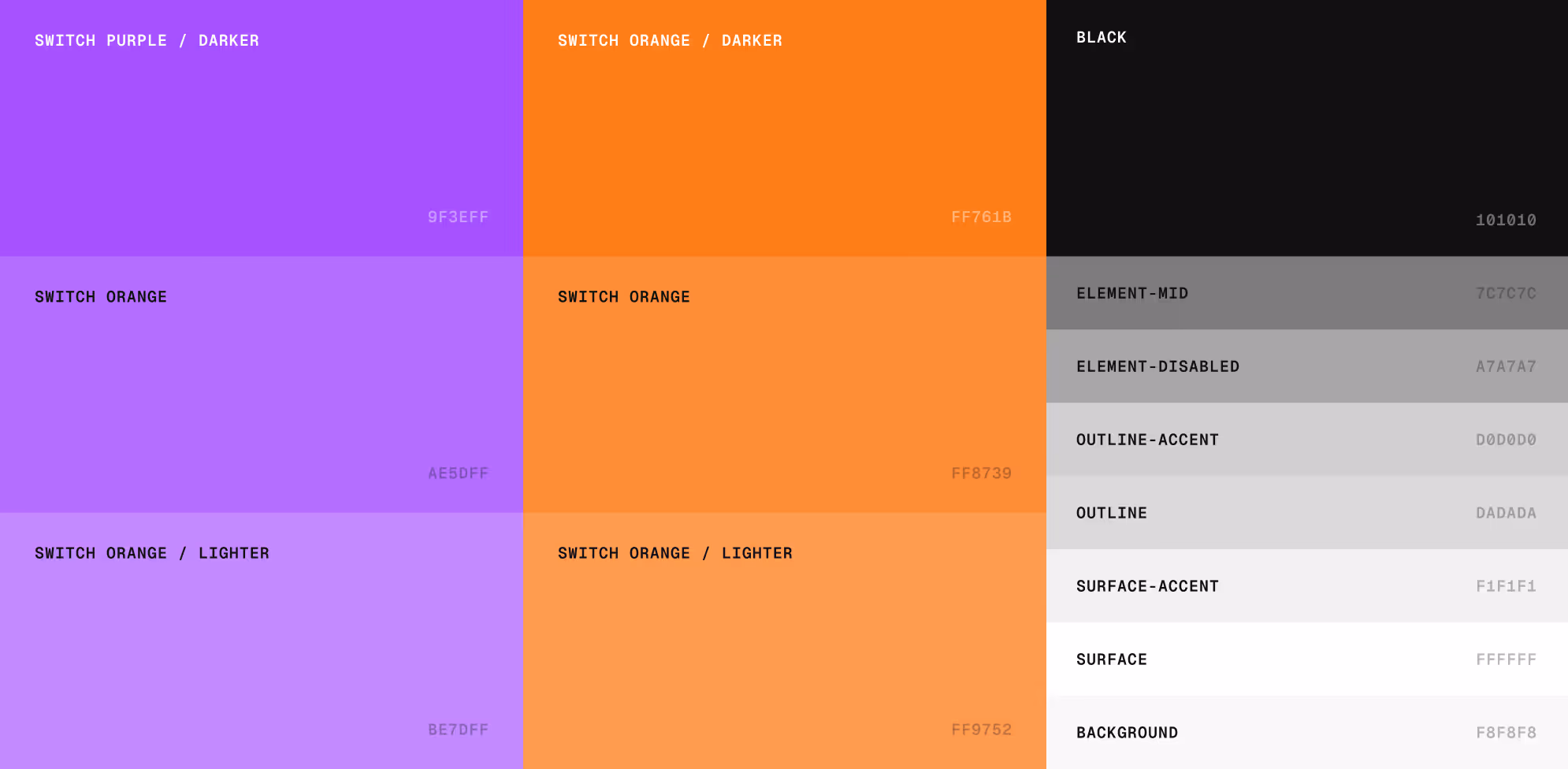
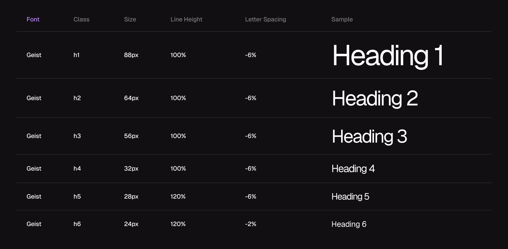
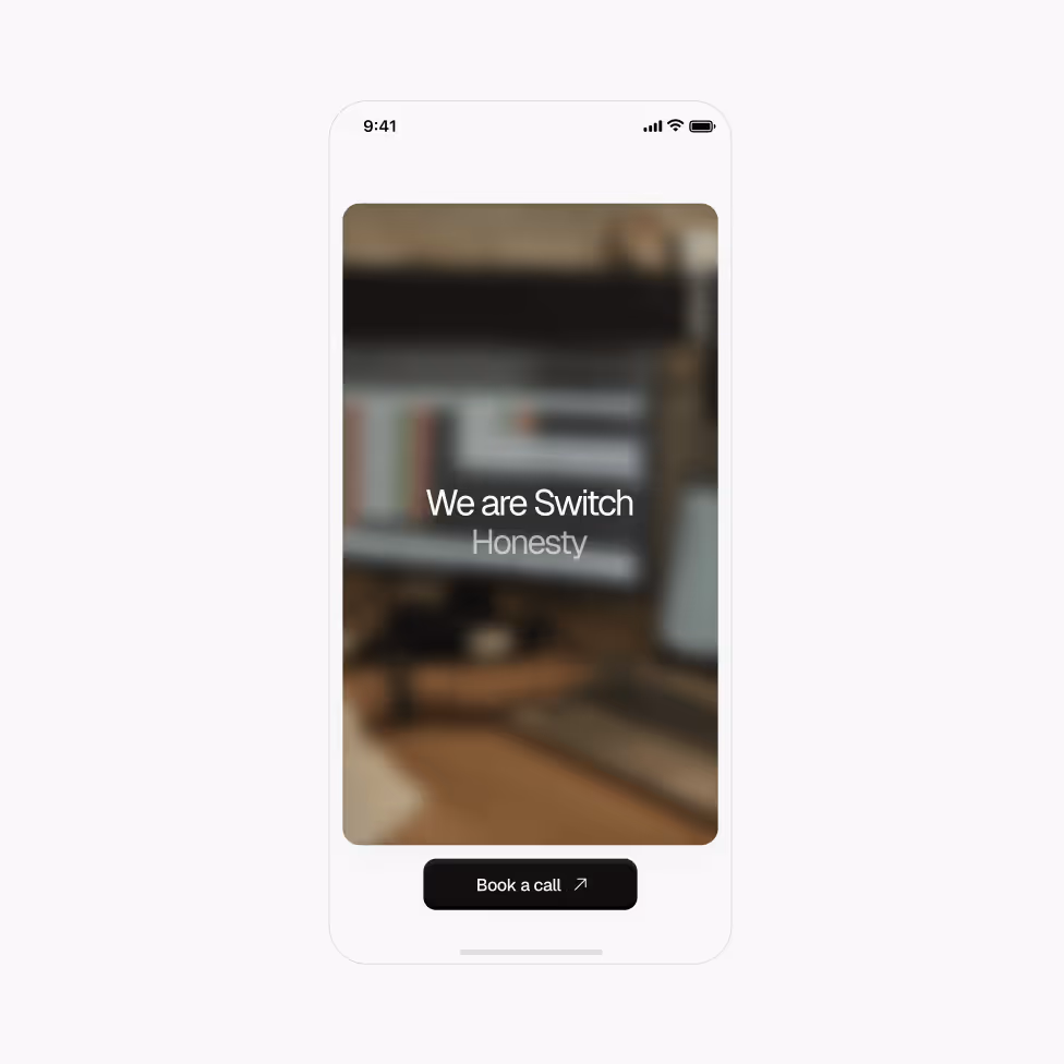
The new visual identity featured a broader color palette, a shift to a more modern typeface, and the use of photography to reflect Switch’s work culture.

Go to case details to know more

Color palette grid showing shades of purple and orange labeled with names and hex codes, alongside grayscale colors from black to white labeled with functional names and hex codes.
Table showing Geist font styles for headings h1 to h6 with size, line height, letter spacing, and sample text for each.
Smartphone screen displaying a blurred workspace background with the text 'We are Switch Honesty' and a black button labeled 'Book a call'.

Result on webflow.

A competitive, visually striking website with intuitive navigation that strengthens their value proposition and drives future client engagement.

Go to case details to know more

Collage of various devices displaying different screens of the Switch company website and mobile app, showcasing services, work samples, team collaboration, and contact options.
Smiling woman with short dark hair and ruffled sleeves wearing a headset microphone seated on a couch.

“What I appreciated most about the team was their professionalism, well-structured processes, creativity, and the great vibe that fostered a collaborative and trusting environment.”

Message from Mariana Sanguinetti  |  Chief Sales and Marketing Officer at Switch
A series of six digital cards showcasing Switch company content, including a blurred background with the phrase 'Crafting tomorrow’s solutions, today.', a Front-End Developer Semi Senior job ad, a social media project image of a woman on a phone, a testimonial in Spanish highlighting Switch’s people, a custom tech solutions card, and a tech talk announcement on event-driven architectures using AWS by Héctor Fernandez.