Acerca de Switch
El desafío
Outcomes


%2015.29.02.avif)


%2015.43.46.avif)
.avif)
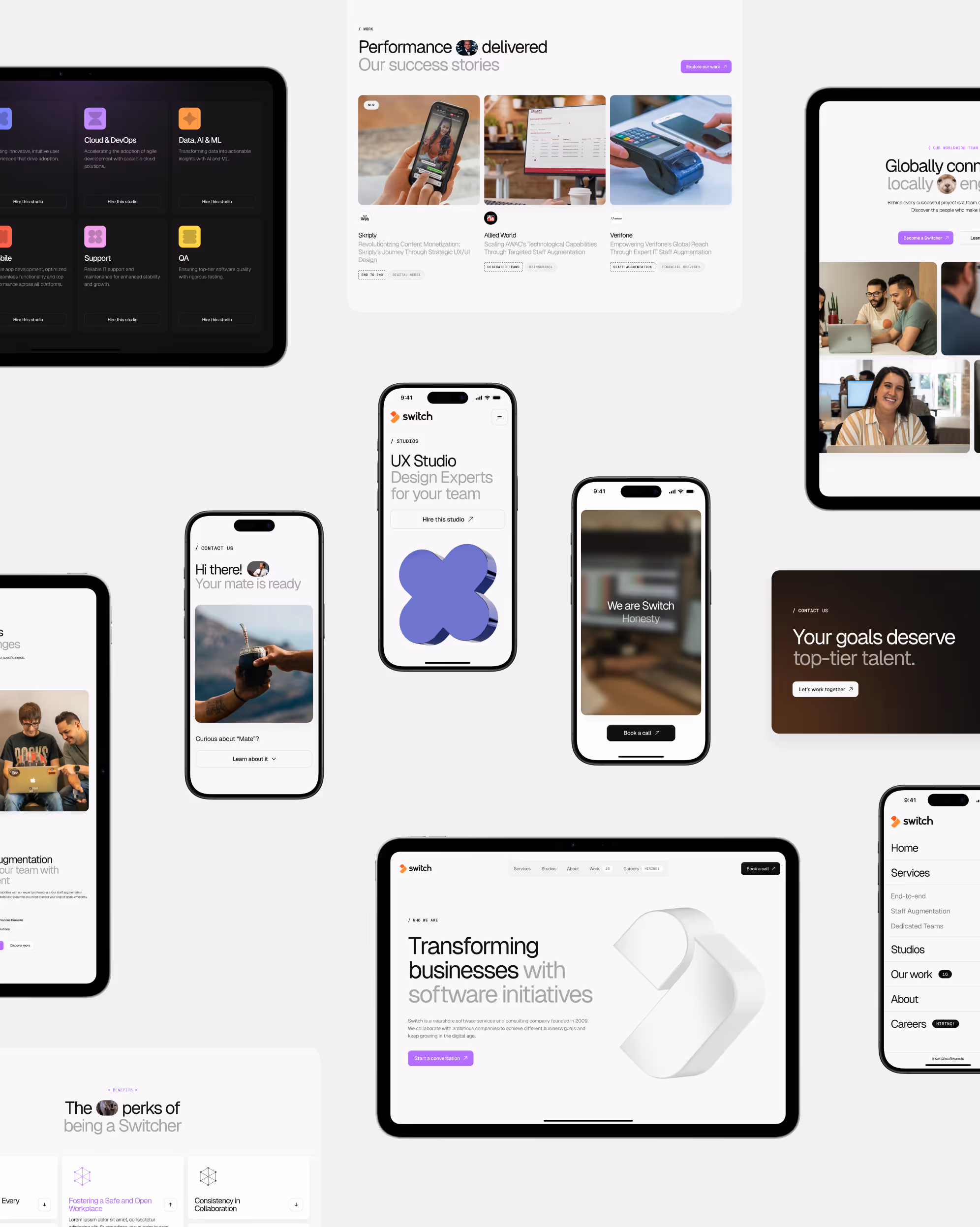
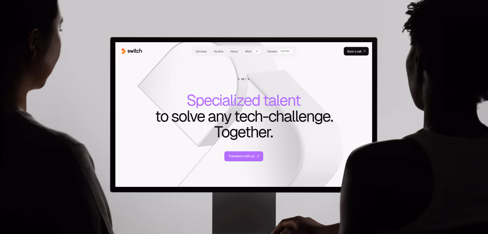
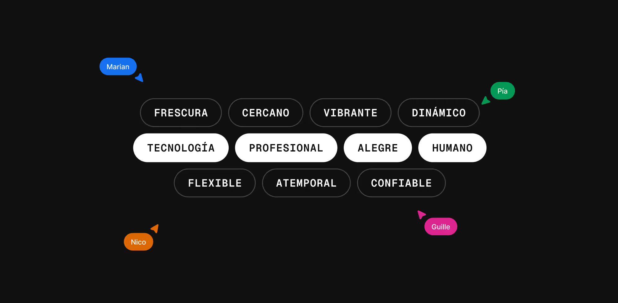
Cuando innovación y diseño se combinan, el resultado no solo transforma una marca, sino que redefine su impacto en el mercado global. Este es el caso de Switch Software, una empresa uruguaya que decidió dar un paso valiente hacia el futuro, con un sitio web que refleje su esencia, su cercanía y profesionalismo.El sitio web de Switch ya no reflejaba el nivel de sofisticación de sus servicios ni la energía de su equipo.
Tras una redefinición estratégica, buscaban un socio que los ayudara a comunicar su propuesta de valor de manera más clara y persuasiva, llegando así a Paisanos, un aliado con el mismo ADN de innovación.
Ve a los detalles del caso para obtener más información
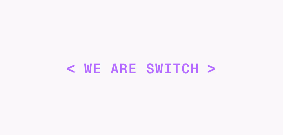

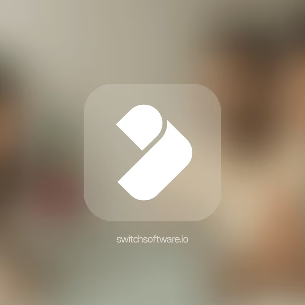
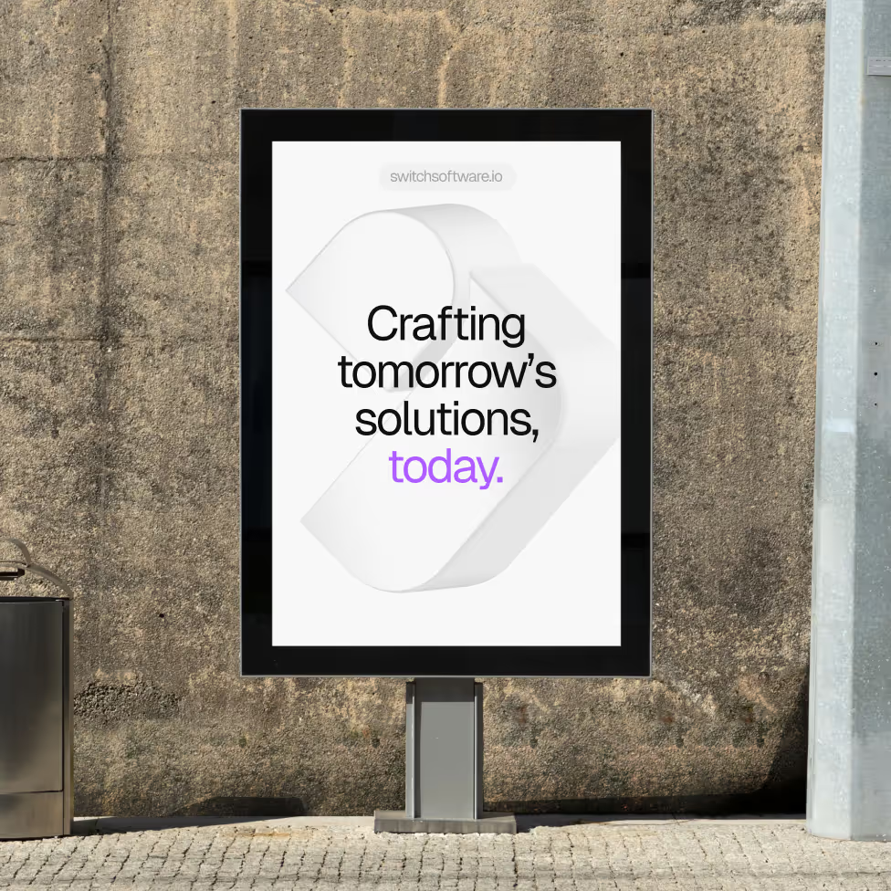
Identidad visual
El objetivo era repensar su identidad visual, profesionalizar su marca, modernizar su comunicación y todo sin perder la cercanía y el dinamismo que los caracteriza, diferenciándose así en el ecosistema tech global, con un diseño de vanguardia que atraiga nuevos clientes calificados.
Ve a los detalles del caso para obtener más información
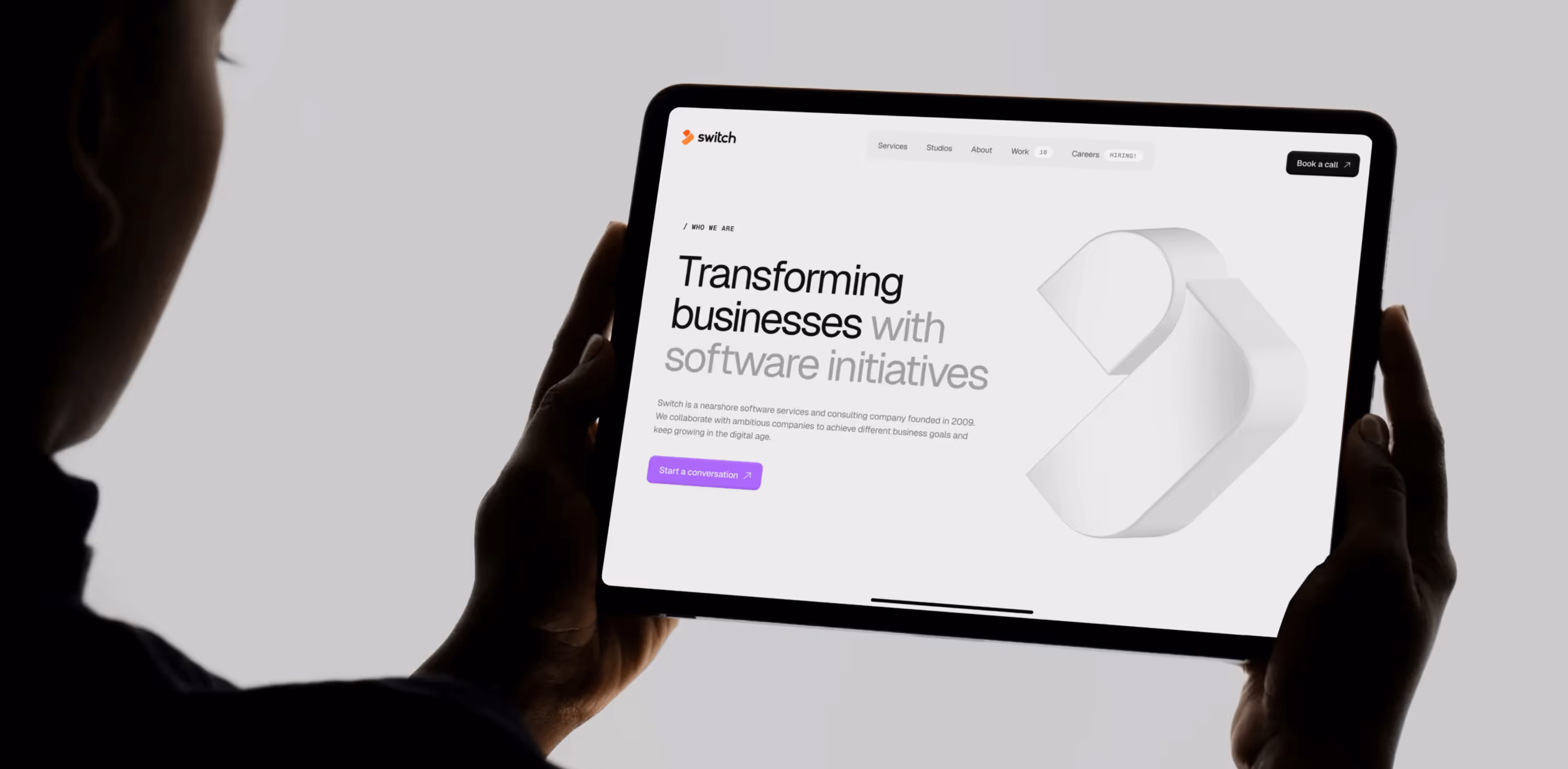
El resultado final fue un sitio web que equilibra la cercanía y el profesionalismo sin caer en lo corporativo, reforzando su posicionamiento estratégico en la industria y mejorando las métricas de navegación y conversión en el sitio.
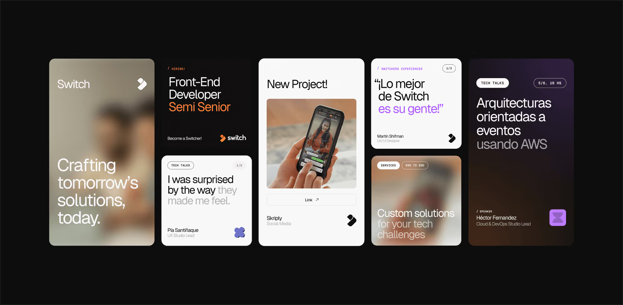
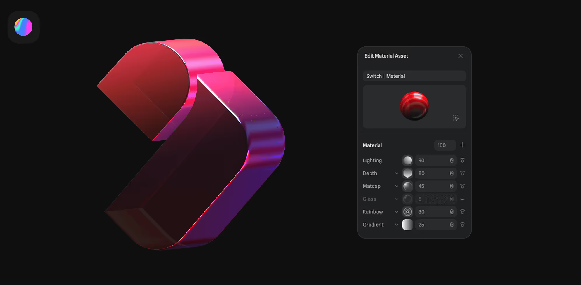
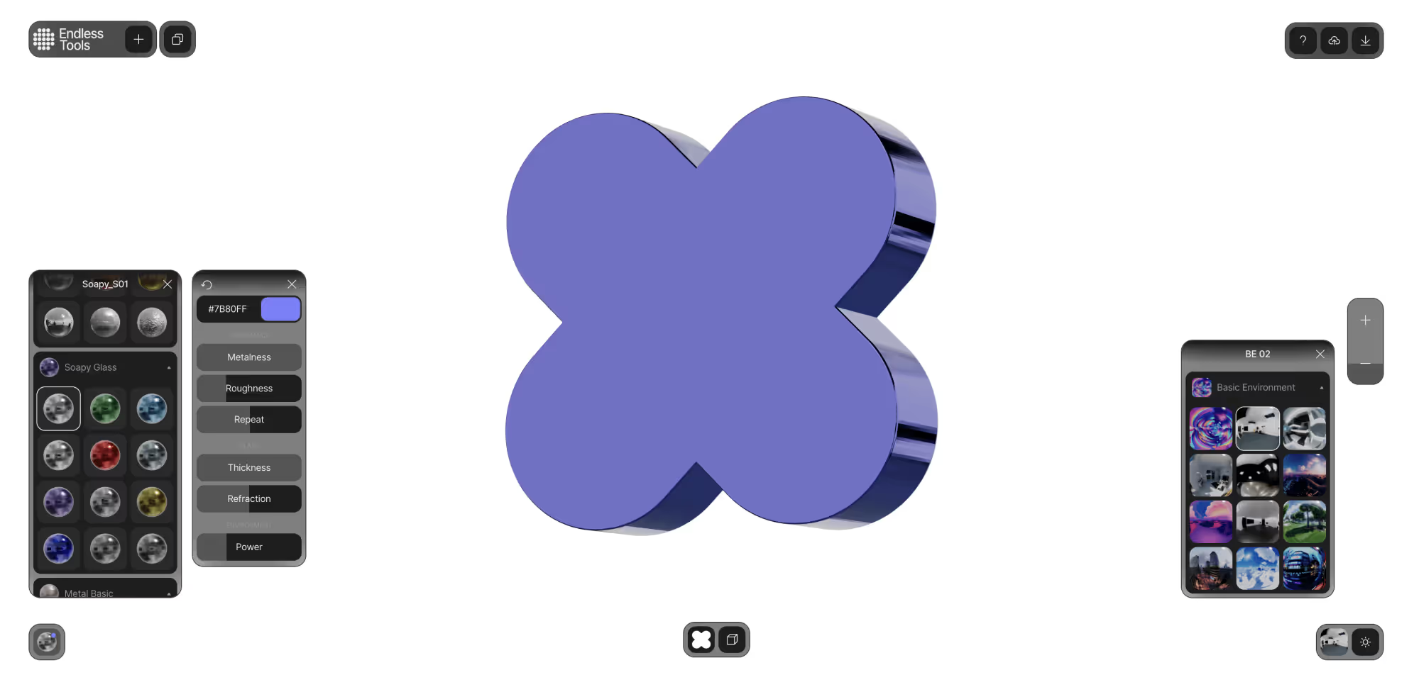
A su vez, ampliamos el abanico de recursos que comprendía su marca, sumando gráficos 3D y 2D creados con Spline y Endless Tool.
Ve a los detalles del caso para obtener más información
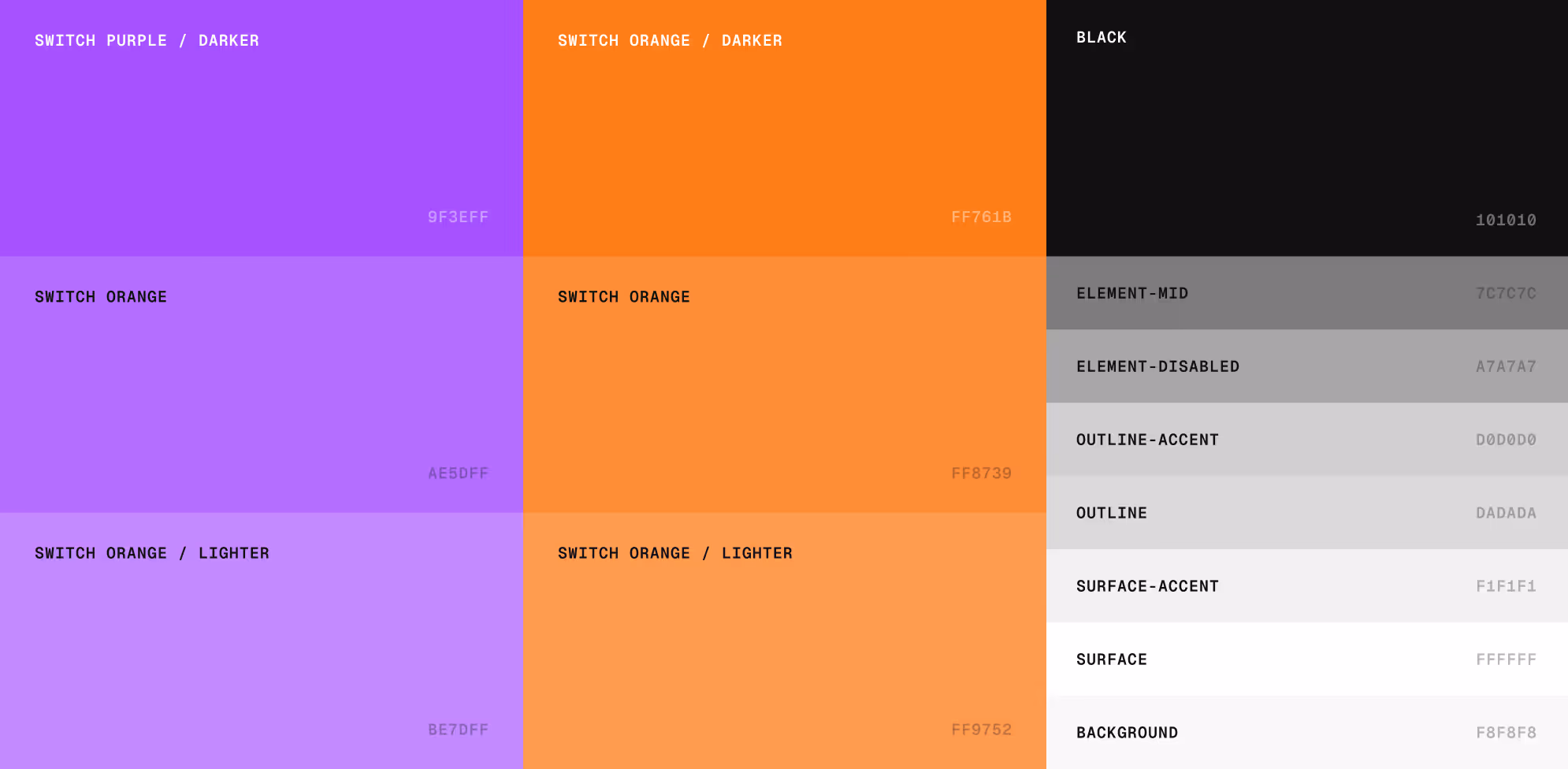
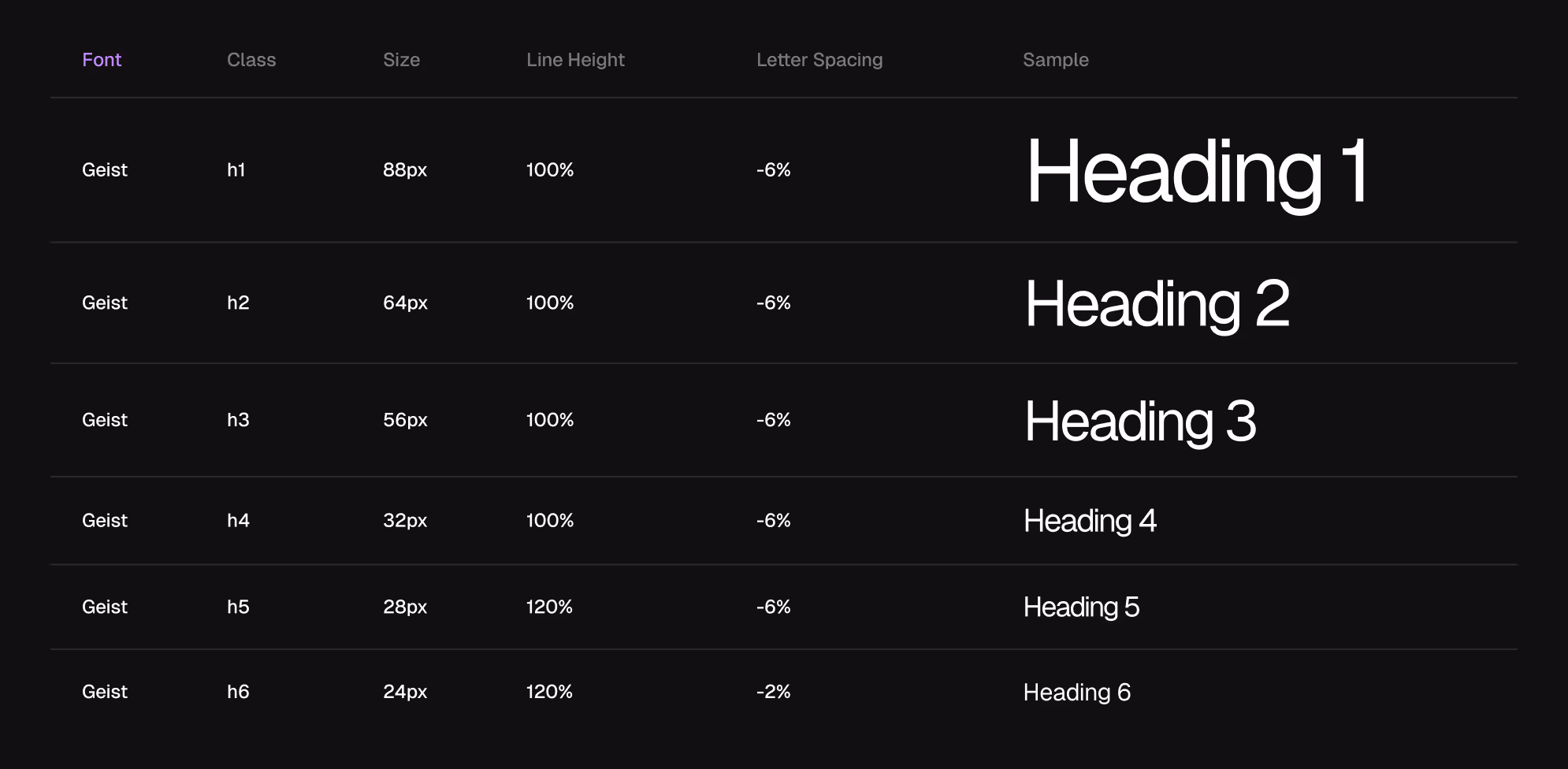
La nueva identidad visual incluyó una paleta de colores mas amplia, el cambio a una tipografía mas moderna y el uso de fotografías para reflejar la cultura de trabajo de Switch.
Ve a los detalles del caso para obtener más información
Resultado en Webflow.
Un website competitivo, visualmente impactante, con una navegación intuitiva que fortalece su propuesta de valor y tracciona futuros clientes
Ve a los detalles del caso para obtener más información