Description
The challenge
The impact





A supermarket with a bit of a small-town soul in its DNA. The kind of place where everyone greets everyone. A business that scaled, but managed to hold onto that essence.
La Reina is a family-owned supermarket chain, one of the top three in Rosario. At some point, they launched an e-commerce platform, but never fully leveraged it. It stayed static, outdated, and the user experience was largely neglected.
That’s the problem they brought to us, within a very clear context: they were in the middle of a broader transformation.
La Reina was about to open a new store in Funes, and with it, introduce a refreshed brand identity. The third generation of the family was pushing the brand forward—without wanting to lose what had always made it different. And the digital channel was the only piece that had fallen behind.
Their challenge was no longer just about selling courses; it was about supporting and sustaining professional career paths. They needed to evolve from a course catalog into a career guidance platform, moving from teaching isolated skills to providing lifelong professional mentorship.
Go to case details to know more
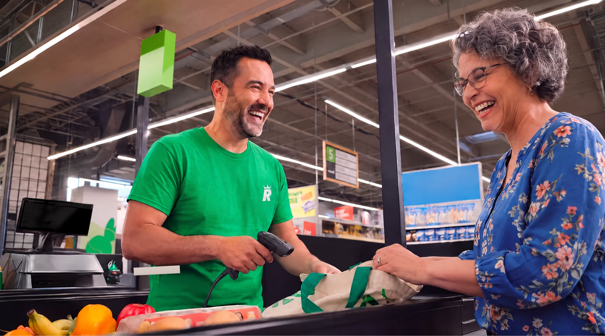
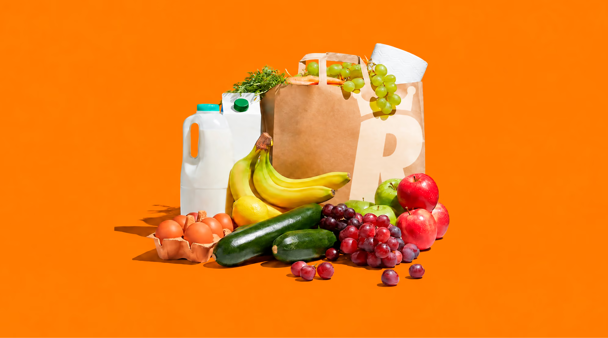
Before opening Figma, we went to Rosario.
The goal wasn’t to benchmark competitors or review metrics (we did that later). We went to understand what La Reina really is, from the inside out.
We met the grandfather who started it all, and his grandchildren, who now run the business. We visited all three stores, but focused especially on Funes: the newest, most ambitious location, and the one that best captured where the brand wanted to go.
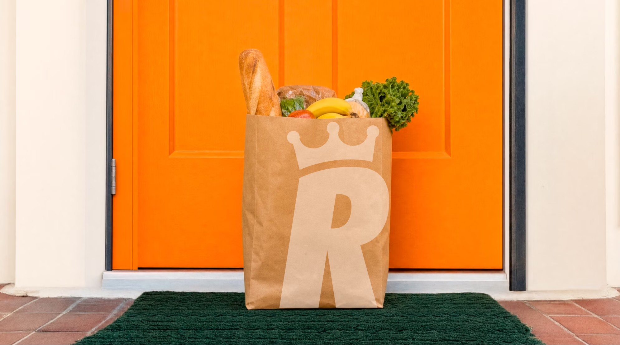
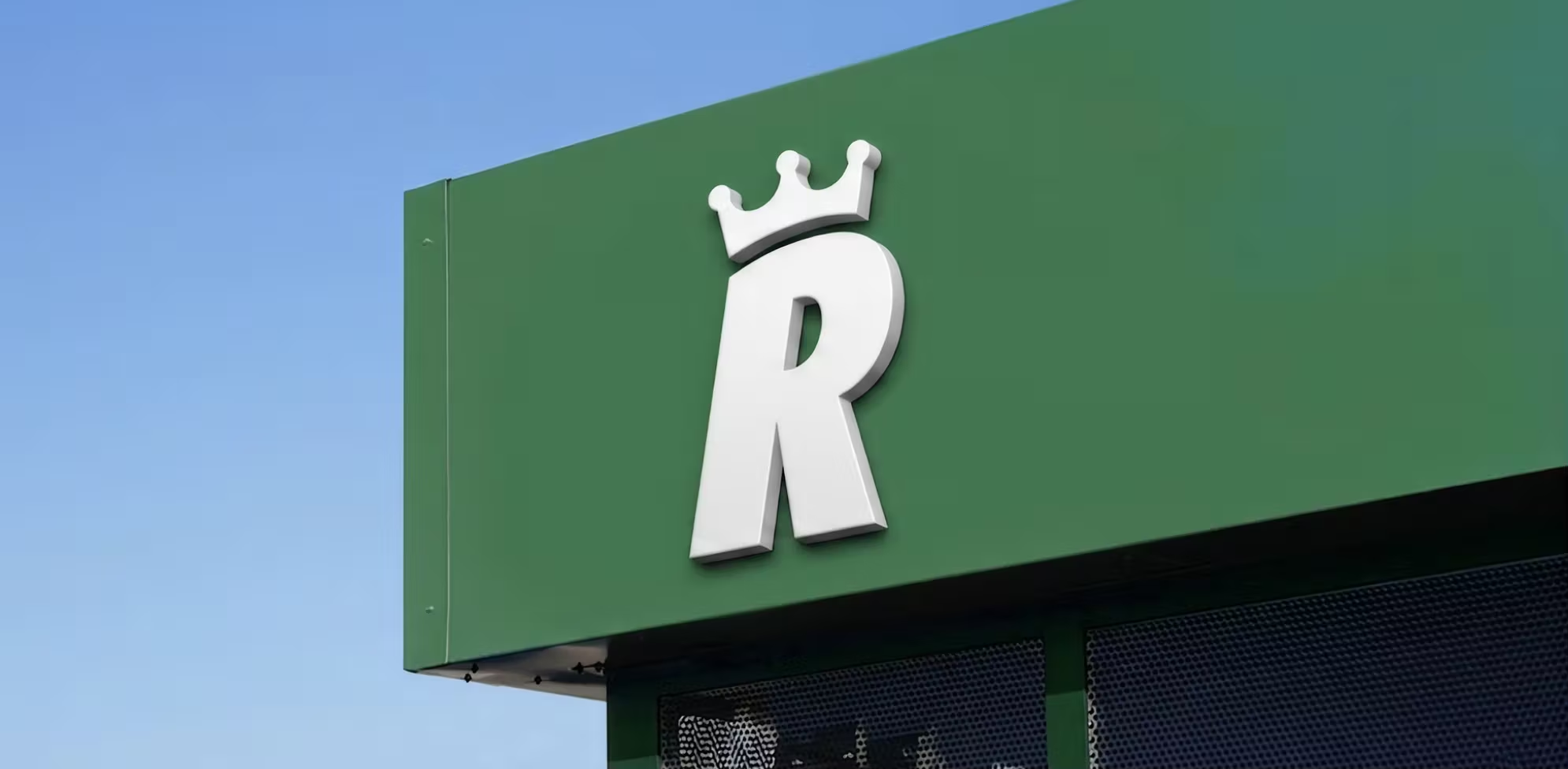
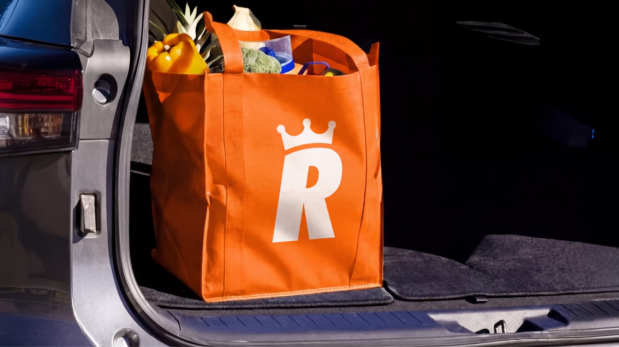
We documented everything. How typography lived on shelves, how the brand showed up on employee uniforms, delivery trucks, signage. How they spoke to customers. That sense of closeness (almost like a neighborhood store) that defines them.
That was the part we couldn’t afford to lose when translating the experience into digital.
Go to case details to know more
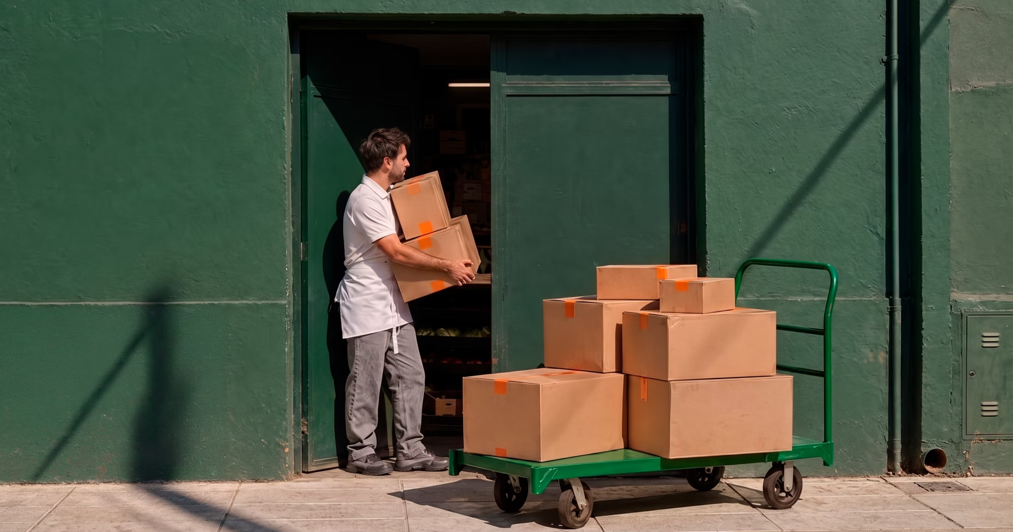
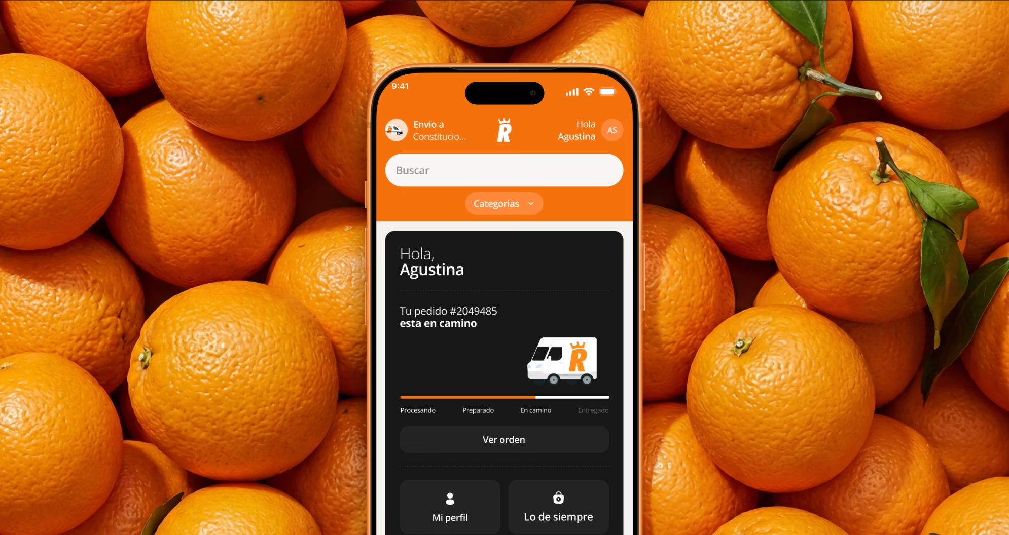
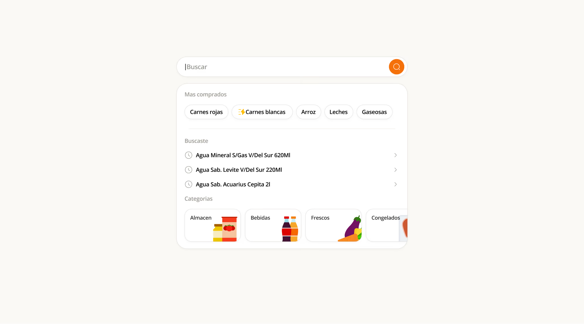
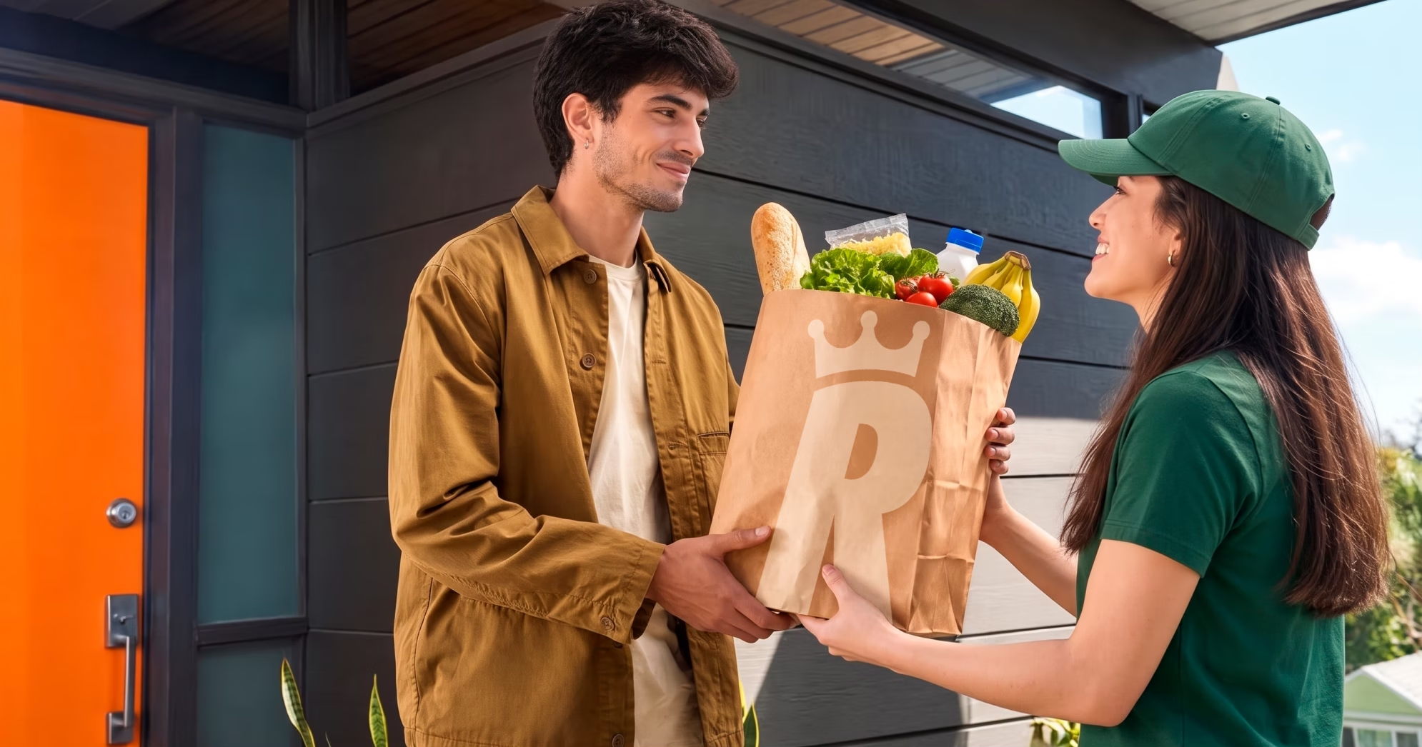
One of the most interesting design challenges was how to introduce black (part of this push toward a more “premium” feel) into an experience that still needed to feel warm, approachable, and optimistic. That still needed to feel like La Reina.
The answer was to use black selectively: category banners, promotional modules, and specific mobile screens. The rest of the atmosphere stayed rooted in the brand’s original colors, supported by a custom illustration system we developed.
Go to case details to know more
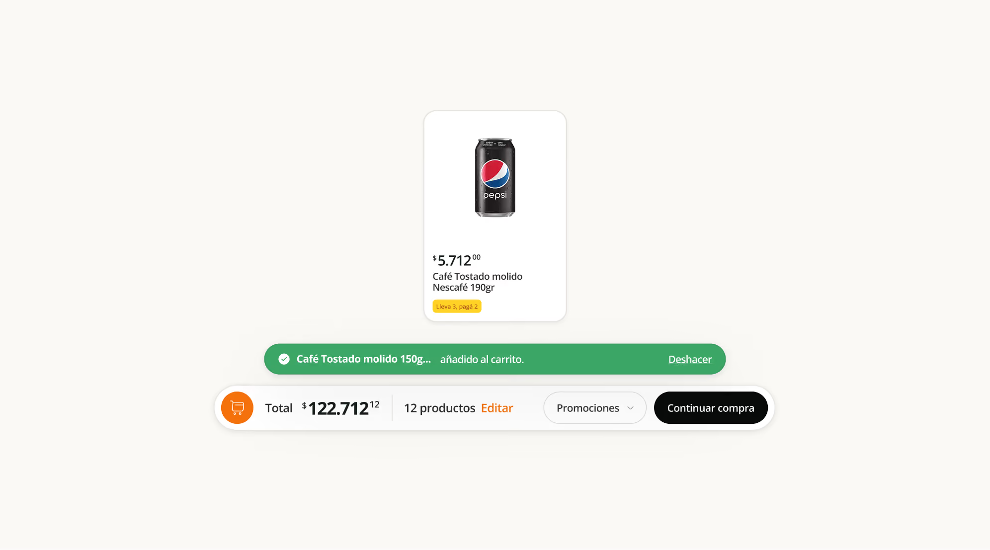
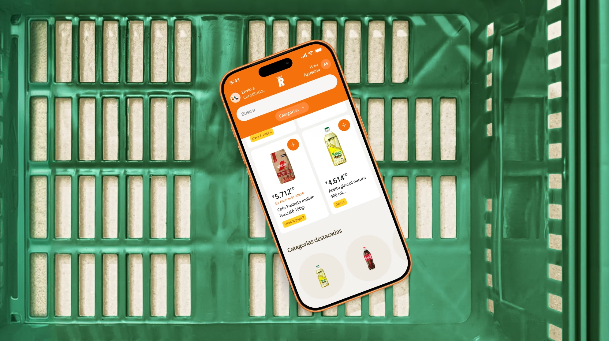
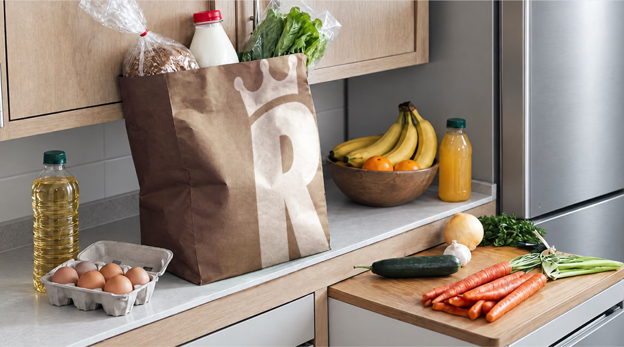
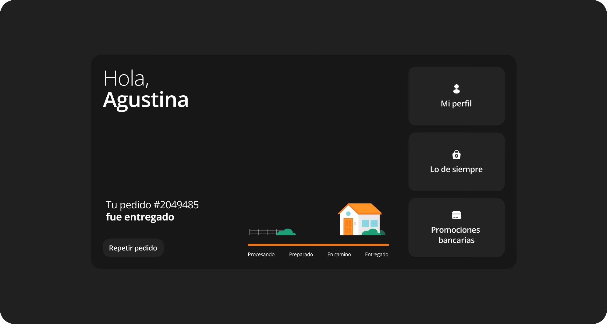
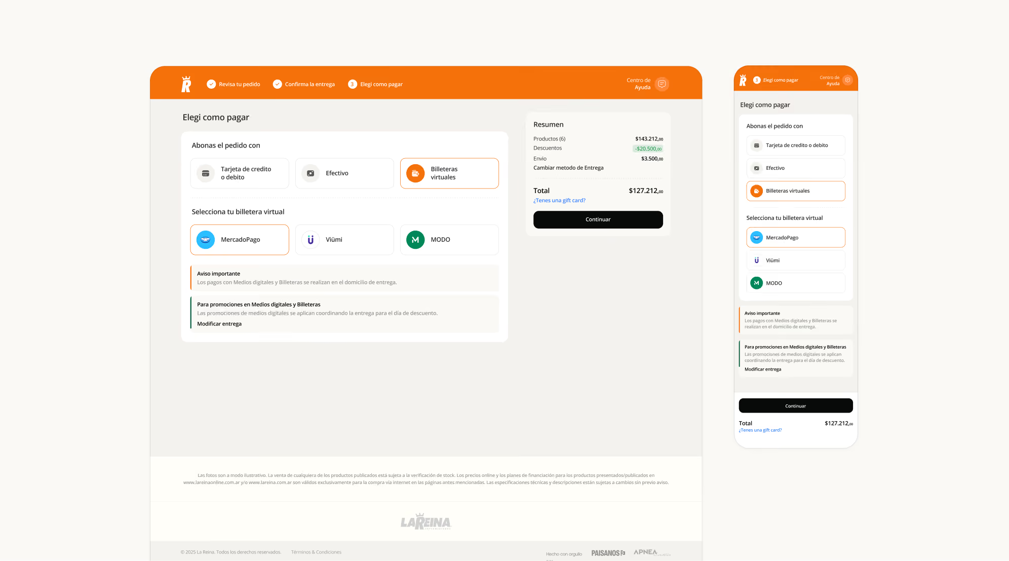
The redesign of the shopping experience had a clear goal: make the path from homepage to product as smooth as possible.
We introduced subcategory pages that didn’t exist before.
We redesigned the cart as a floating dock that follows you throughout the experience, with a real-time total always visible.
We also incorporated upselling, quick reordering, and easy-access shopping lists.
Go to case details to know more
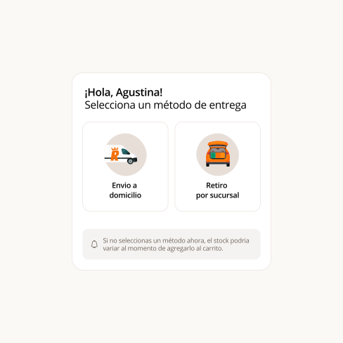
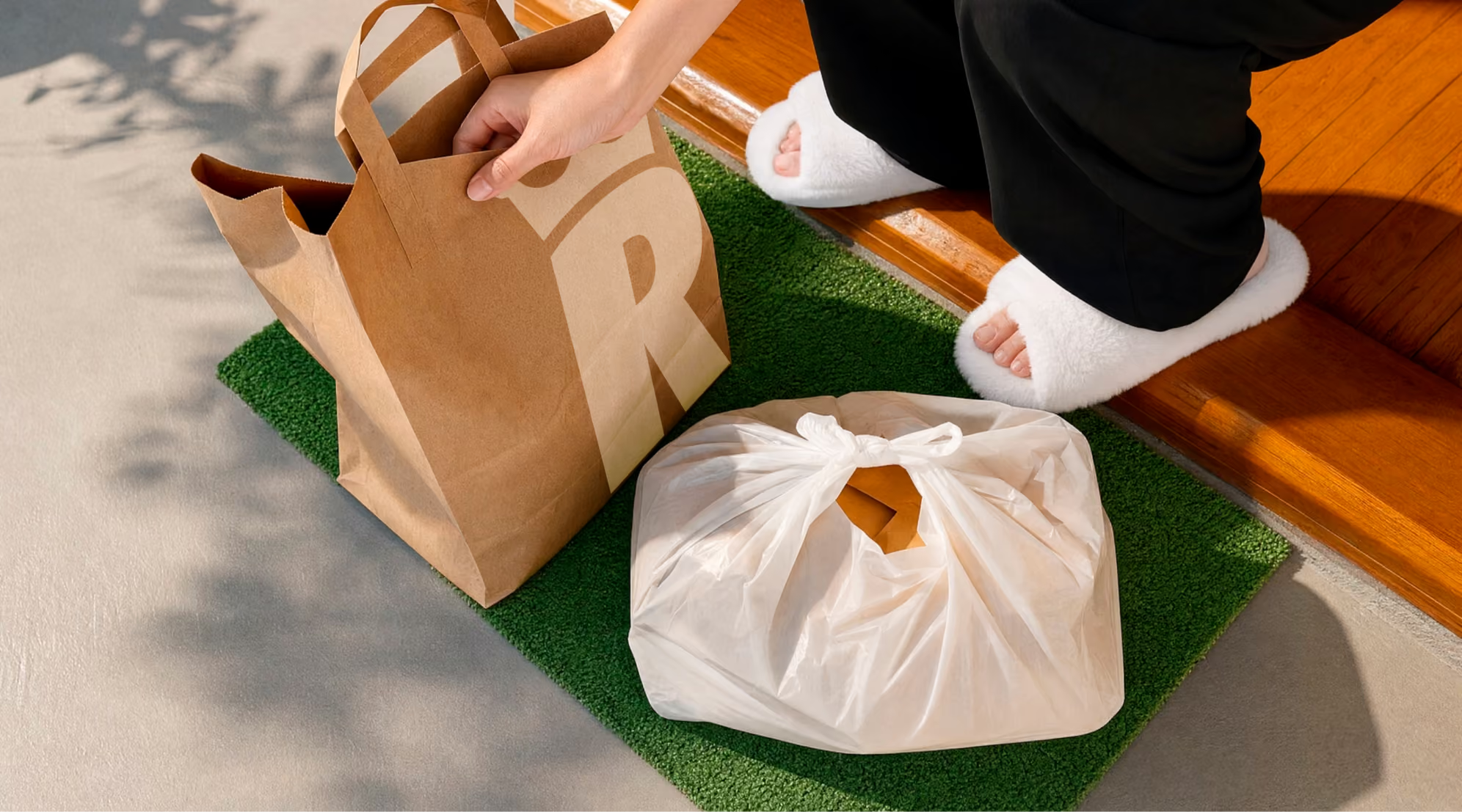
The trip to Rosario informed many layers of the project, including the illustration system.
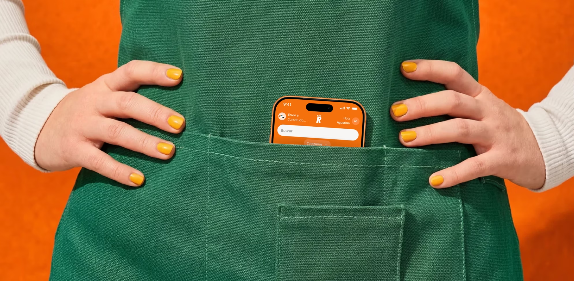
For example, the delivery truck we illustrated is a direct replica of the real one, down to the “R” logo and color palette. The store shown in the pickup step mirrors the actual architecture of their locations. We paid close attention to detail, constantly bringing the physical world into the digital one.
Go to case details to know more
The guiding concept for the site was “royalty”, a nod to the name, but also to a growing sense of maturity and presence. We extended that idea into sound.
We worked with ElevenLabs to create a set of trumpet sounds that play when a purchase is completed. But not just any trumpets, they were carefully tuned to feel optimistic. To evoke celebration without becoming pompous or cold. A sound that’s simple, positive, and distinctive.
The idea was for that same sound to eventually play in-store announcements. To create a truly 360° brand ecosystem. So that someone who shops online and later walks into the store recognizes it instantly.
That’s memorability. And in a saturated market, it’s what makes a brand stick.
Go to case details to know more
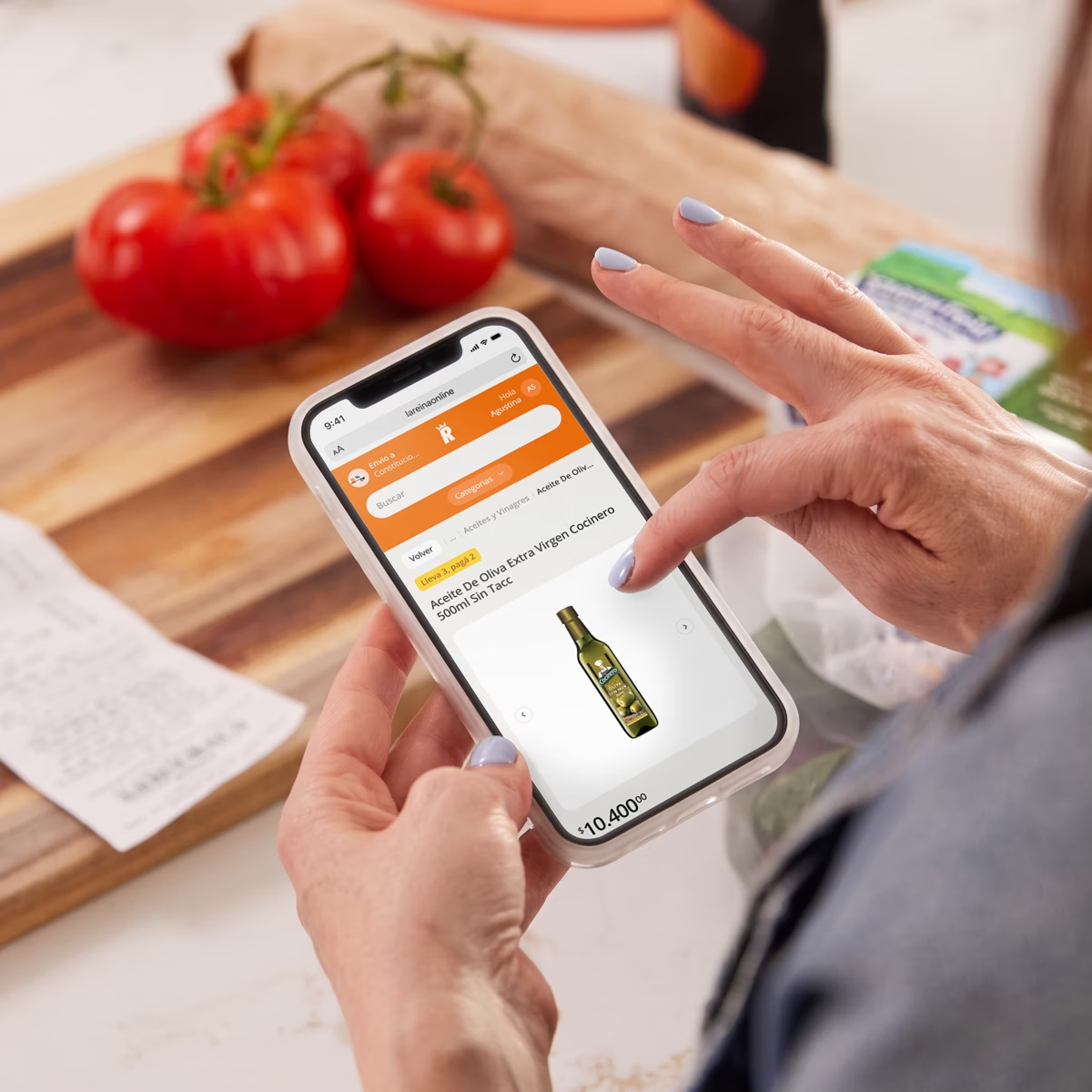
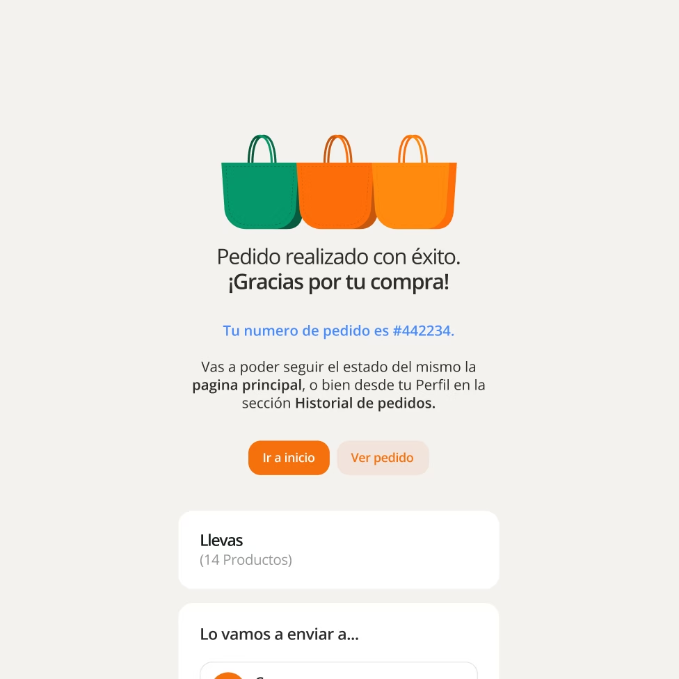
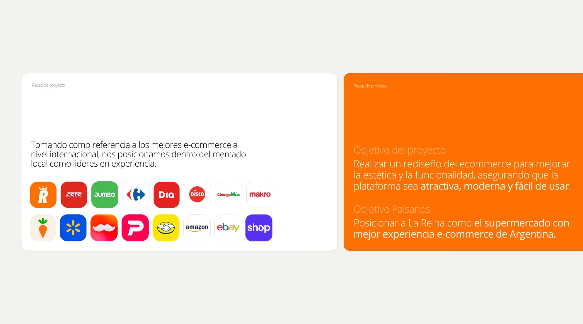
Before, the experience didn’t do justice to what La Reina is in Rosario.
After, it’s a platform that stands shoulder to shoulder with the best supermarket e-commerce experiences in the region, built from the brand’s real identity, not from a generic idea of what an online supermarket should look like.
There wasn’t a single design decision that didn’t trace back to something we saw, heard, or understood during that trip.
That’s what makes it feel real.
Go to case details to know more