Description
The challenge
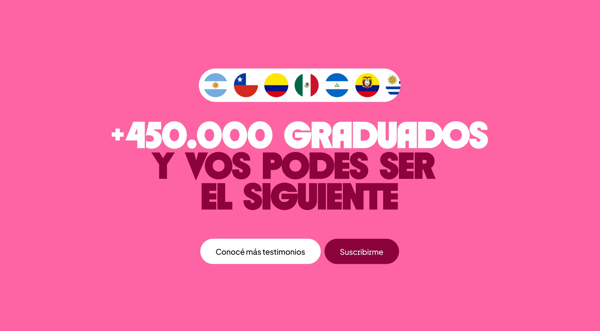
The impact


Not every story begins with a grand revelation; sometimes, they start with a request that seems small.
Coderhouse came to Paisanos with one of those requests: “We want a new logo,” they said. They were looking to stand out, get a "facelift"... nothing out of the ordinary. But we believe that when a brand is about to shed its skin, the first thing you need to look at isn't the form, but the intent.
Their challenge was no longer just about selling courses; it was about supporting and sustaining professional career paths. They needed to evolve from a course catalog into a career guidance platform, moving from teaching isolated skills to providing lifelong professional mentorship.
Go to case details to know more

Coder has been growing across LATAM for years, building a community and becoming a household name for anyone looking to break into tech. But now, they are ready for a new chapter: repositioning themselves to speak to enterprises, preparing for their U.S. launch, and moving past the perception of being just "live online courses"—all without losing the freshness and accessibility that made them a household name.
That new chapter required more than a logo restyling; it needed a North Star. So, before we started designing, we paused. We went into listening mode: analyzing the business, audiences, expectations, frictions, and ambitions. A clear pattern emerged: Coderhouse didn’t just want to look bigger, they wanted to be bigger.
Go to case details to know more
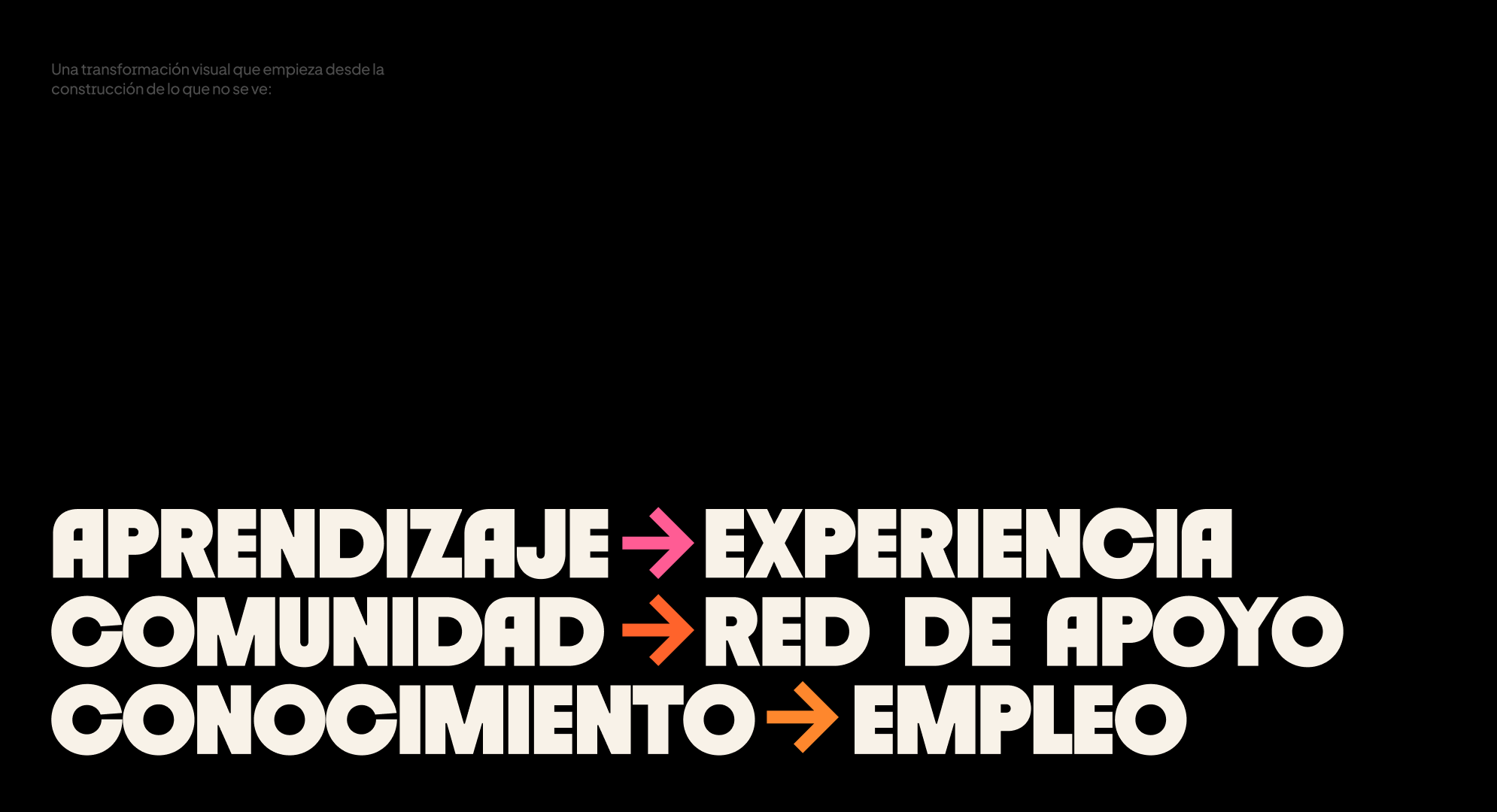
"Horizon" redefined how Coderhouse presents itself to the world: it no longer sells courses, but career paths. The new identity system aligned design, tone, product, and communication under a single idea of continuous progress.
To build the future today is to be radically present: staying up to date, remaining curious, and learning in real-time. That is where curiosity ignites everything, new knowledge is shared, and the journey stops being yours alone to become collective.
And yes, you never truly reach the horizon. And that’s perfectly fine. Because the more you move toward it...
Go to case details to know more

The brand gained clarity, coherence, and international projection. The rebranding strengthened the bond with students, companies, and mentors. It allowed for the organization of its visual and narrative presence and established the foundations for its next stage of growth as a horizontal platform for education and employability.
Before diving into concepts, we needed to fully understand the current situation. We organized everything: how Coderhouse works today, what its students expect, what companies are looking for, what weighs them down, and what excites them. We also looked outward: the competition is massive, and courses (in a world full of tutorials and free content) are no longer enough to differentiate oneself.
That’s where the key point emerged: the real value isn’t in the class; it’s in the journey someone takes and how you accompany them along the way.
Go to case details to know more

“Horizont” had something the others didn’t: it organized ambition without breaking the essence. It looked toward the future without becoming solemn. Most importantly, it reclaimed the horizontal culture that has always defined Coderhouse.
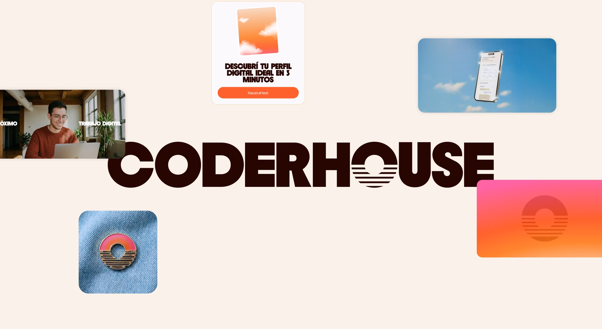
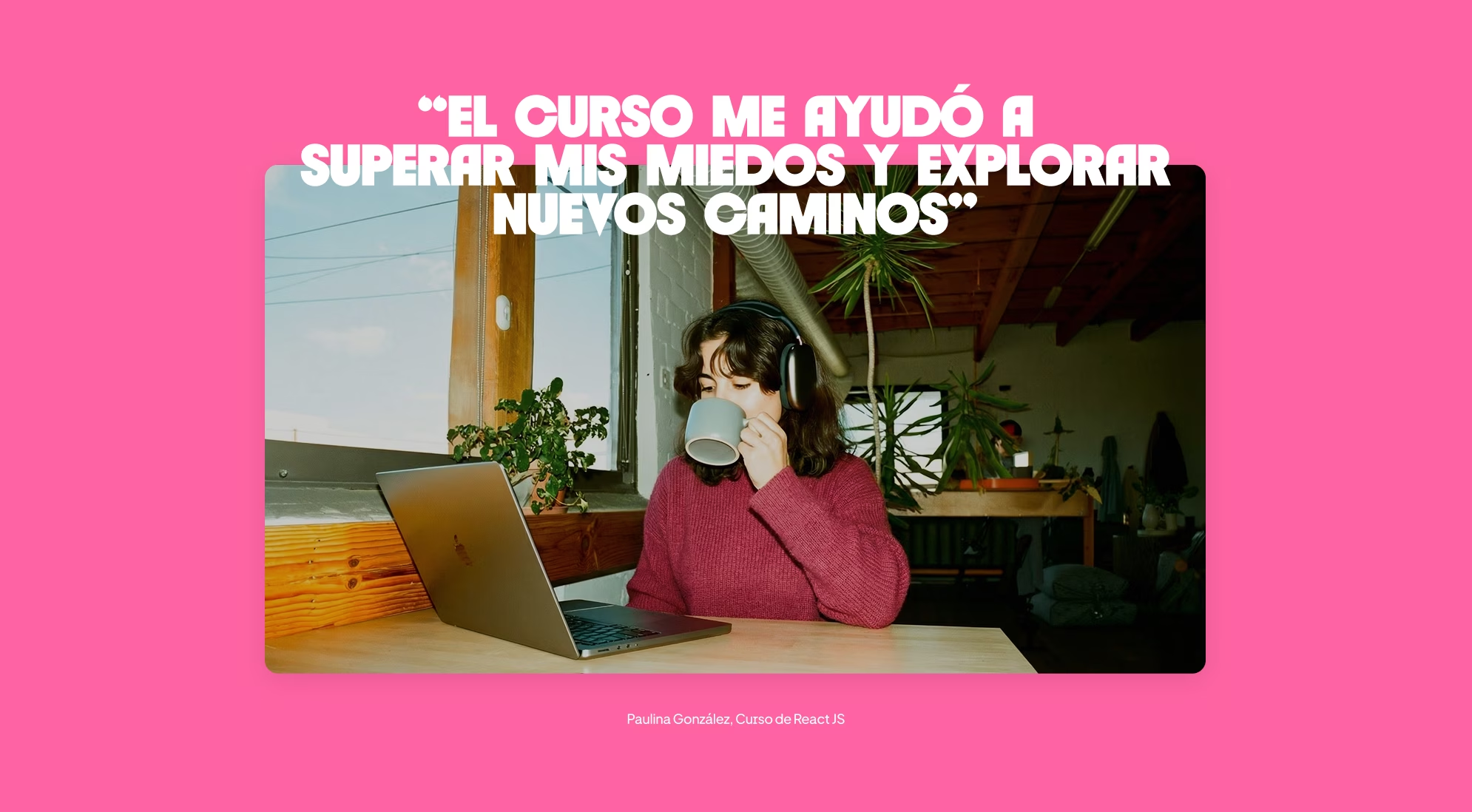
With that concept, the ideas began to fall into place. Not as a moodboard (we never wanted to fall into the "sunset postcard" cliché) but as an atmosphere. A mood with warm accents, the spark that appears on the horizon line. It was a palette that initially raised doubts (pink, orange, yellow), but came to life when applied: they weren't just pretty colors; they were representative colors.
Go to case details to know more

We went back to the drawing board with a single question: what makes the horizon clearer? That’s when everything clicked.
Design, narrative, and strategy began speaking the same language; the brand stopped looking like an "update" and started feeling like a new way of standing in the world. It wasn't a logo: it was a system to organize communication, product, tone, photography, and experiences.
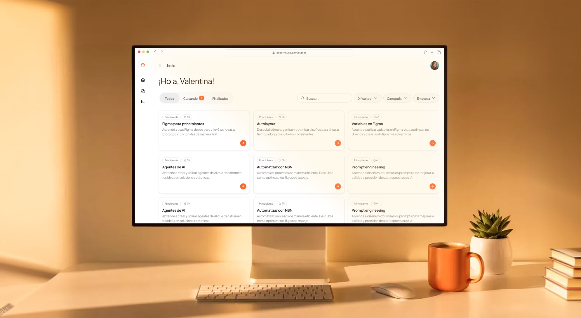
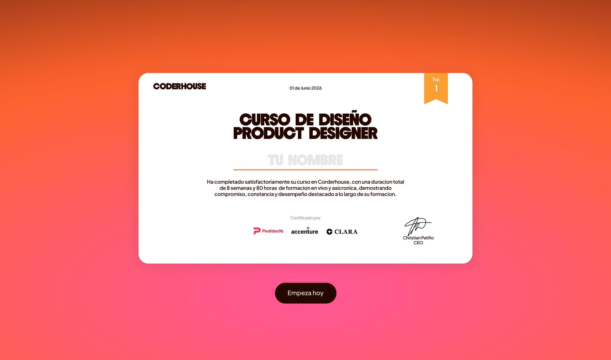
The identity began to take shape, and the platform shifted from presenting itself as a catalog to behaving like a career map: milestones, progress, and visible deliverables. The AI already present in Coder, with its 24/7 tutor and course generator, found its natural role: not as the protagonist, but as the co-pilot. Community stopped being a mere claim and became the setting. And companies began to see themselves not as a secondary audience, but as partners evaluating real-world performance.
Go to case details to know more


What started as a request for a logo restyling ended up as a complete repositioning. A brand that shifts away from being a "practical course school" and transforms into an operating system for education.
A brand that doesn't promise destinations, but expanding futures, because at the end of the day, what we created wasn't a logo; we opened up a direction.
Go to case details to know more